Autumn Color Palette: Warm, Deep & Soft Personal Colors
Find your Autumn color palette with Warm, Deep, and Soft Autumn colors, practical neutrals, accents, metals, makeup, and everyday outfit formulas.
STYLEFINDEN editorial review: checked before publication for wearability, proportion logic and real-life outfit use. We explain our editorial method and image policy on the About page and keep affiliate independence details in the affiliate disclosure.
An Autumn personal color palette is not a calendar-season guide to sweaters and boots. It is a color direction built around warmth, softened richness, and medium-to-deep contrast. If rust, moss, warm ivory, and brown make your features look present while icy pink and stark optic white take over, Autumn is a useful starting comparison.
The point is not to turn your closet into a pile of camel. It is to spot the shared temperature and depth that make clothes look connected to you. Autumn often gets reduced to orange, but the most useful Autumn wardrobes have olive, teal, burgundy, cream, and dark brown doing just as much work.
What Is an Autumn Personal Color Palette?
An Autumn personal color palette is a family of warm, moderately muted, and often medium-to-deep colors used in seasonal color analysis. Think cream, camel, cognac, moss, olive, rust, brick red, warm teal, aubergine, and chocolate. Compare a warm brick red with a blue-red berry in daylight; the useful observation is which color makes your eyes, skin, and facial definition easier to see.
Color language is clearer when it separates hue, saturation, and brightness. Adobe’s Color Picker guide defines HSB through color type, intensity, and brightness. Autumn is a relationship between those variables, not a list of mandatory hex codes.
Where Autumn Color Analysis Came From
The familiar four-season system came from twentieth-century color consulting and later beauty books that made warm-versus-cool and light-versus-deep comparisons practical for dressing. Keep the comparison method, not the idea that a seasonal label can settle every style decision. Test colors on your own face, in ordinary daylight, and look for a pattern across several shades.
Modern seasonal systems still describe Autumn through warm, rich color families. Color Me Beautiful’s Autumn guide uses shades such as olive, rust, camel, and teal as useful entry points. Use those as swatches to compare, not as a verdict about what you may wear.
The Key Colors in an Autumn Palette
Begin with warm ivory, cream, beige, camel, cognac, warm taupe, olive, moss, dark teal, rust, terracotta, brick, burgundy, aubergine, and chocolate. Their common thread is warmth with substance. A neon orange can be warm, yet its saturation will often compete with a classic Autumn palette; a weathered paprika or red-brown has more room to sit beside the face.
For best neutrals, cream, warm beige, camel, olive, dark brown, and petrol are more useful than a single all-black uniform. Accent colors can be rust, tomato red, warm turquoise, marigold, forest green, or a deep warm berry. Build a swatch group first, then notice whether your best colors lean golden, deep, or softened.
Warm Autumn Color Palette: Golden and Grounded
Warm Autumn places temperature first. Golden olive, moss, honey, pumpkin, warm coral, turquoise, camel, and rich brown feel native here because their yellow or red undertones keep the palette lively. The colors can be clear enough to feel sunny, but they need more earth than the bright citrus shades of Spring.
Warm Autumn often overlaps with Warm Spring at the temperature level. The separation comes from weight: Spring reads clearer and lighter, while Autumn usually benefits from more depth, texture, and softened saturation. Pair cream with olive or a rust knit with dark denim instead of stacking pale yellow, bright aqua, and white in one outfit.
Deep Autumn Color Palette: Rich and Dimensional
Deep Autumn prioritizes depth while keeping a warm base. Espresso, dark olive, oxblood, aubergine, deep teal, mahogany, and near-black brown give it a stronger contrast range than Warm or Soft Autumn. It can borrow visual weight from Deep Winter, but the Winter version is cooler, sharper, and more blue-based.
This subtype handles a dark column well: a dark brown skirt, burgundy top, and deep olive jacket create dimension without the hard graphic edge of black and white. Gold, bronze, antique brass, tortoiseshell, and warm pearls are useful jewelry tests because they echo the palette rather than introducing a cool flash.
Soft Autumn Color Palette: Muted With Warmth
Soft Autumn leads with low saturation. Mushroom, warm gray, dusty olive, muted sage, rose brown, soft teal, cocoa, antique pink, and gentle rust offer warmth without demanding visual drama. It sits close to Soft Summer, but Summer turns cooler and grayer while Soft Autumn holds a yellowed or earthy undertone.
The common mistake is stripping Soft Autumn down to beige. Muted color is still color. A dusty teal shirt with cocoa pants, or olive beside warm ivory, gives this palette more life than head-to-toe sand while preserving its low-contrast logic.
How to Style Autumn Colors Without Looking Costume-Like
Choose one warm neutral close to the face, add a related accent, then let texture provide the third note. Cream with olive and cognac leather works because all three have warmth but none competes for attention. A sharp fluorescent bag or a cool silver belt can interrupt that temperature relationship; keep them for an outfit built around deliberate contrast.
Autumn colors gain credibility from materials with depth: suede, brushed cotton, corduroy, washed denim, wool, leather, and matte knits. This is why a brown outfit can read polished rather than dated. The color is only half the answer; a thin shiny synthetic in the same brown can flatten the whole combination.
Autumn Makeup Colors: Blush, Lipstick, and Eyeshadow
For an Autumn makeup comparison, test apricot, warm peach, terracotta, cinnamon rose, brick, warm berry, bronze, olive, khaki, chocolate, and warm plum. A peach or terracotta blush often repeats the palette more naturally than an icy pink. Lipstick can move from warm nude to brick red or deeper raisin according to your contrast and preference.
Eyeshadow is where depth becomes practical: bronze, olive, cocoa, warm taupe, and copper can frame the eye without the high shine of a cool silver. None of this overrides skin depth or a favorite product. Swatch two options at once in daylight and keep the color that supports your features instead of merely matching an online label.
Common Autumn Palette Mistakes to Avoid
Avoid treating every warm color as an Autumn color. Bright yellow and clear coral often belong closer to Warm Spring, while a very dark cool jewel tone may make more sense on Deep Winter. Autumn needs warmth plus a measured level of richness or softness; intensity alone is not the test.
Avoid costume logic, too. A rust scarf, olive trousers, camel coat, brown boots, and gold jewelry can become a theme rather than an outfit when every piece announces the same season. Keep one or two colors quiet, then let the accent do its job. An Autumn palette is a set of relationships, not a pumpkin-spice uniform.
Autumn Color Palette Outfit Examples
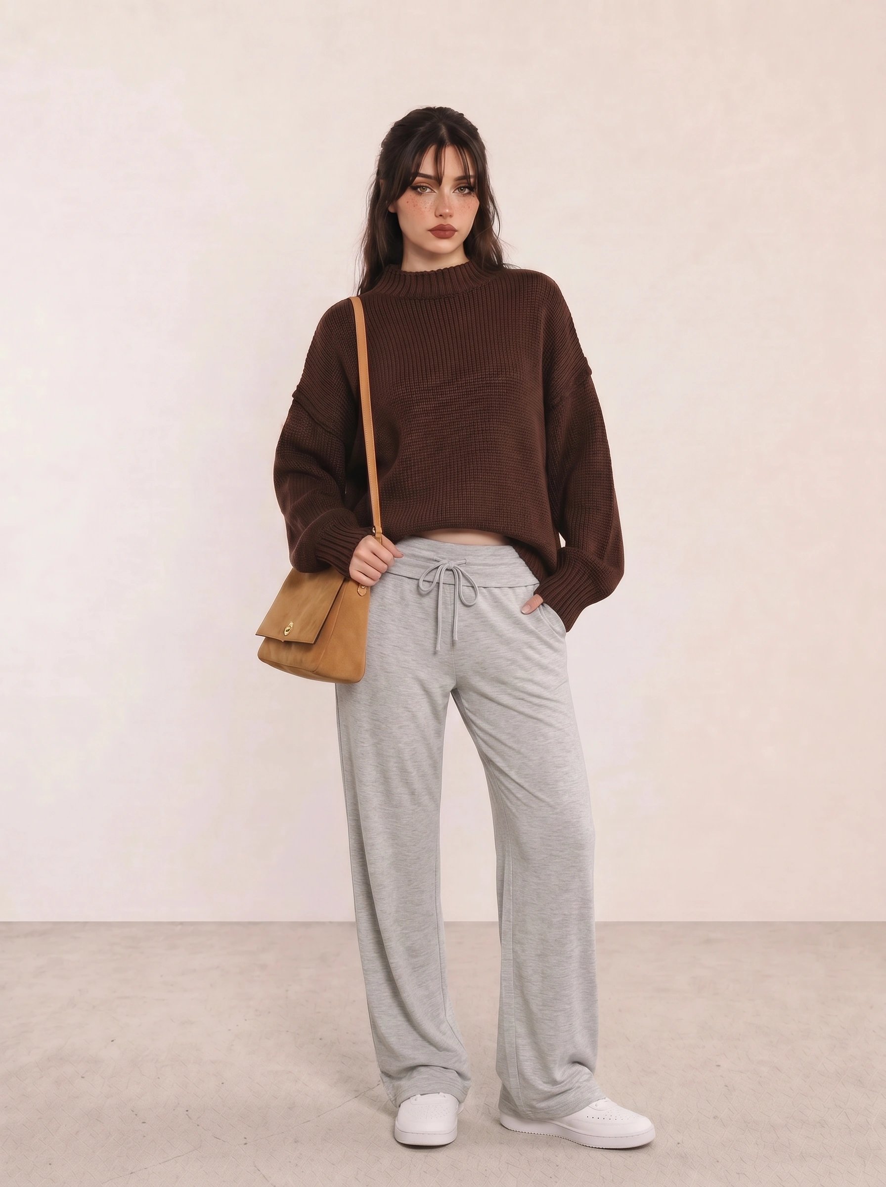
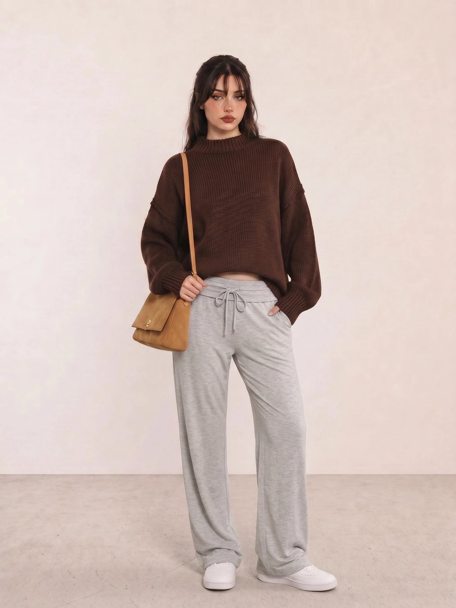
In Brown Chunky Sweater & Grey Drawstring Pants, the brown knit supplies warmth while gray pants lower the contrast. The useful Soft Autumn move is the tan suede bag: it repeats the sweater’s temperature without making the outfit a head-to-toe brown block.
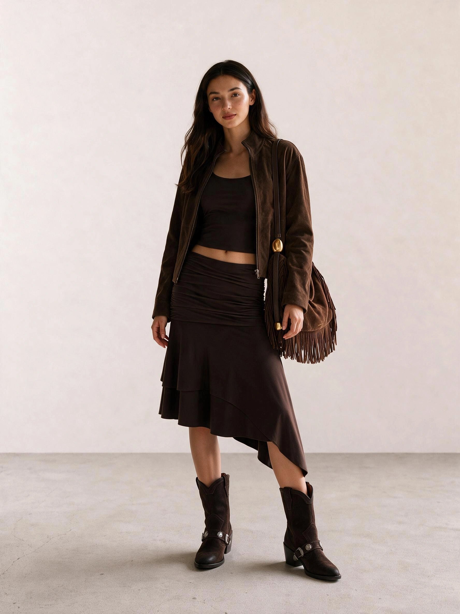
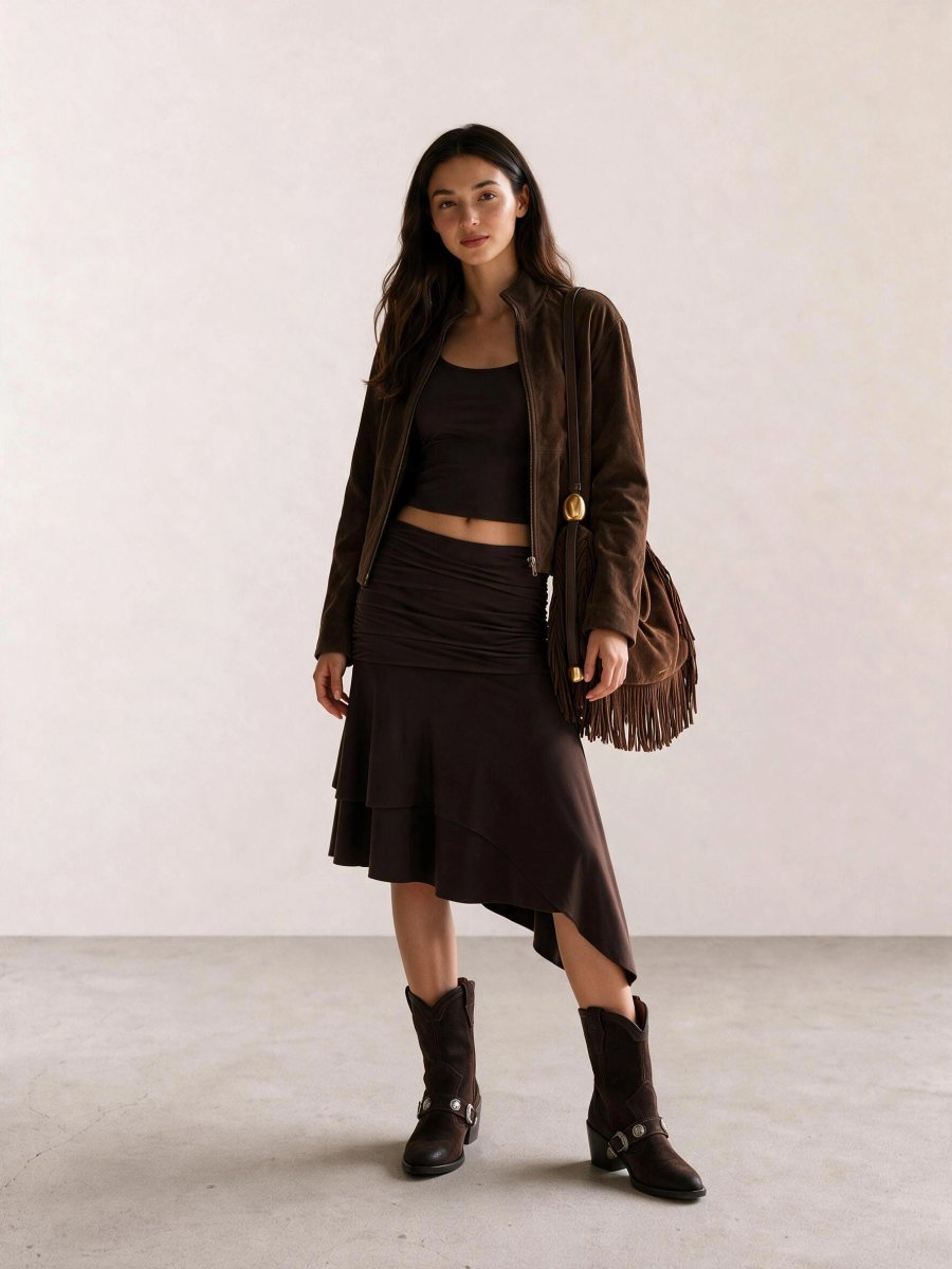
Brown Halter Top & Asymmetric Skirt with Fringe Bag shows why Deep Autumn can use a near-monochrome look. The jacket, skirt, fringe, and boots move across different brown values, so texture creates the separation that a cold high-contrast color pairing would usually provide.
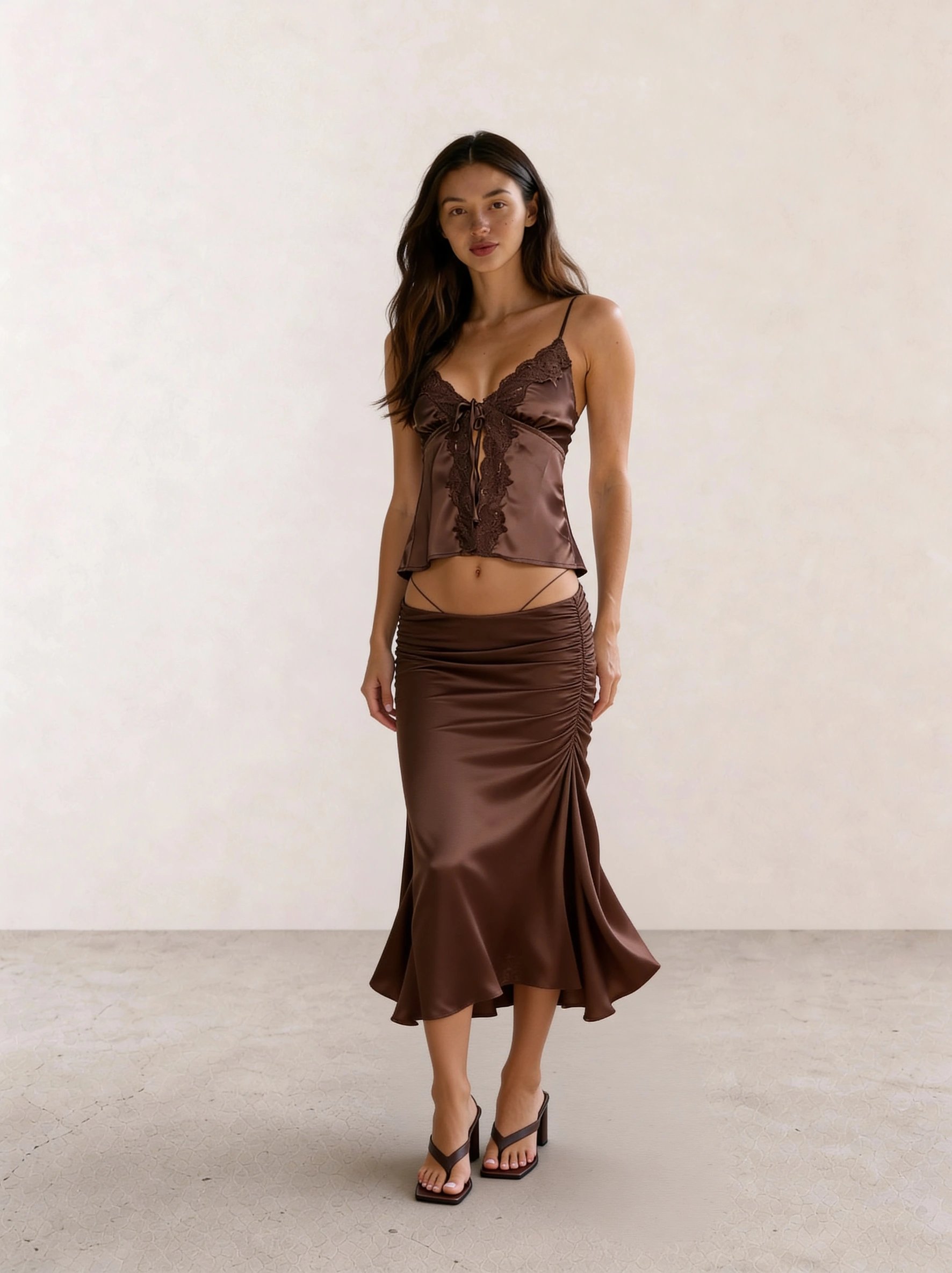
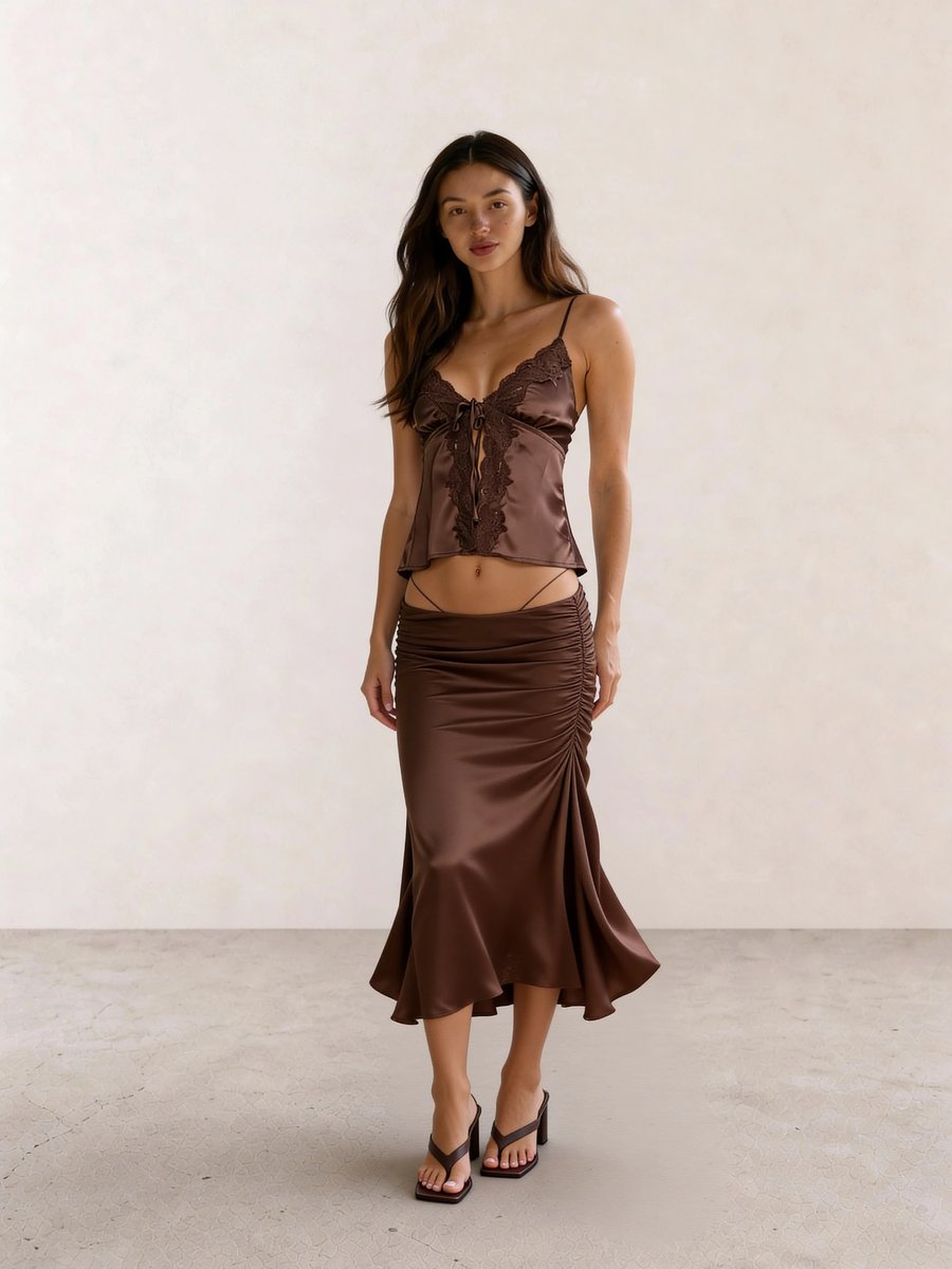
The tonal pull in Brown Satin Cami & Ruched Midi Skirt comes from depth, not decoration. A bronze cuff or antique-gold earring would strengthen the warmth; icy rhinestones would shift attention from the column of brown to the accessory.
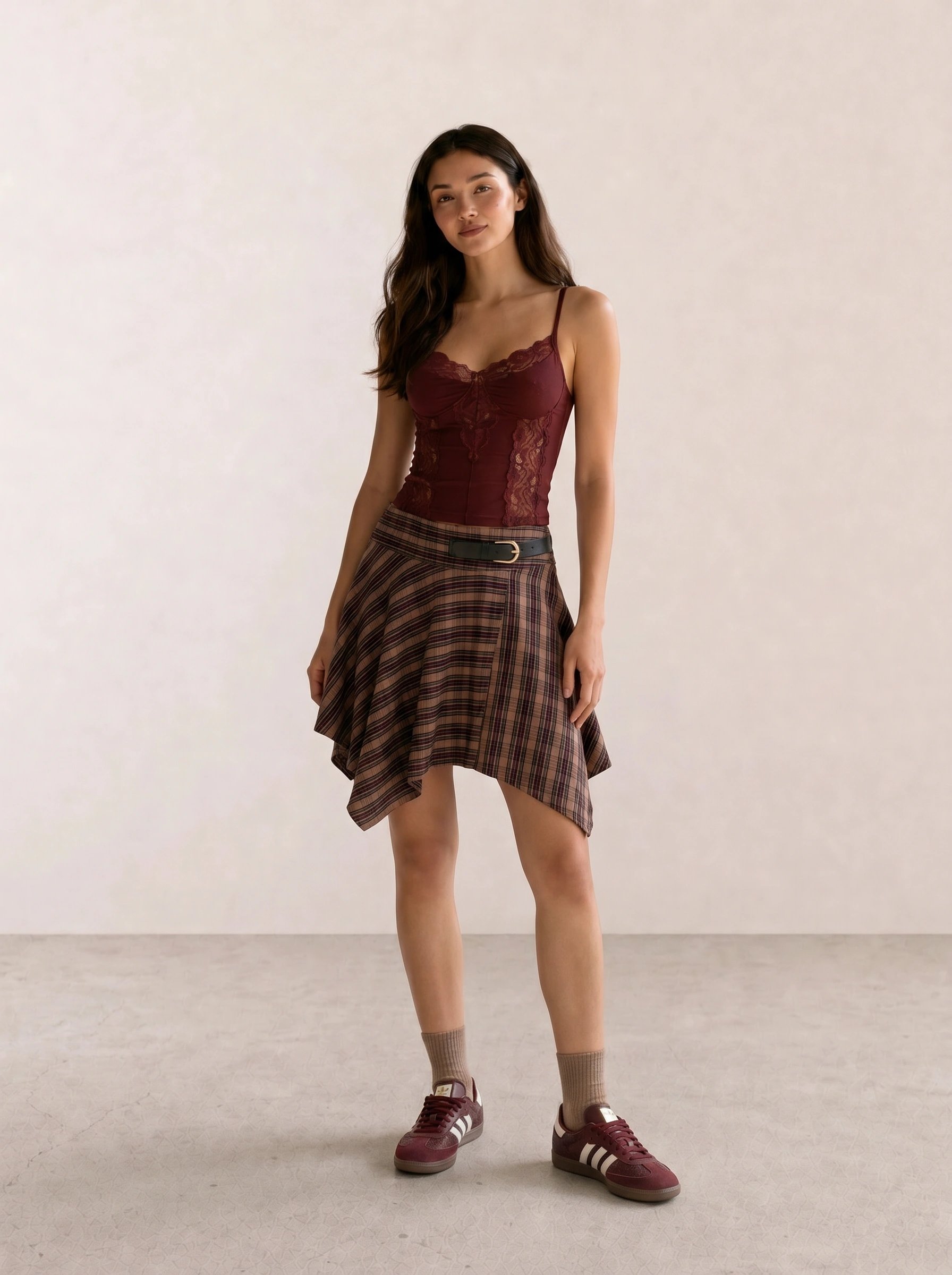
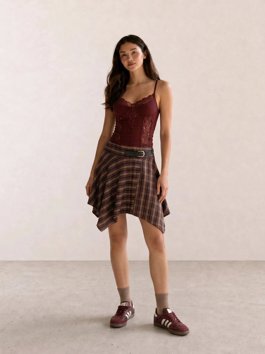
For Burgundy Lace Cami & Plaid Asymmetric Mini, burgundy gives a warm red alternative to a bright primary red. The plaid keeps the mini skirt grounded; without the brown in the print, matching burgundy sneakers and cami could look too coordinated for the proportions.
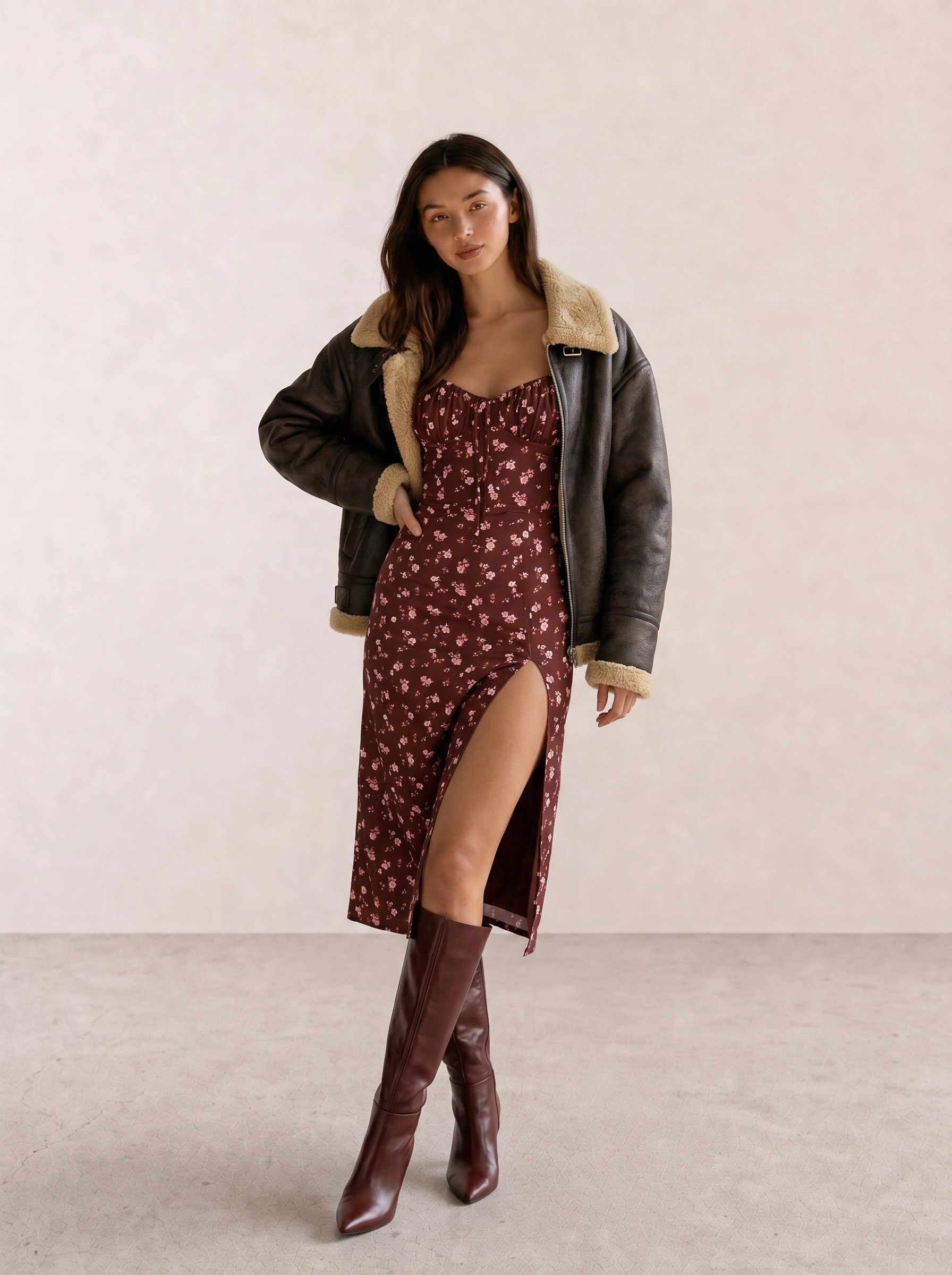
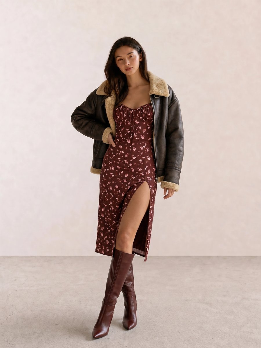
In Floral Midi Dress & Shearling Jacket with Brown Boots, the dress carries the accent while the jacket and boots provide a warm frame. This is the outfit for a dinner reservation on a cold evening when a black coat would feel like a separate idea rather than part of the color story.
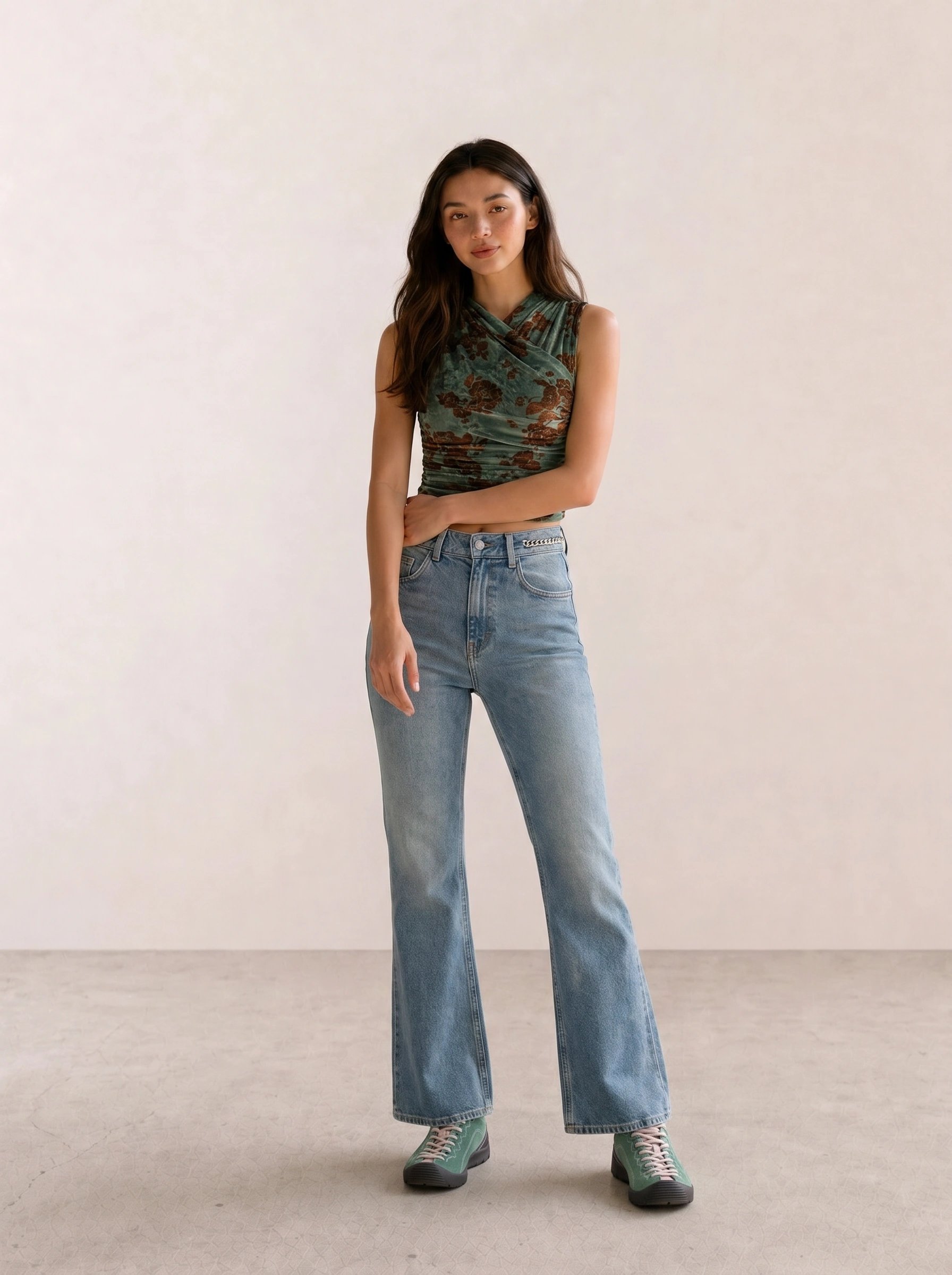
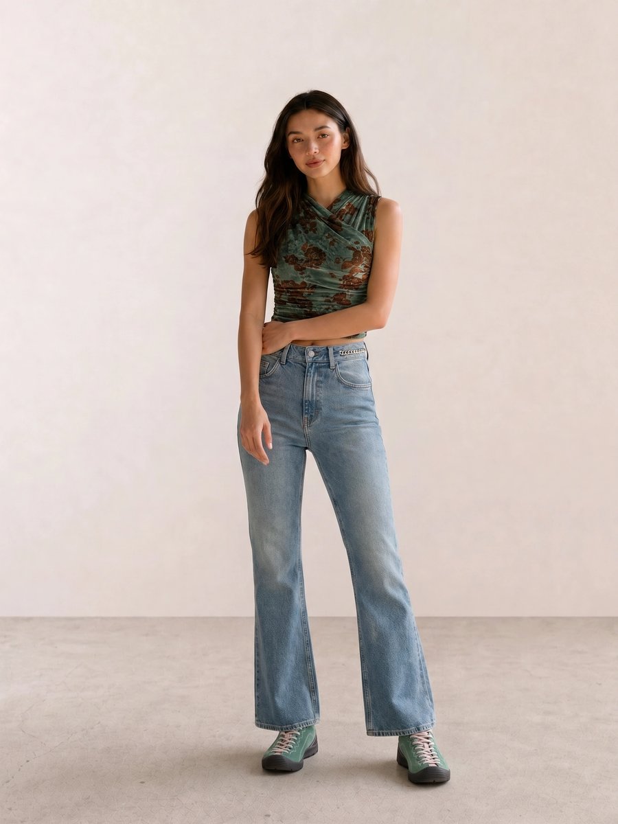
The green in Green Velvet Wrap Top & Flare Jeans earns its place through fabric weight as much as hue. Velvet adds the depth Warm Autumn needs, while denim keeps the look from feeling overly precious. A bright emerald top would make the same jeans read like a different palette.
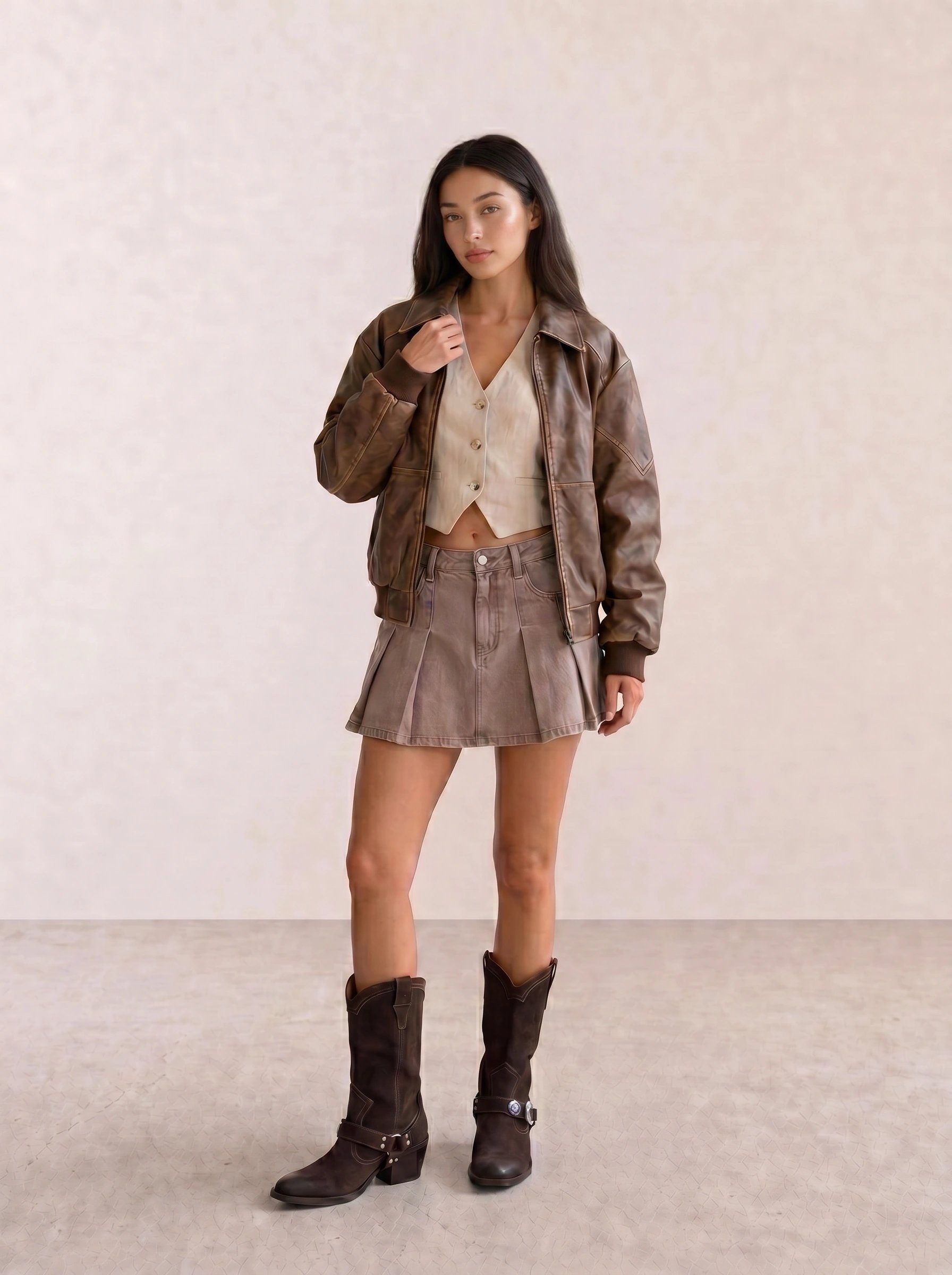
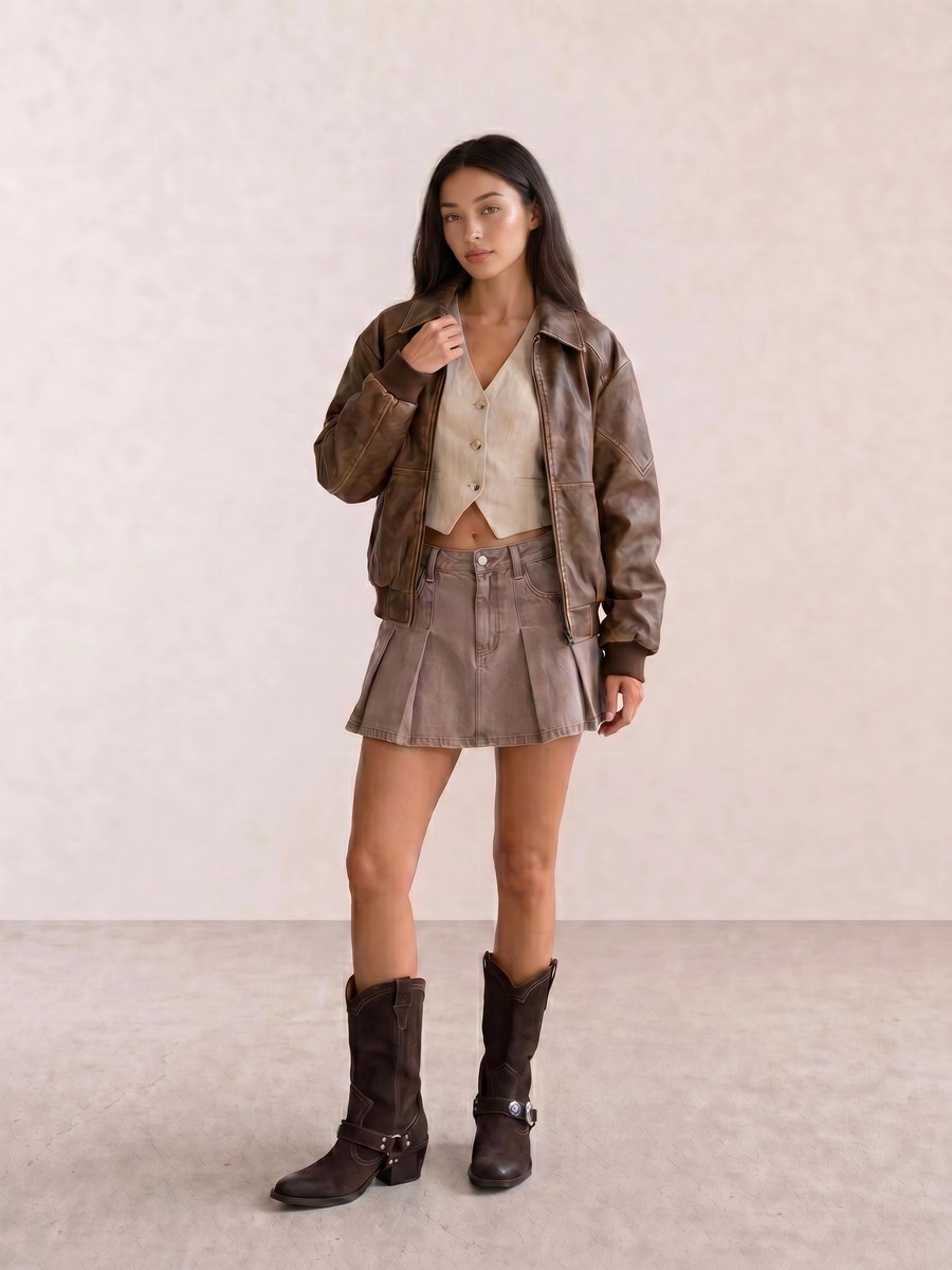
With Leather Bomber & Linen Vest with Pleated Mini Skirt, cream near the face prevents the leather bomber from becoming visually heavy. This is an easy first formula for someone testing Autumn neutrals: warm ivory, brown leather, then one taupe or olive lower-half piece.
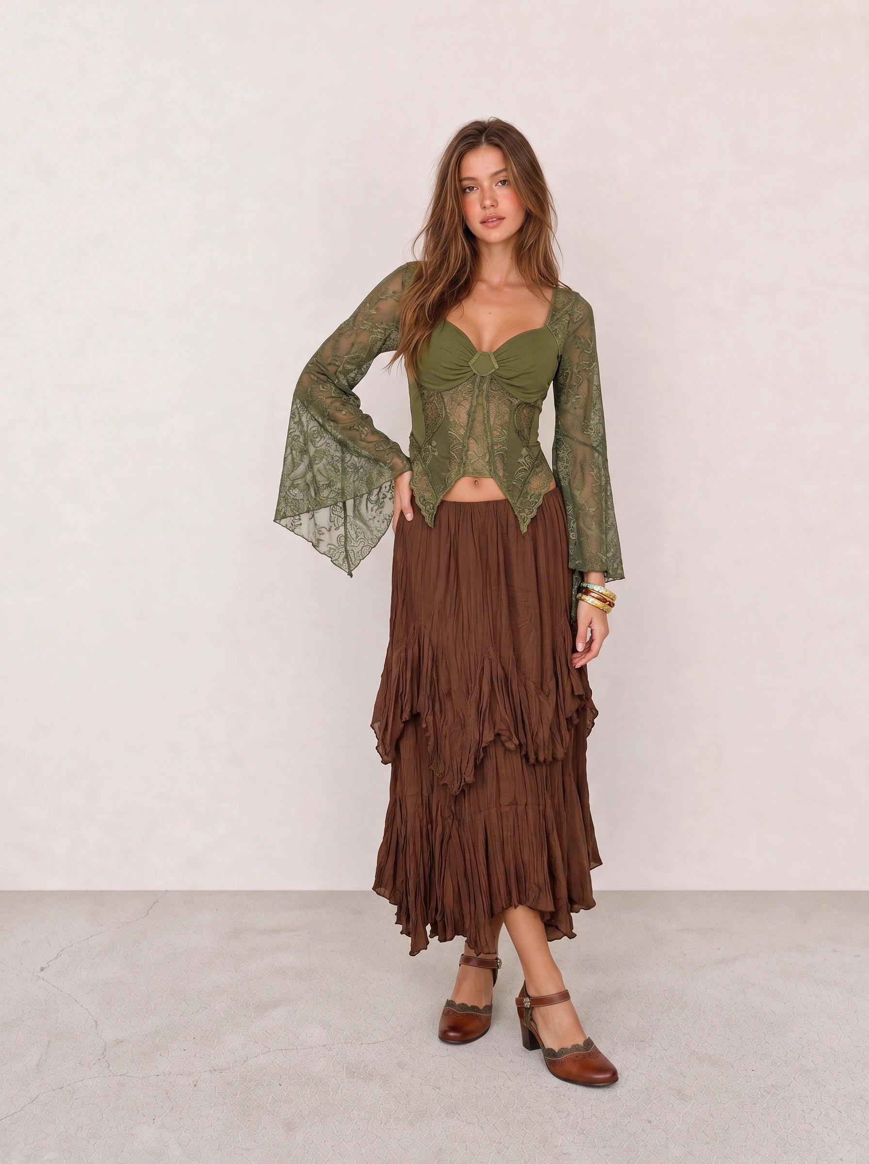
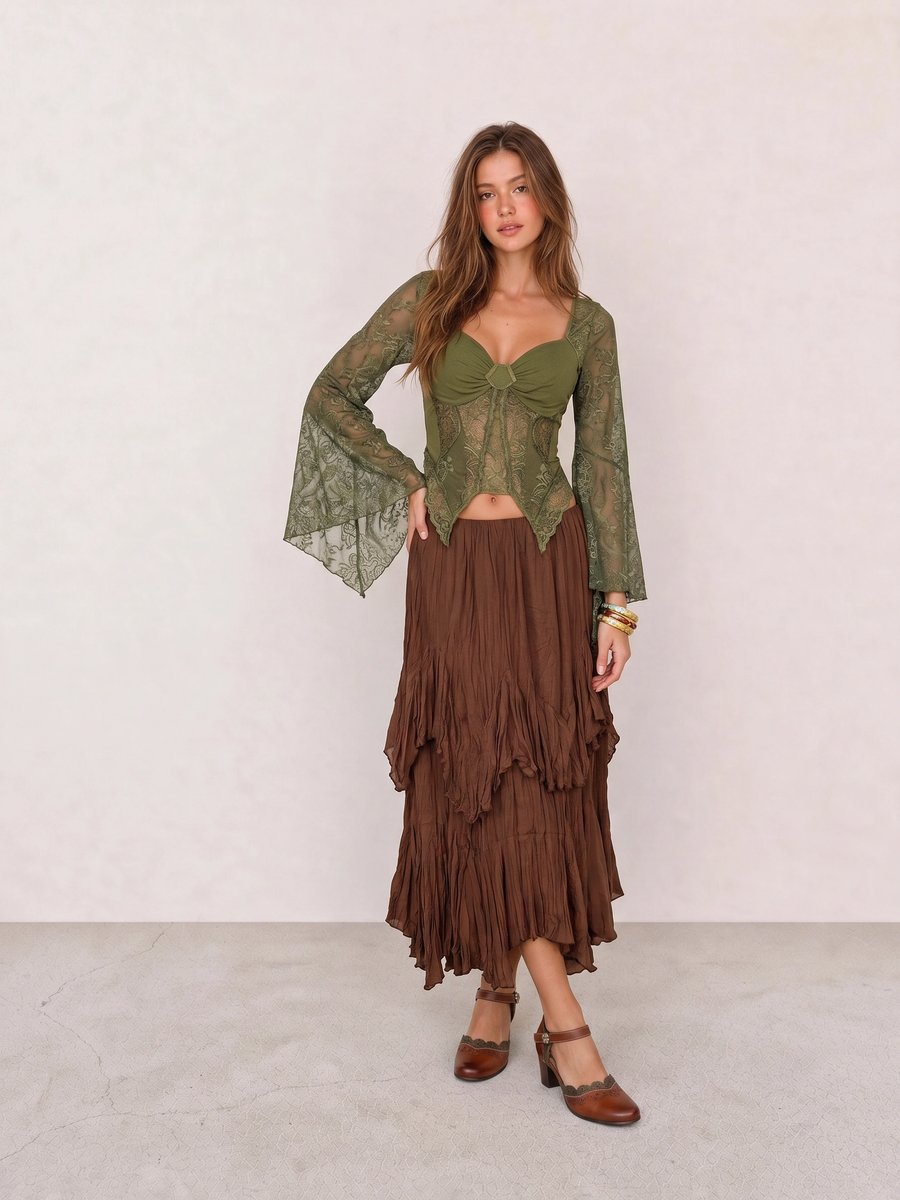
The balance in Olive Lace Corset Top & Brown Ruffle Midi Skirt is temperature rather than strict matching. Olive and brown are neighbors in an Autumn palette, while the floral heel adds small-scale pattern; replace the olive with a cool blue-green and the warm connection becomes less convincing.
A Practical Shopping Guide for Autumn Colors
At a budget, start with a cream tee, olive or dark denim trousers, one camel or brown knit, and a rust or burgundy top. Spend more on the pieces that frame your face often: coat, blazer, handbag, shirt, or eyewear. Fit and fabric outrank a perfect color name. A slightly wrong olive in a great jacket can still earn a place if it works across the rest of your closet.
Apply Autumn Beyond a Swatch
Set Autumn beside Seasonal Color Analysis, then test your undertone, clothing colors, jewelry metals, and makeup colors before you build a brown-only wardrobe.
Autumn Personal Color Palette FAQ
What colors look best on an Autumn palette? Warm ivory, camel, olive, moss, cognac, rust, brick red, warm teal, burgundy, chocolate, and aubergine are useful first swatches. Choose the more golden, deep, or muted version according to Warm Autumn, Deep Autumn, or Soft Autumn.
Can an Autumn palette wear black? Yes, especially Deep Autumn, but dark brown, espresso, olive, or petrol often offer the same structure with a warmer result. Compare the colors at the neckline and keep the one that leaves your own features in focus.
What jewelry metals suit Autumn coloring? Yellow gold, bronze, antique brass, copper, tortoiseshell, and warm pearls are practical starting tests. Silver is still wearable when the scale, finish, and rest of the outfit support it.
How do Warm Autumn, Deep Autumn, and Soft Autumn differ? Warm Autumn puts golden temperature first, Deep Autumn puts depth first, and Soft Autumn puts mutedness first. All three differ from clear Warm Spring, cooler Soft Summer, and sharper Deep Winter.
Weekly outfit picks and style guides — no fluff, unsubscribe anytime.