How to Find Your Undertone: Warm, Cool, Neutral & Olive
Learn how to find your undertone with warm, cool, neutral, and olive comparisons, natural-light draping, white versus cream, jewelry, and makeup tests.
STYLEFINDEN editorial review: checked before publication for wearability, proportion logic and real-life outfit use. We explain our editorial method and image policy on the About page and keep affiliate independence details in the affiliate disclosure.
Undertone is a comparison tool, not a verdict from one wrist photo. The useful result is a short list of colors, metals, and makeup shades that look easier beside your face in daylight. If cream, silver, or a muted rose wins one day and loses the next, record the pattern before you name it.
Start with fabric rather than a filtered selfie. Camera white balance, surface redness, tanning, and indoor bulbs can change what you think you see. This guide uses warm, cool, neutral, and olive as styling observations, then shows how to test them without turning a preference into a rule.
What Is an Undertone?
In personal color analysis, undertone describes a recurring warm, cool, neutral, or olive direction that can affect which nearby colors feel harmonious. It differs from skin depth: fair, medium, deep, and dark describe visible depth, while undertone describes the color cast you are comparing. Neither label tells you what you are allowed to wear.
Color Me Beautiful’s color-analysis guide describes cool, warm, and neutral undertones as part of its broader color-analysis framework. Treat that framework as a vocabulary for styling choices, not as a medical or biometric assessment.
The point is practical. A blue-red lipstick and an orange-red lipstick can share the same depth, but one may make you look more rested with no extra effort. That result can come from undertone, yet value, contrast, texture, and personal taste can also change it. Compare more than one variable before drawing a conclusion.
Undertone, Surface Tone, and Skin Depth
Surface tone is what you notice first: a recent tan, visible redness, freckles, or unevenness. It can change with sun, temperature, skincare, or a breakout. Skin depth is the overall light-to-deep range you see. Undertone is the repeated direction you are testing beneath those changing surface conditions.
This distinction matters because redness can make a warm-leaning complexion look cool in a bathroom mirror, while a golden tan can make a cool-leaning complexion look warm in a vacation photo. Use indirect daylight, a bare face if that is comfortable, and the same mirror for every comparison. You are looking for a repeatable response, not a perfect label.
The broader color vocabulary also separates hue from saturation and brightness. Adobe’s guide to hue, saturation, and brightness explains those controls; they help explain why a muted cool pink and a bright cool fuchsia can produce very different results beside the same face.
Warm, Cool, Neutral, and Olive: The Working Definitions
Warm-leaning comparisons often favor golden cream, camel, coral, tomato red, warm brown, and yellow-gold. Cool-leaning comparisons often favor optic white, blue-red, cool pink, charcoal, cobalt, and silver. These are starting swatches, not uniforms. A warm person may prefer a cool jewel tone for contrast; a cool person may love a warm brown bag.
Neutral is useful when both warm and cool comparisons can work, usually with a small lean in one direction. Olive can describe a green-gray or golden-green cast that may coexist with warm, cool, or neutral behavior. Olive is not a fourth point on a simple warm-to-cool line, and it does not automatically mean that every olive garment will flatter you.
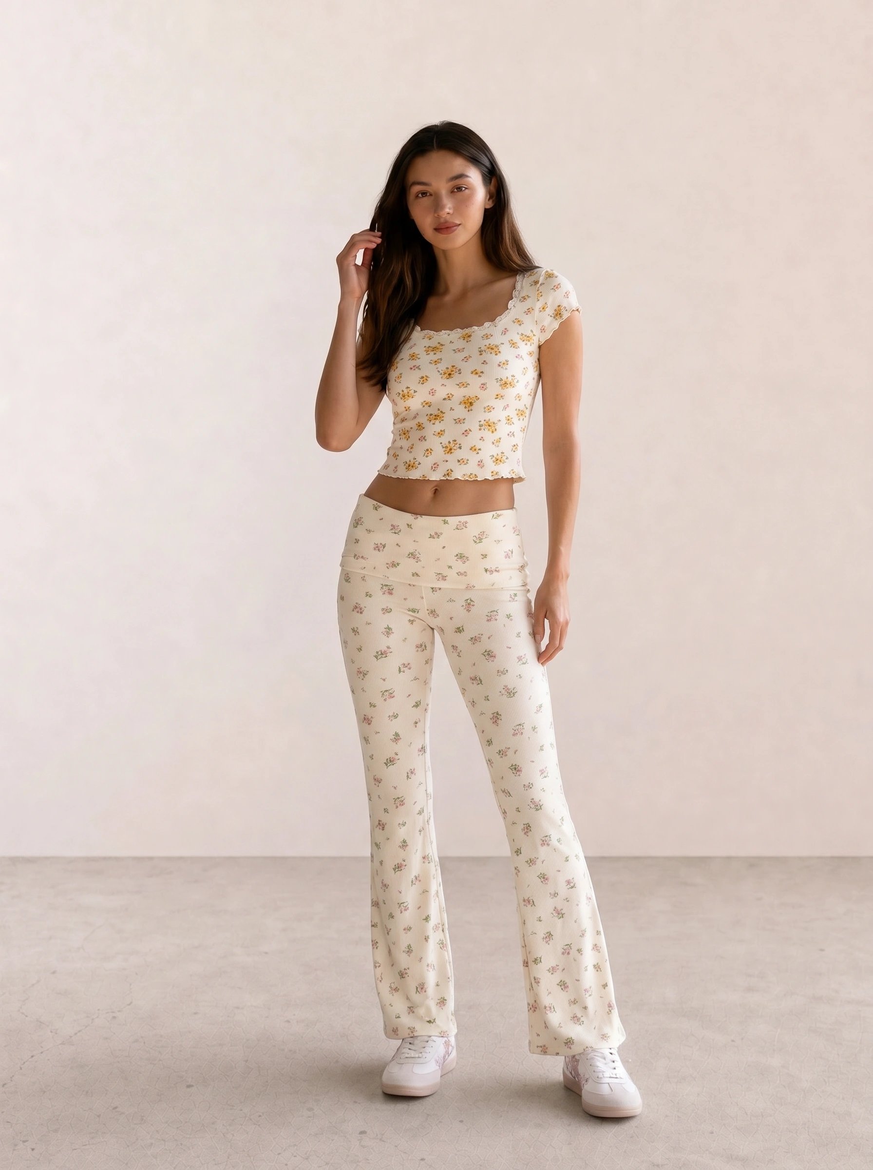
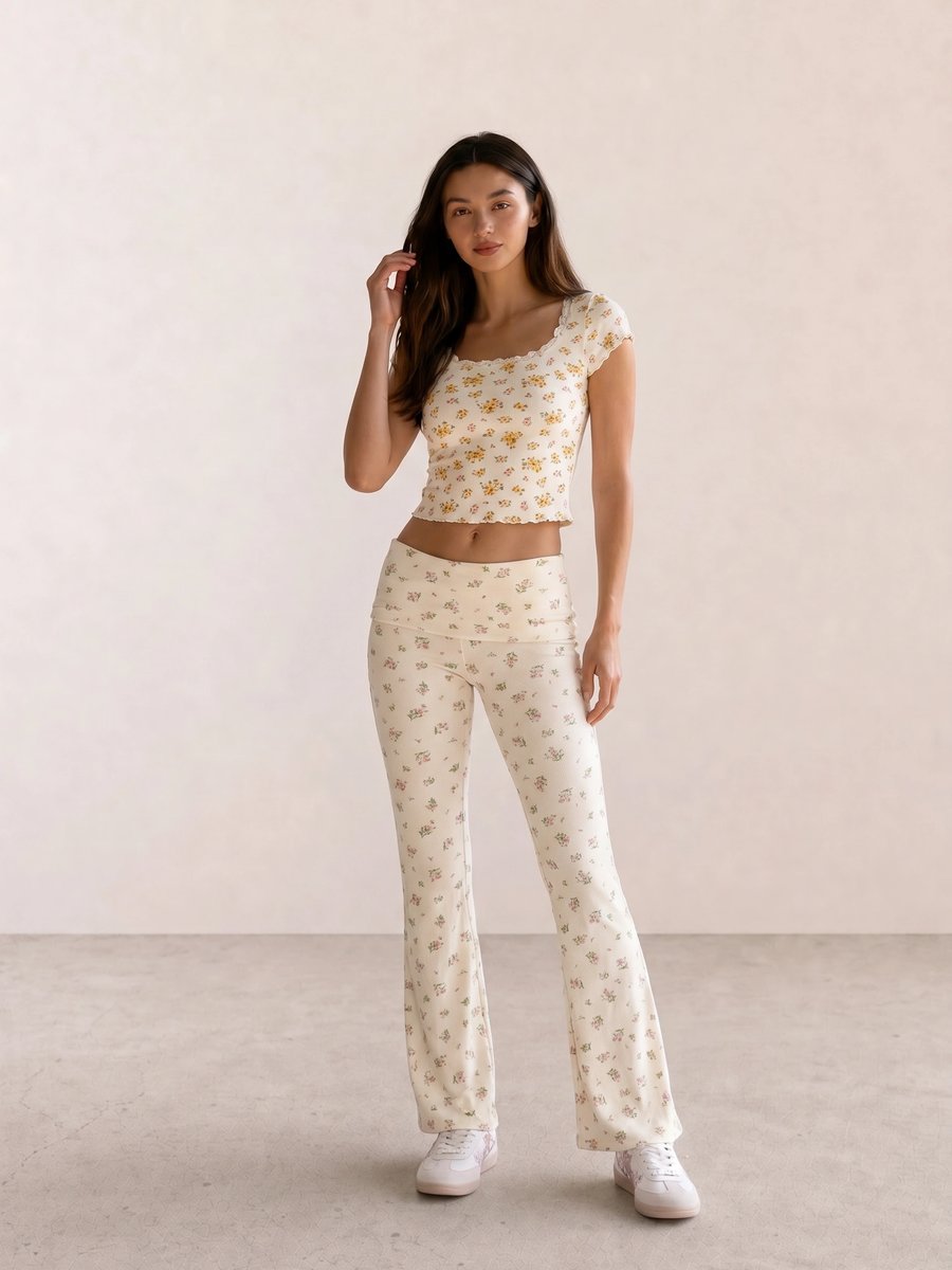
In Yellow Daisy Floral Co-Ord Set, clear yellow sits close to ivory. Use this pairing as one warm-leaning comparison, then try a cooler yellow or pale grey beside it before treating your response as a pattern.
Why One At-Home Test Cannot Settle It
The vein test, jewelry test, white-shirt test, and lipstick test are prompts to compare, not verdict machines. Veins can look different through skin depth and lighting. Jewelry changes with finish, scale, and neckline. White shirts vary from optic to creamy, while lipstick changes with opacity and the rest of your makeup.
Most people think an undertone test has to deliver one decisive answer. The better result is a small scorecard: which swatch made your under-eye area look calmer, which metal made your features look clearer, and which colors still looked good after you changed the light? Mixed results are useful data. They often point to neutral behavior, an olive cast, or a stronger value and chroma preference than temperature preference.
Test 1: Natural-Light Draping
Draping is the strongest home test because fabric sits close to the face and lets you compare one variable at a time. Stand by a window in indirect daylight. Remove tinted glasses, turn off colored lamps, and hold two tops, scarves, towels, or paper sheets under your chin. Take notes before you photograph anything.
Begin with pairs: cream versus optic white; camel versus cool taupe; coral versus blue-red; moss versus emerald; warm navy versus ink navy. Keep the fabrics similar in size and distance. Ask which choice leaves your eyes and skin visible, rather than which swatch feels more fashionable on its own.
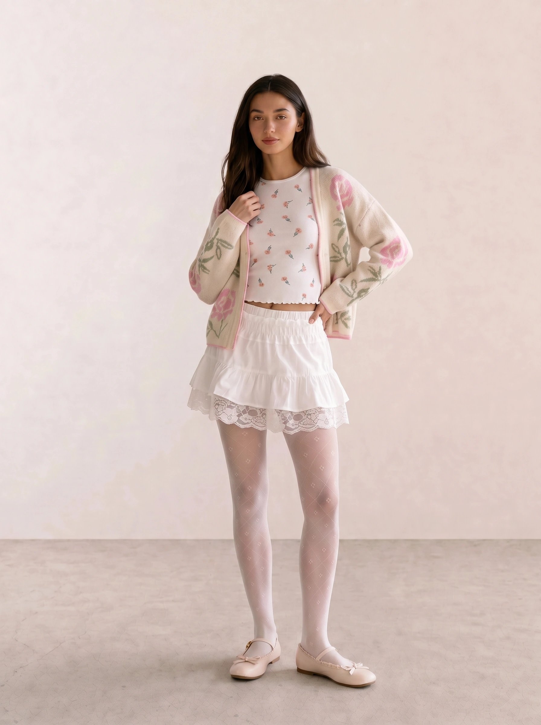
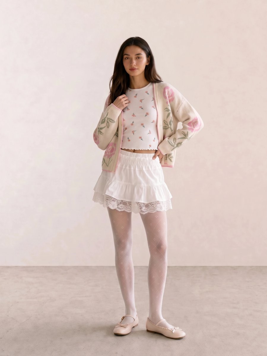
The close cream and blush values in Embroidered Floral Cardigan & White Lace Mini offer a low-contrast reference. Compare them with a crisp white scarf or a stronger blue pink to see whether softness or temperature changes the outcome first.
Test 2: White Versus Cream
White versus cream is a quick place to start because both colors are familiar and often appear in tops. Compare a true bright white with a yellowed ivory or cream. If one makes the face look more even, write it down. Then repeat the test on another day; the result can shift when your hair color, makeup, or window light changes.
Do not confuse “white feels too stark” with a final cool-or-warm conclusion. A stark result may come from high contrast, brightness, or a fabric finish. Try soft white, pearl grey, stone, and pale beige next. Four near-neutral swatches often reveal more than the first two.
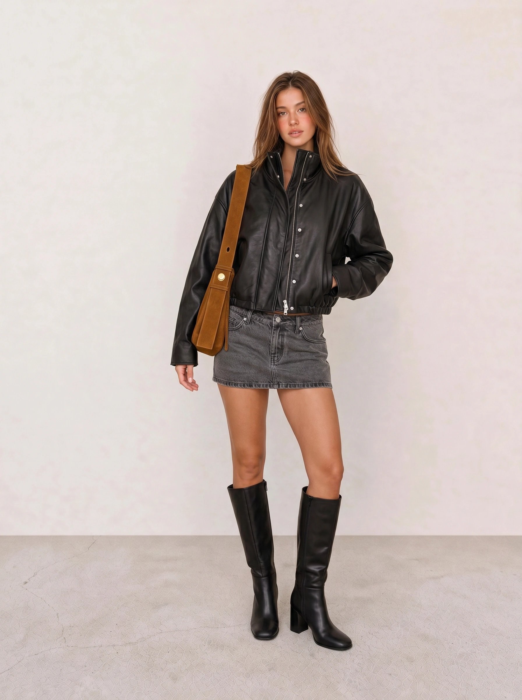
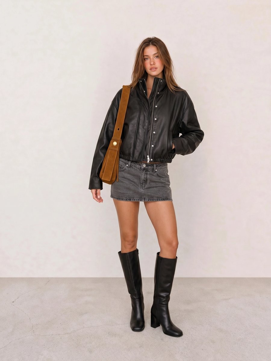
A black-and-grey outfit can look intentional because it creates a clear value boundary. If that boundary feels heavy near your face, compare charcoal or ink before removing all dark colors from your closet. Value may be the issue, not temperature.
Test 3: Jewelry and Makeup as Preference Checks
Place a silver-toned and a yellow-gold-toned earring, chain, or foil near the same neckline. Compare matte with matte or polished with polished, because shine can draw attention on its own. The stronger metal is the one that makes the face look present without becoming the first thing you notice.
Use makeup only after fabric comparisons. A cool pink blush, warm peach blush, blue-red lip, and coral lip can show what you enjoy, but formula and opacity make them poor standalone evidence. If both work at different intensities, you may be responding to depth or chroma. The Gold or Silver Jewelry and Makeup Colors by Undertone companion guides will turn these observations into narrower shopping comparisons after their drafts exist.
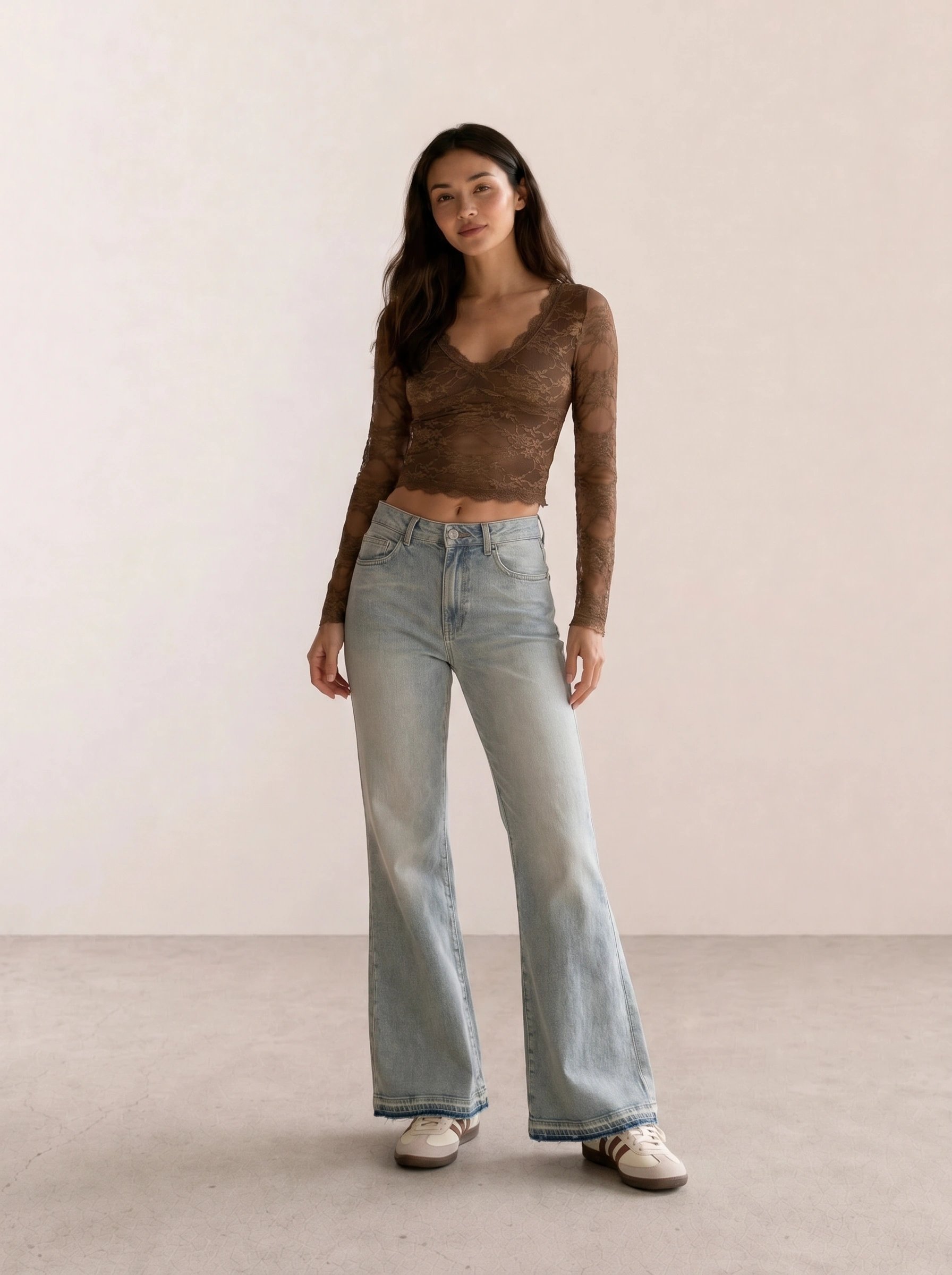
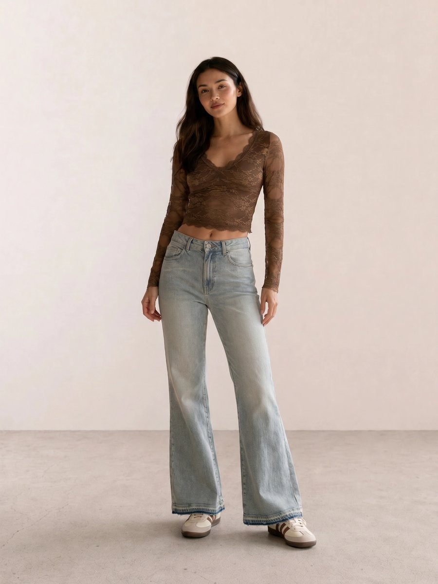
In Brown Lace Crop & Bell-Bottom Flares, brown lace already adds warmth and texture. A delicate silver chain may create the contrast you want; gold may continue the tonal pull. Neither choice proves an undertone by itself.
How to Read Mixed Results
Mixed results do not mean the process failed. Start by sorting your notes into temperature, value, and chroma. You might prefer cool berry lipstick, deep espresso outerwear, and muted olive tops. That is a usable set of observations even before you choose a seasonal label.
Olive complexions often benefit from this slower approach because yellow-gold, green-gray, warm, cool, and neutral elements can interact in ways a two-option test misses. Compare olive with moss, sage, khaki, emerald, and teal rather than declaring every green a match. Keep the colors that make your features look clear and your outfit feel like you.
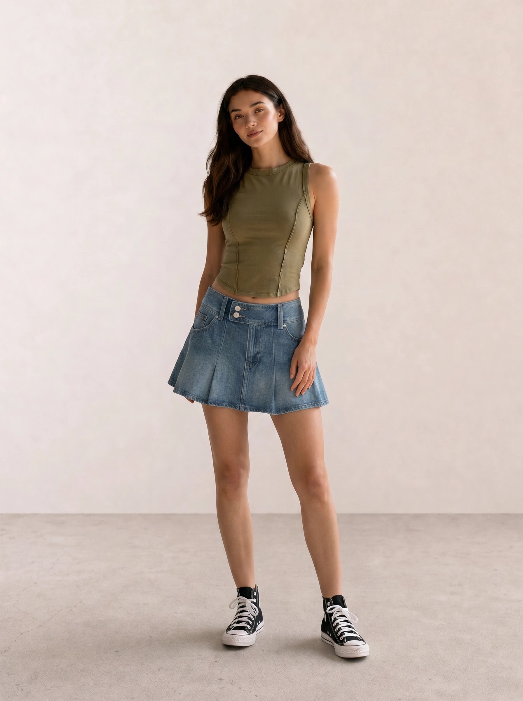
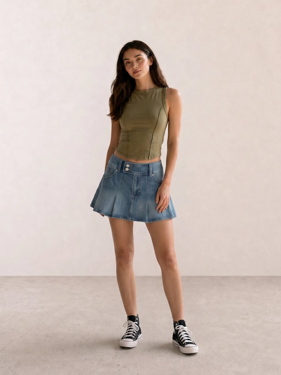
The olive in Olive Crop Tank & Denim Pleated Mini Skirt is balanced by blue denim and a black boundary. Change only one element at a time when you test: a sage top, a teal top, or a different shoe will tell you more than replacing the entire outfit.
What to Do With Your Undertone Notes
Build a small comparison rail near your face: two whites, two reds, two pinks, two greens, and two metals. Photograph the pairs in the same daylight only if the image matches what you saw in the mirror. Save the winners as shopping references, then test them across casual outfits, work clothes, and evening makeup.
Use the result to edit rather than restrict. If cream works better than bright white, choose cream for knitwear and still wear a crisp white shirt when you like its graphic contrast. If both metals work, use one for a quiet outfit and the other for a sharper one. Style should retain room for mood, silhouette, and occasion.
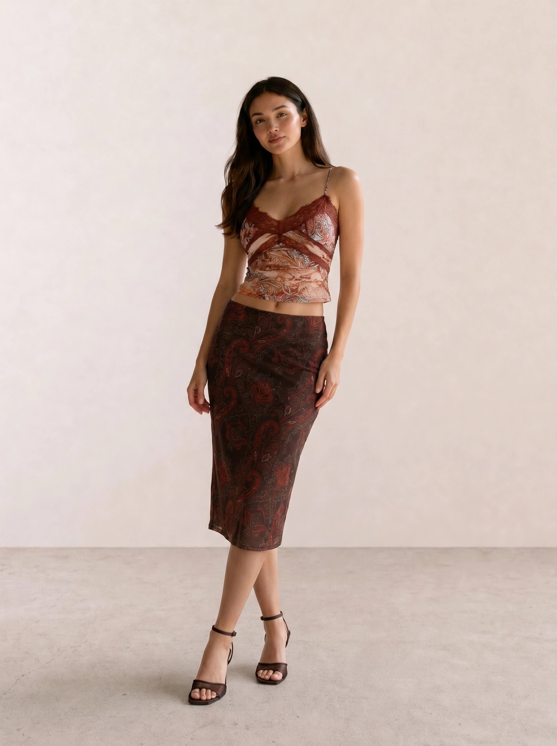
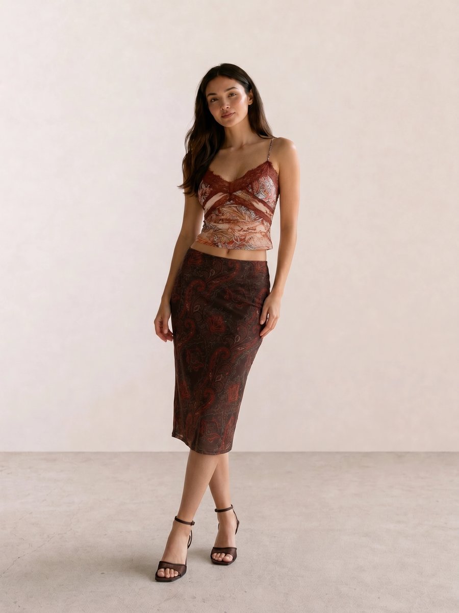
The depth in Burgundy Paisley Cami & Dark Floral Midi comes from burgundy, dark floral pattern, and brown shoes together. A fabric test can help you decide whether a warmer or cooler burgundy feels easier, but the outfit also succeeds because its values stay connected.
How Undertone Fits Into Seasonal Color Analysis
Undertone is one input in seasonal color analysis, alongside value, chroma, and contrast. It cannot assign a Spring, Summer, Autumn, or Winter label by itself. The Seasonal Color Analysis pillar explains those four broad palette families; its draft link will become public only after the cluster’s reciprocal-link review, so this guide does not point readers to an unavailable page.
The next practical step is clothing color. Compare your favorite neutrals, accents, denim, black, and white with the notes from this guide. The upcoming Clothing Colors by Undertone guide will translate that work into outfit formulas, followed by focused jewelry and makeup guides. Until then, test one color family at a time and keep your best evidence: repeat wear, repeat light, repeat ease.
For weather-led color ideas rather than personal-color labels, browse spring outfit ideas, summer outfits, autumn outfit ideas, and the winter color palette guide.
Use Your Undertone Notes Across the Cluster
Place your notes inside Seasonal Color Analysis, then test them in clothing, jewelry, and makeup before you narrow your palette.
The Spring, Summer, Autumn, and Winter palette guides show how temperature, value, and softness change a practical choice.
Undertone FAQ
How can I find my undertone at home? Compare pairs of fabrics near your face in indirect daylight, record which pair makes your features look clear, and repeat on another day. Use several comparisons because no single test settles undertone.
Can I have neutral or olive undertones? Yes. Neutral can describe mixed warm and cool responses, while olive can describe a green-gray or golden-green cast that may show warm, cool, or neutral behavior. Use extra swatches and focus on repeated outcomes.
Are veins a reliable undertone test? Veins can be a useful prompt, but they are not reliable enough to stand alone. Lighting, skin depth, and camera processing can change their appearance, so pair the observation with fabric draping.
Can I wear gold if I have cool undertones? Yes. Jewelry scale, finish, neckline, outfit contrast, and preference all matter. Wear the metal that supports the effect you want instead of treating undertone as a restriction.
Weekly outfit picks and style guides — no fluff, unsubscribe anytime.