Winter Color Palette: Cool, Deep & Bright Personal Colors
Find your Winter color palette with Cool, Deep, and Bright Winter colors, practical neutrals, metals, makeup, and high-contrast outfit formulas.
STYLEFINDEN editorial review: checked before publication for wearability, proportion logic and real-life outfit use. We explain our editorial method and image policy on the About page and keep affiliate independence details in the affiliate disclosure.
A Winter personal color palette is not a guide to calendar-season coats, camel knits, or snow-day dressing. It is a personal color direction built around cool undertones, clear color, and stronger contrast. If crisp white, black, cobalt, blue-red, and cool berry leave your face visible while oatmeal, orange, and dusty beige make the clothes arrive first, Winter is a useful comparison point.
The goal is not a black-only closet. Winter palettes use color with enough clarity or depth to stand next to the face. Think sapphire, emerald, fuchsia, cool red, charcoal, icy pink, and inky navy. The practical question is which temperature and contrast make your own features easier to see in daylight.
What Is a Winter Personal Color Palette?
A Winter personal color palette groups cool, clear, and often high-contrast shades in seasonal color analysis. Pure white, black, charcoal, cool navy, cobalt, sapphire, emerald, fuchsia, raspberry, blue-red, and icy pastels are useful swatches. Winter does not mean every person has dark hair or pale skin; it describes the relationship between a color’s temperature, depth, and clarity beside the face.
Color language helps keep that comparison precise. Adobe’s Color Picker guide separates hue, saturation, and brightness. A Winter palette is therefore more useful as a pattern across those variables than as a list of colors you must buy.
Where Winter Color Analysis Came From
The familiar four-season system grew from twentieth-century color consulting and the beauty books that turned warm-versus-cool, light-versus-deep comparisons into everyday dressing tools. Keep the experiment, not the rigidity. Try several fabrics near the neckline in ordinary daylight, then pay attention to whether the color clarifies your features or asks the eye to look at the garment first.
Contemporary seasonal guides still describe Winter through cool, bold, high-contrast color families. Color Me Beautiful’s Winter guide lists jewel tones, true red, crisp white, black, silver, white gold, and platinum as practical entry points. Those are starting swatches, not a ruling on your style.
The Key Colors in a Winter Palette
Start with pure white, black, charcoal, cool gray, inky navy, and deep blue as best neutrals. Then test cobalt, sapphire, emerald, cool turquoise, fuchsia, magenta, raspberry, cherry, blue-red, royal purple, and icy pink or icy blue. Their shared quality is a clean coolness: a color can be deep or bright, but it does not need the browned, softened finish that suits many Autumn palettes.
Accent colors work best when they preserve that clarity. A saturated cobalt scarf, a cool red lip, or an emerald bag can carry an otherwise black-and-white outfit. Silver, platinum, white gold, and pewter are useful metal tests because their cool shine matches the temperature of the palette. Gold is still an option when you like it; use it as an intentional contrast rather than proof that the palette failed.
Cool Winter Color Palette: Clear, Cool, and Balanced
Cool Winter, sometimes called True Winter, puts cool temperature first. Blue-red, cobalt, cool rose, royal purple, emerald, icy pink, crisp white, charcoal, and black make a compact starting group. The colors are clear, but Cool Winter usually needs less extreme brightness than Bright Winter and less near-black depth than Deep Winter.
Cool Winter can sit close to Cool Summer because both are cool. The useful difference is contrast and saturation: Summer often prefers smoky, softened rose and blue, while Cool Winter can hold a cleaner raspberry, sharper navy, and more definite black-and-white pairing. If a color looks gray before it looks blue, it may be too muted for your best range.
Deep Winter Color Palette: Cool With Depth
Deep Winter leads with value. Black, ink navy, graphite, deep emerald, wine, blackberry, dark sapphire, and cool burgundy create more visual weight while remaining cool. It can borrow some darkness from Deep Autumn, but Autumn usually carries a warmer brown or yellow cast; Deep Winter is stronger when the dark colors stay blue-based, jewel-toned, or neutral-cool.
This subtype often makes a dark column feel deliberate: black trousers, an inky top, and a deep berry coat read as one long line without becoming flat. The common mistake is using warm espresso, camel, and rusty red to make the outfit “softer.” A deep cool red or charcoal layer supplies depth without changing the palette’s temperature.
Bright Winter Color Palette: High Contrast and Clear
Bright Winter places clarity and contrast first. Electric blue, clear emerald, fuchsia, cool hot pink, true red, vivid purple, optic white, and black are useful tests. Bright Winter overlaps with Bright Spring in saturation, yet Spring is warmer and more yellowed; a blue-red or cool fuchsia usually keeps Bright Winter closer to its center.
Most people think Bright Winter needs every outfit to be loud. Contrast matters more than quantity. A white shirt, black jeans, and one saturated fuchsia or cobalt accessory can be more convincing than six competing jewel tones. Let one clear color provide the charge, then use neutral structure around it.
How to Style Winter Colors Without Looking Harsh
Build contrast on purpose. Black with pure white, charcoal with cobalt, navy with icy pink, or emerald with cool gray gives Winter colors a clean framework. If black feels severe at the neckline, replace it with charcoal, navy, deep teal, or a jewel tone rather than automatically reaching for camel; you keep the depth but lower the graphic edge.
Fabric changes the result. Matte wool, smooth leather, crisp cotton, dark denim, fine knitwear, and polished metal preserve Winter’s definition. A muddy washed fabric can make a correct color look tired, while a clean finish gives a simple navy sweater enough separation from black trousers. Avoid scattering too many soft beige accessories into a high-contrast outfit; they can interrupt the color logic more than they soften it.
Winter Makeup Colors: Blush, Lipstick, and Eyeshadow
For a Winter makeup comparison, test cool rose, raspberry, cherry pink, cool berry, plum, blue-red, charcoal, navy, silver, cool taupe, and deep purple. A berry or cool rose blush often gives the cheek a clearer result than orange peach. Lipstick can range from cool nude rose to a blue-red or blackberry according to your desired contrast.
Eyeshadow gives the palette another route beyond a bright lip: charcoal, navy, silver, cool taupe, plum, and deep cool brown can frame the eyes without adding warmth. Makeup preference, skin depth, and finish still matter more than a label. Compare two shades in daylight, keep the one that supports your features, and leave any color you enjoy in rotation regardless of the chart.
Common Winter Palette Mistakes to Avoid
Avoid confusing depth with Winter. A dark warm olive, orange-brown, or camel coat can be rich, but richness alone does not make it cool. Compare it with charcoal, navy, or a blue-red beside the face. Winter tends to need the cooler option, while Deep Autumn often thrives on the warmer one.
Avoid turning every Winter outfit into black plus one bright accessory. The palette also has icy lights, charcoal, navy, cool gray, jewel greens, and clear pinks. A controlled navy-and-ice-blue combination can feel sharper than black and more useful for daytime. The palette gives you contrast; it does not require a uniform.
Winter Color Palette Outfit Examples
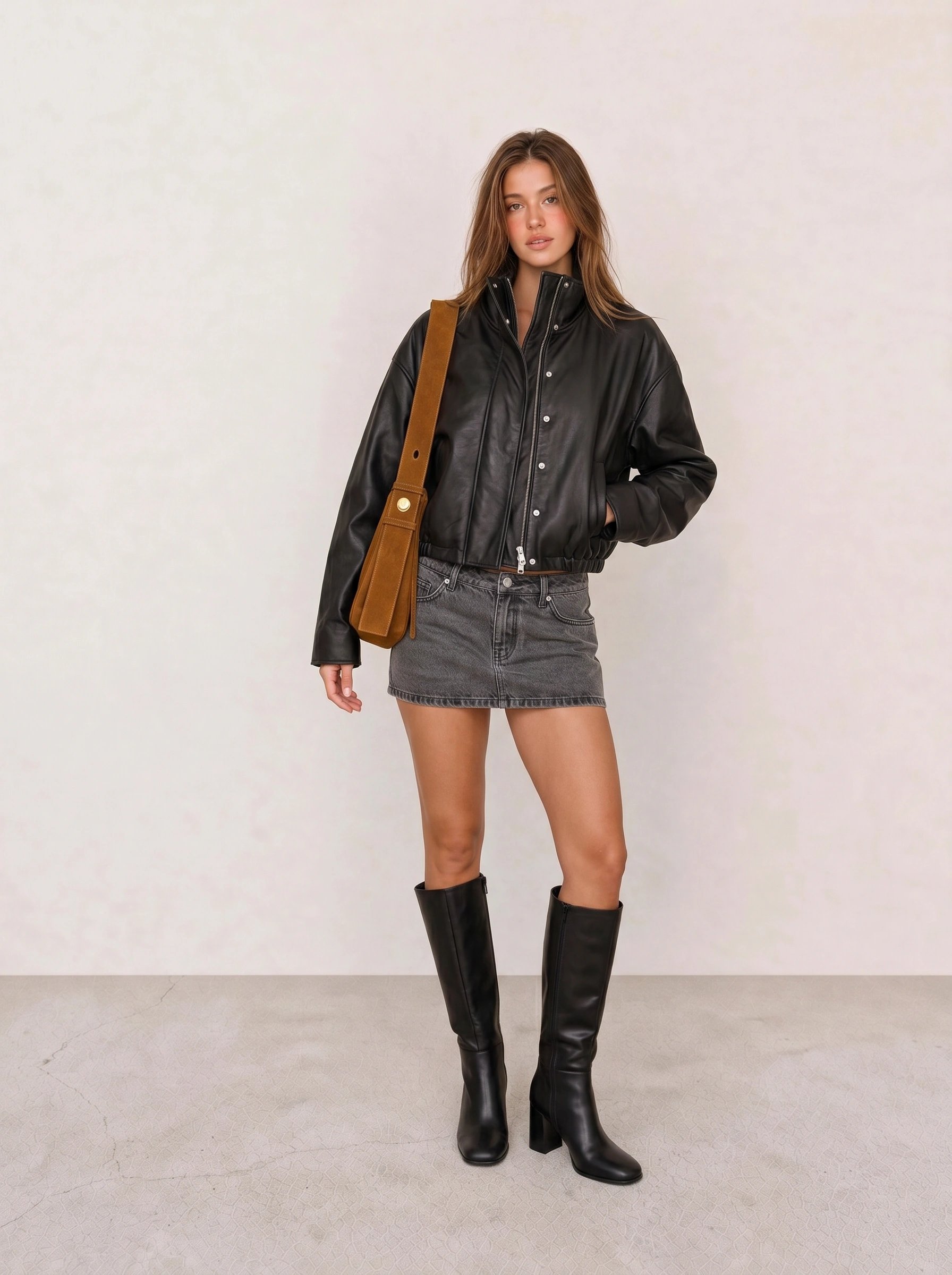
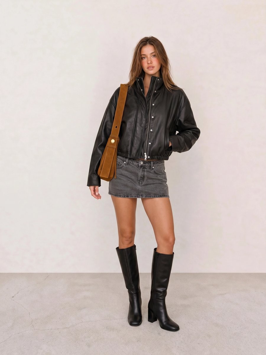
In Black Leather Bomber & Grey Denim Mini Skirt, black outerwear supplies the depth while gray denim breaks up the column without adding warmth. A cobalt, emerald, or berry bag would make the Winter direction more explicit than the existing cognac accessory.
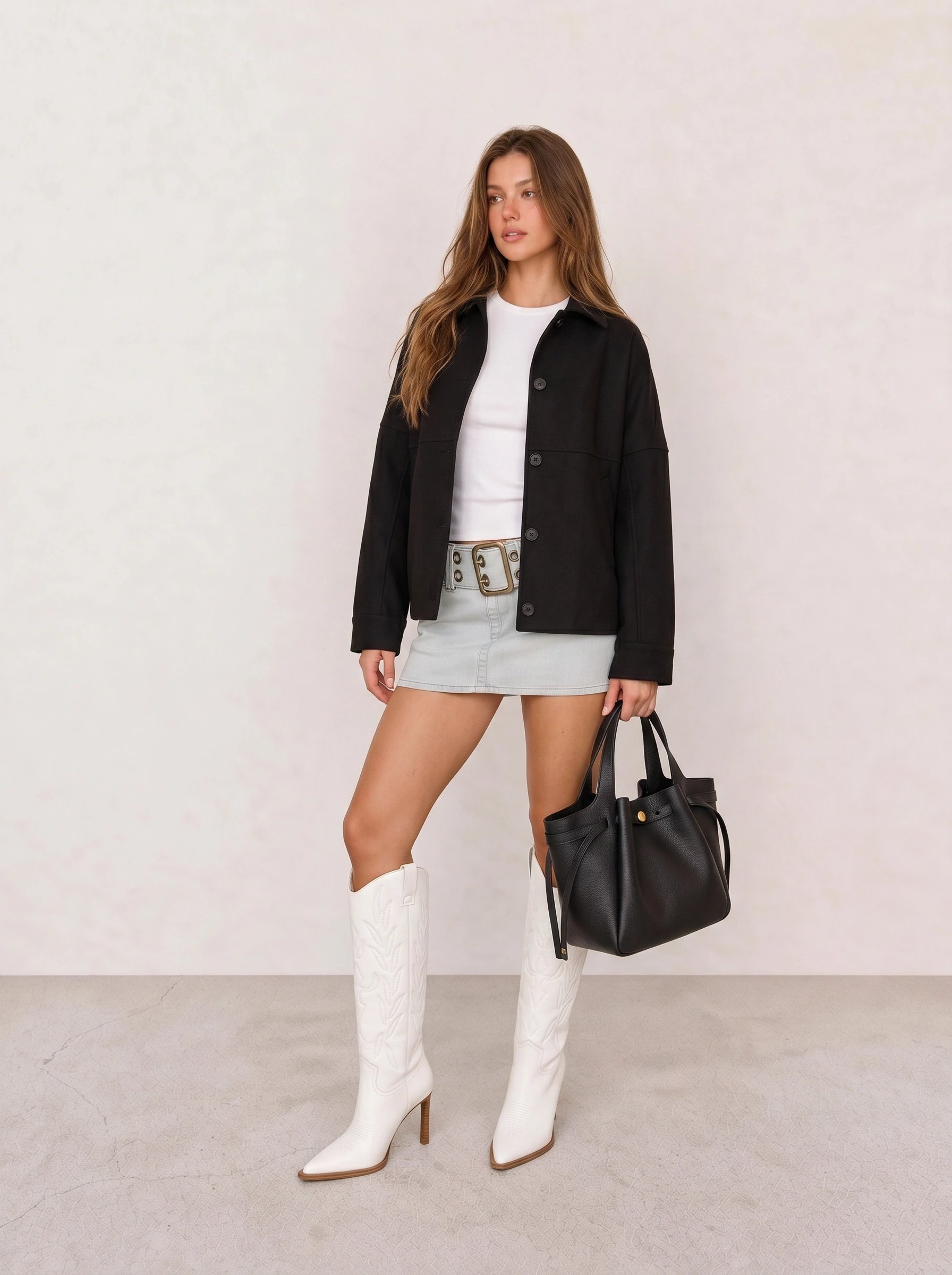
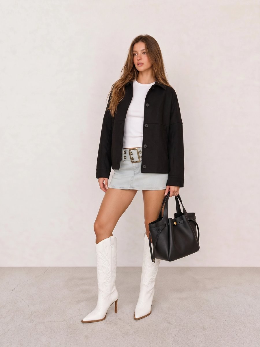
Black Shirt Jacket & Belted Denim Mini Skirt makes the case for contrast before color. The white top and boots give the black jacket a crisp edge; a fuchsia lip or cool red bag could add Bright Winter energy without asking the whole look to become a color study.
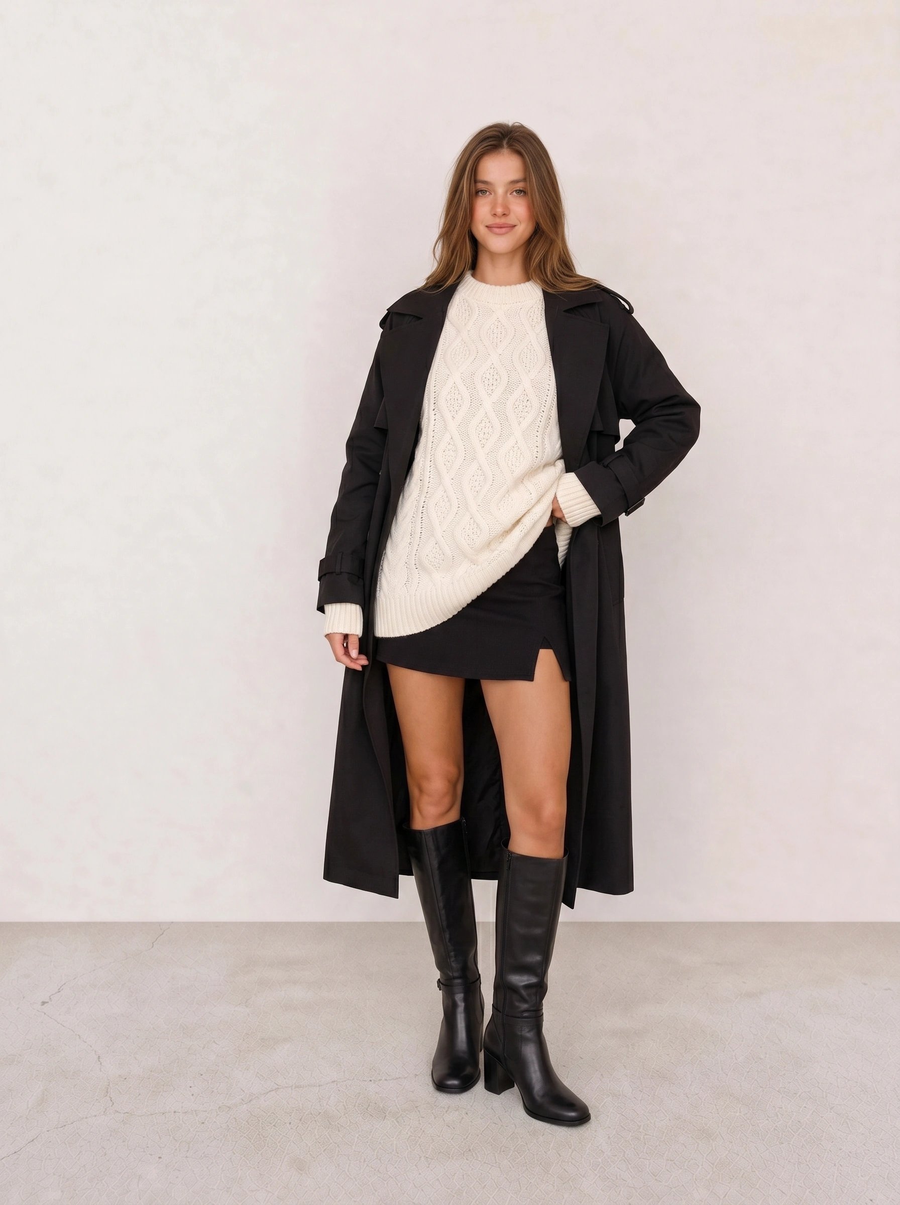
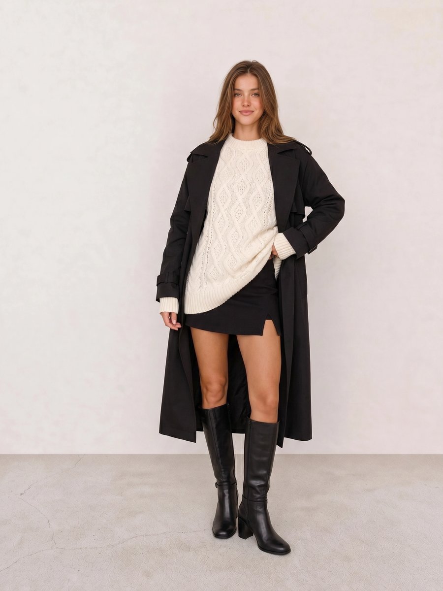
The mechanism in Black Trench Coat & Cream Cable-Knit Sweater is proportion. The long black coat creates the dark frame, while the lighter knit sits close to the face. For a more exact Winter version, choose crisp white or cool light gray over yellowed cream.
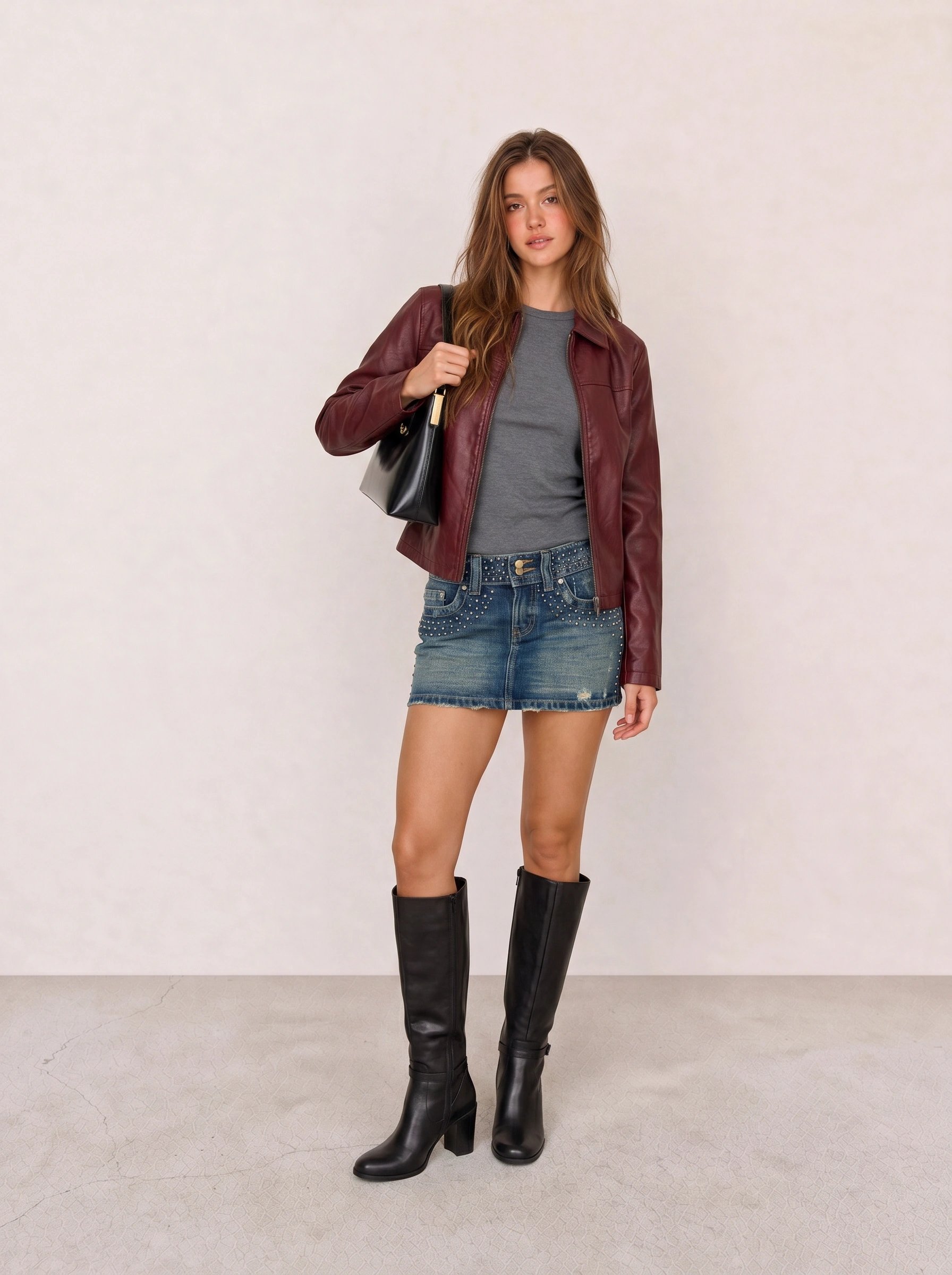
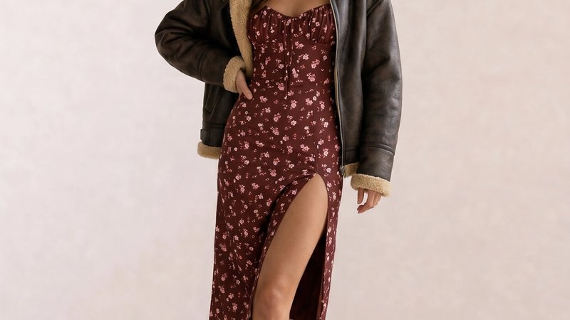
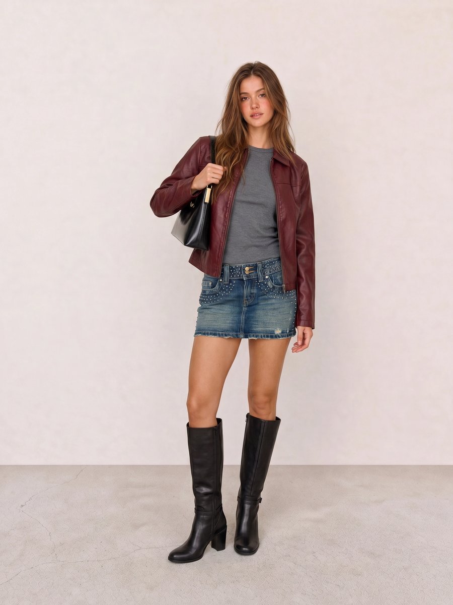
With Burgundy Leather Jacket & Studded Denim Mini Skirt, the jacket is the color focal point and the black boots keep the silhouette anchored. A cool berry or wine leather reads more Winter than a rust jacket because the red stays blue-based.
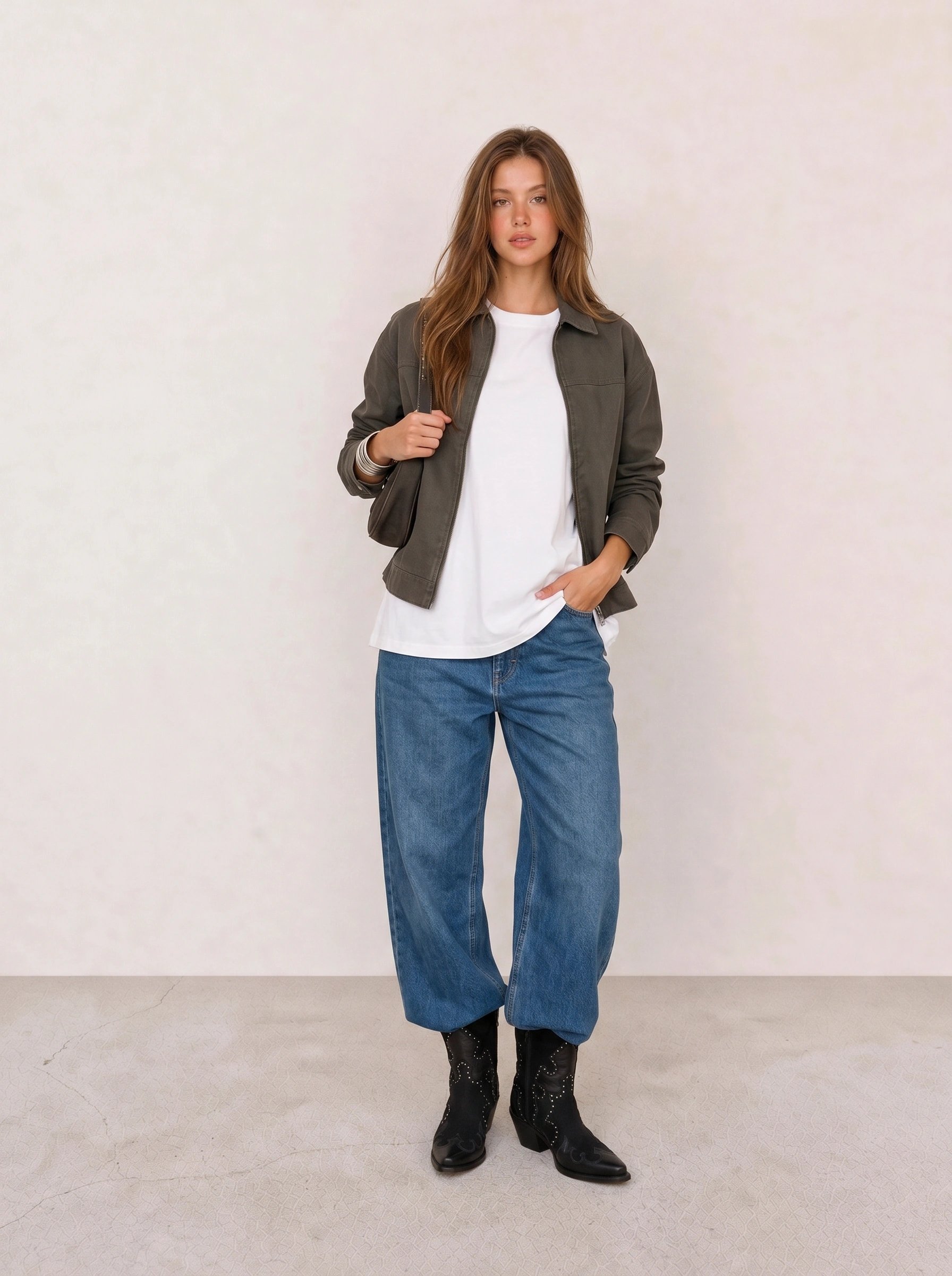
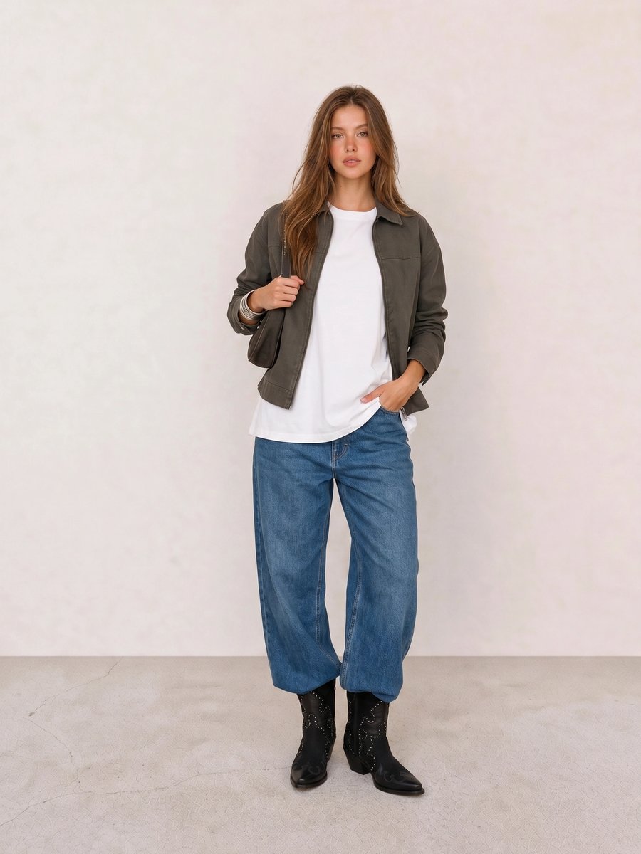
In Olive Jacket & White Tee with Barrel Jeans, the white tee and black boots already create a Winter-friendly contrast. The olive jacket may suit a warmer palette better, so test a cool emerald, navy, or charcoal layer if you want the personal color direction to lead the outfit.
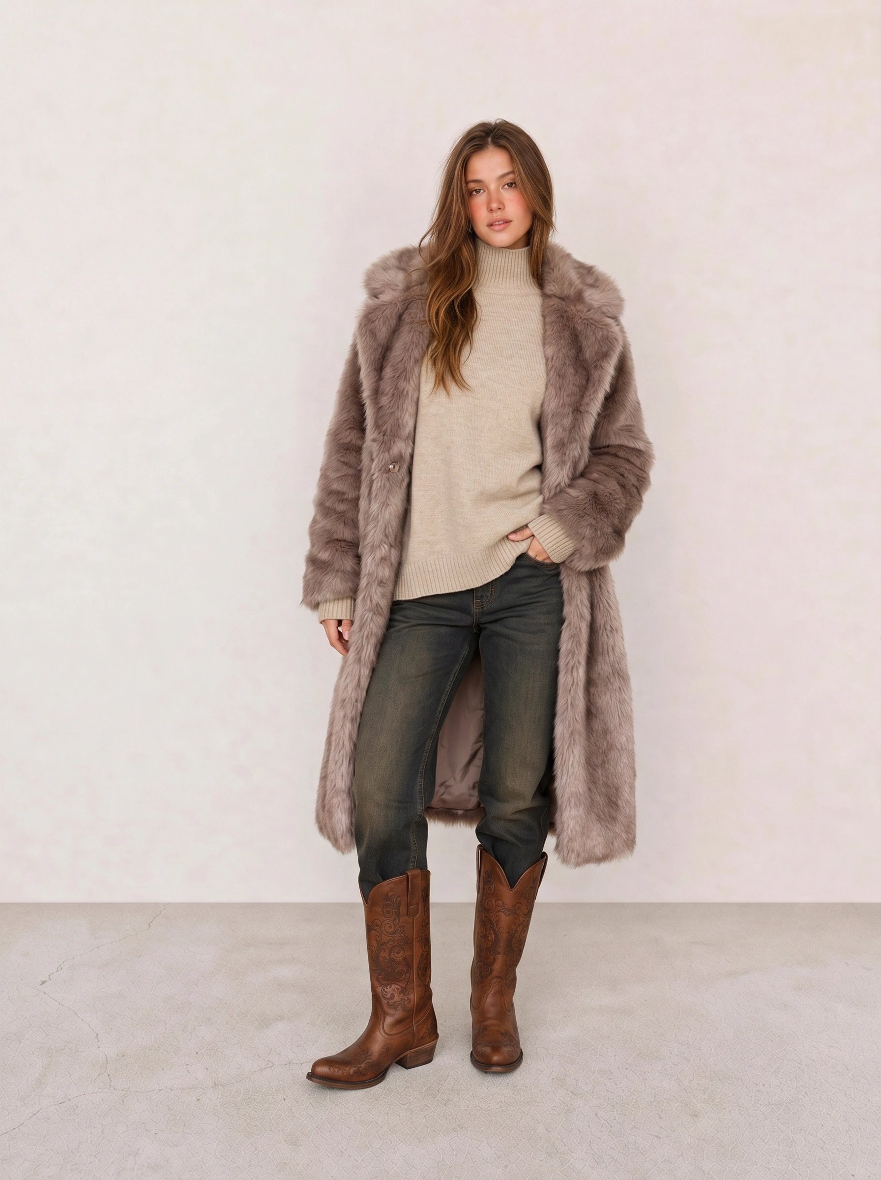
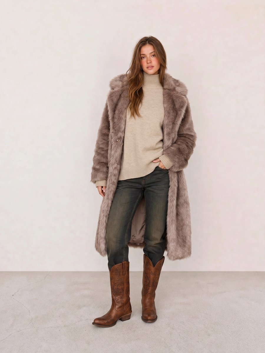
The mauve coat in Mauve Faux Fur Coat & Beige Turtleneck offers a useful comparison rather than a strict Winter formula. A cool, clearer orchid or fuchsia would raise the palette’s brightness; the beige and olive base pulls the outfit toward softer, warmer territory.
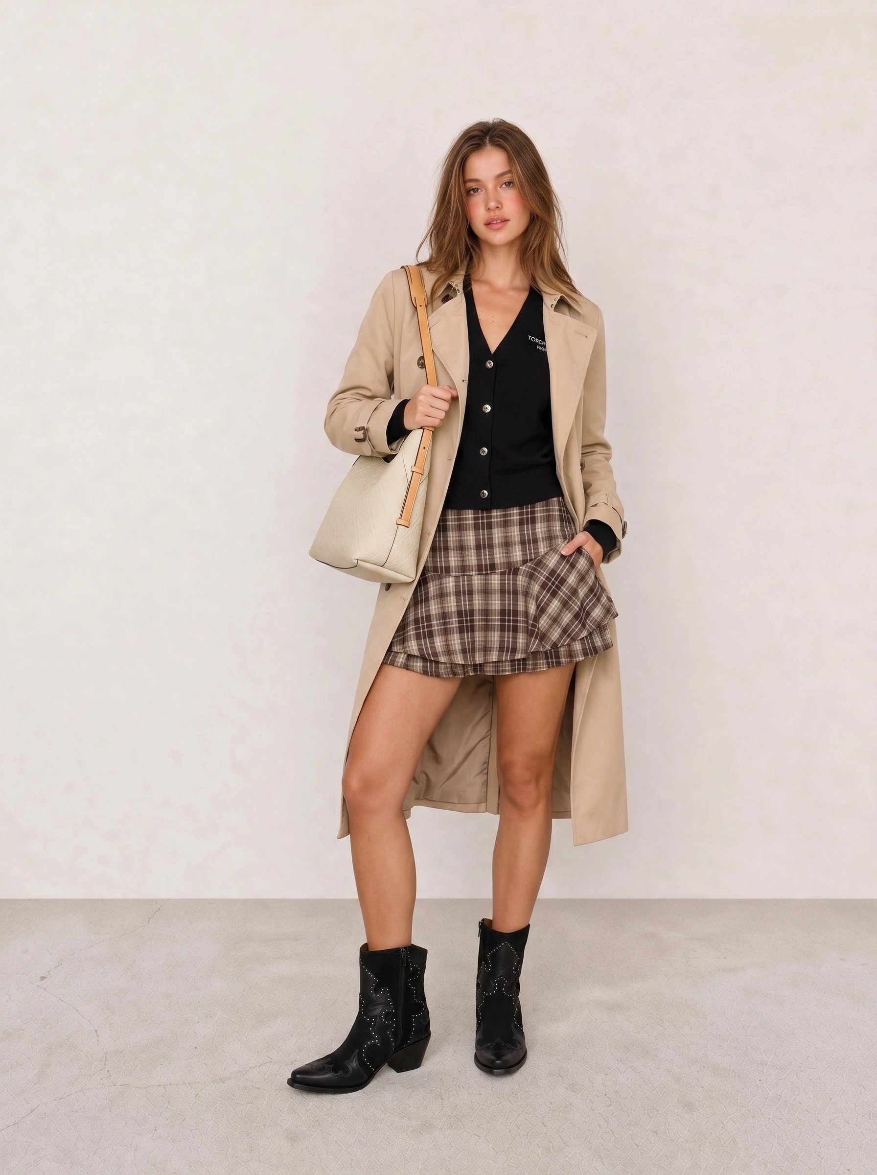
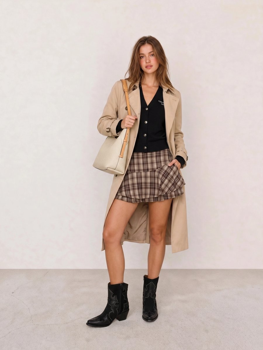
For Beige Trench Coat & Plaid Ruffle Mini Skirt, replace the beige trench with black, charcoal, or deep navy to see the contrast change at once. The black boots already give the mini skirt more Winter structure than a tan boot would.
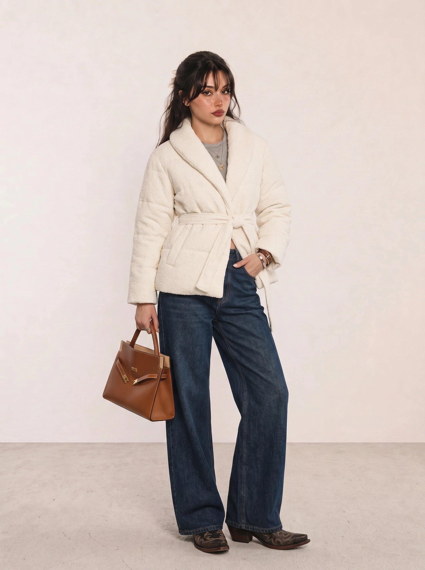
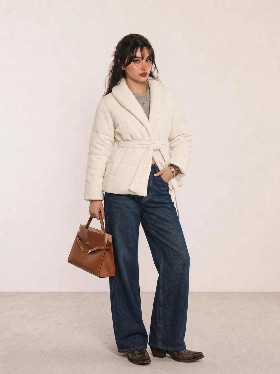
Cream Teddy Jacket & Wide-Leg Jeans is a reminder that a well-made outfit need not match every personal palette. For Winter, shift the brown bag and boots to black, charcoal, or cool burgundy, and choose optic white or gray near the face. The wide-leg proportions can stay exactly as they are.
A Practical Shopping Guide for Winter Colors
Start with the pieces you wear close to the face: a crisp white shirt, charcoal knit, navy coat, black blazer, or jewel-tone top. Add one clear accent such as cobalt, fuchsia, emerald, or cool red. Spend more on outerwear, eyewear, a handbag, and knitwear because their color repeats often; save on trend pieces and use them to test a shade before committing.
Apply Winter Beyond a Swatch
Read Seasonal Color Analysis with your undertone notes, then compare clothing colors, jewelry metals, and makeup colors to keep contrast from becoming a black-only rule.
Winter Personal Color Palette FAQ
What colors look best on a Winter palette? Crisp white, black, charcoal, cool navy, cobalt, sapphire, emerald, fuchsia, cool berry, blue-red, and icy pink or blue are useful first swatches. Choose the deeper, cooler, or brighter version according to Cool Winter, Deep Winter, or Bright Winter.
Can a Winter palette wear beige? Yes, but yellowed camel and oatmeal may look less connected than cool gray, stone, crisp white, or charcoal. Test beige at the neckline and use it farther from the face if you prefer its softness.
What jewelry metals suit Winter coloring? Silver, white gold, platinum, and pewter are practical starting points because they repeat Winter’s cool temperature. Yellow gold can still work when you enjoy it; compare the finish and scale beside the rest of the outfit.
How do Cool Winter, Deep Winter, and Bright Winter differ? Cool Winter puts cool temperature first, Deep Winter puts depth first, and Bright Winter puts clarity and contrast first. All three differ from muted Cool Summer, warmer Deep Autumn, and clearer but warmer Bright Spring.
Weekly outfit picks and style guides — no fluff, unsubscribe anytime.