Seasonal Color Analysis: A Practical Guide to Your Palette
A practical seasonal color analysis guide to hue, value, chroma, the four seasons, and how to use a personal palette for everyday dressing without rigid rules.
STYLEFINDEN editorial review: checked before publication for wearability, proportion logic and real-life outfit use. We explain our editorial method and image policy on the About page and keep affiliate independence details in the affiliate disclosure.
A personal color season is not the same thing as the season outside. Spring can be your palette while you wear a winter coat; Autumn can describe your coloring while you reach for a pale summer dress. Calendar-season guides solve weather and occasion. Seasonal color analysis is a styling framework for comparing how hue, depth, and intensity sit near your face.
It is useful when it gives you better options, not when it turns a closet into a rulebook. Skin depth does not assign a season, and hair or eye color alone cannot settle the question. Start by noticing patterns, then test clothing in daylight and keep the shades you enjoy wearing.
What Is Seasonal Color Analysis?
Seasonal color analysis groups color preferences around four broad families: Spring, Summer, Autumn, and Winter. The names are shorthand for color behavior, rather than a statement about your complexion or the month you were born. A consultant may compare fabric drapes beside the face; at home, you can compare garments you already own.
The framework commonly considers undertone, depth, and contrast. Color Me Beautiful’s overview of seasonal analysis describes the four-family approach through undertone, depth, and contrast; it is a useful starting vocabulary, not a medical classification.
The practical question is smaller: does a color make your features look clear and intentional beside an outfit, or does it ask for a lot of makeup, jewelry, or styling effort to feel balanced? You may prefer the second effect for a night out. A palette should describe an easy starting point, not police a choice.
The Three Color Controls: Hue, Value, and Chroma
Color language becomes clearer once you separate three controls. Adobe’s color-model guide defines hue as the color family, saturation or chroma as intensity, and brightness or lightness as relative lightness and darkness. Personal-color systems borrow this vocabulary, then apply it to clothes near the face.
Hue concerns temperature and direction: a red can lean coral or blue; a beige can lean golden or pink. Value concerns light versus deep: pale stone, mid denim, and espresso can belong to the same outfit but create different visual weight. Chroma concerns clarity: dusty rose is muted, while hot pink is bright.
These controls explain why a single label such as “warm” rarely solves a shopping decision. A warm, pale, clear yellow and a warm, deep, muted mustard have different effects. Begin with one control that you can see reliably, then compare the others. Most closets become easier when you stop treating every green, pink, brown, or blue as interchangeable.
Warm and Cool Are Only One Part of the Picture
Warm and cool describe a color’s direction, not a person’s worthiness to wear it. Warm-leaning colors often contain yellow, golden, or coral notes. Cool-leaning colors often contain blue, rose, or icy notes. Neutral and olive complexions can borrow from either direction, especially when value and chroma are right.
Use the comparison near the face. Hold a cream knit and a crisp white shirt under the same natural light; then compare muted rose with bright fuchsia, or olive with emerald. Look for the version that lets the face remain the focal point. Do not use a wrist-vein photo, a filtered selfie, or a single lipstick as a verdict. The next companion guide will cover undertone tests and their limits in detail.
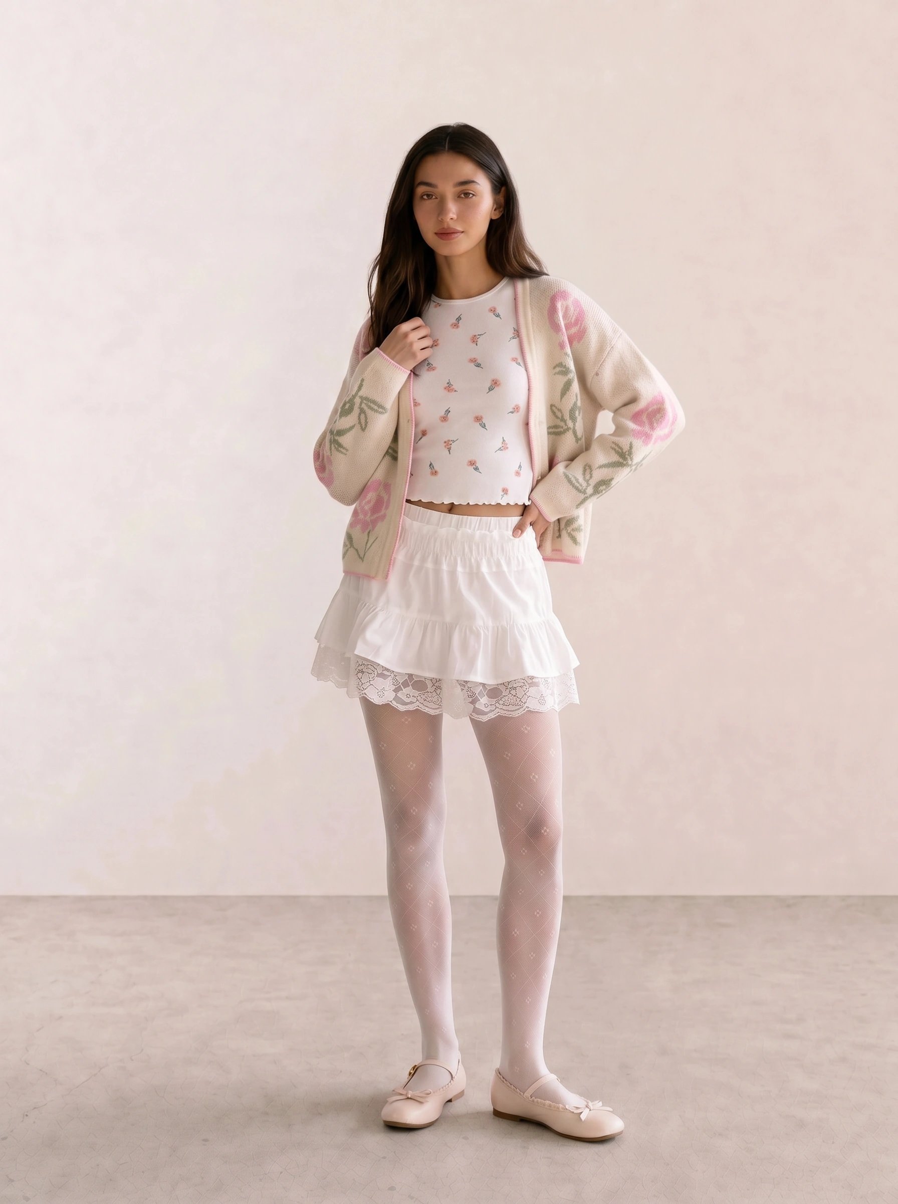
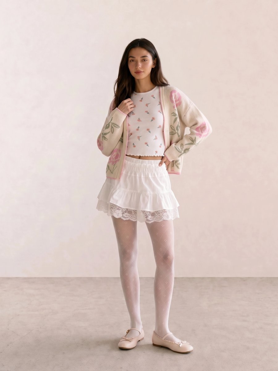
In Embroidered Floral Cardigan & White Lace Mini, cream, blush, and white stay close in value. The color story reads soft because the outfit limits contrast; it does not prove that every person who likes it belongs to one season.
Light, Deep, Soft, and Bright Change the Result
Value and chroma often make a bigger difference than temperature. Light palettes use pale neutrals and clear or softened accents. Deep palettes hold their own beside espresso, charcoal, ink, and saturated jewel tones. Soft palettes reduce contrast and gray down the color. Bright palettes keep colors clean and separated.
Most people think a flattering palette means avoiding contrast. That is backwards for many wardrobes. A high-contrast black-and-white combination can make a clear, deep color story feel deliberate; a muted taupe-and-olive pairing can make the same contrast feel severe. The useful move is to compare intensity before rejecting a hue.
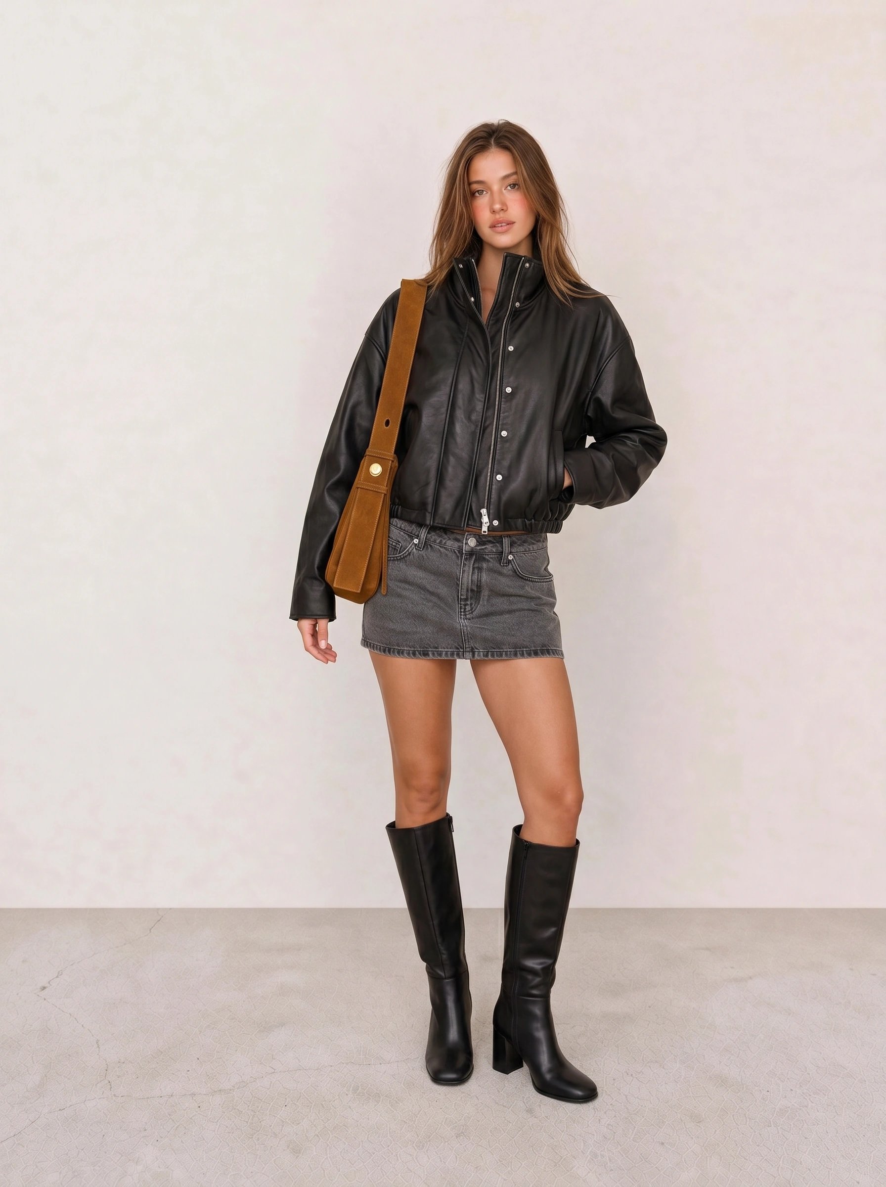
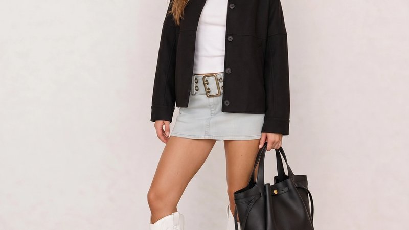
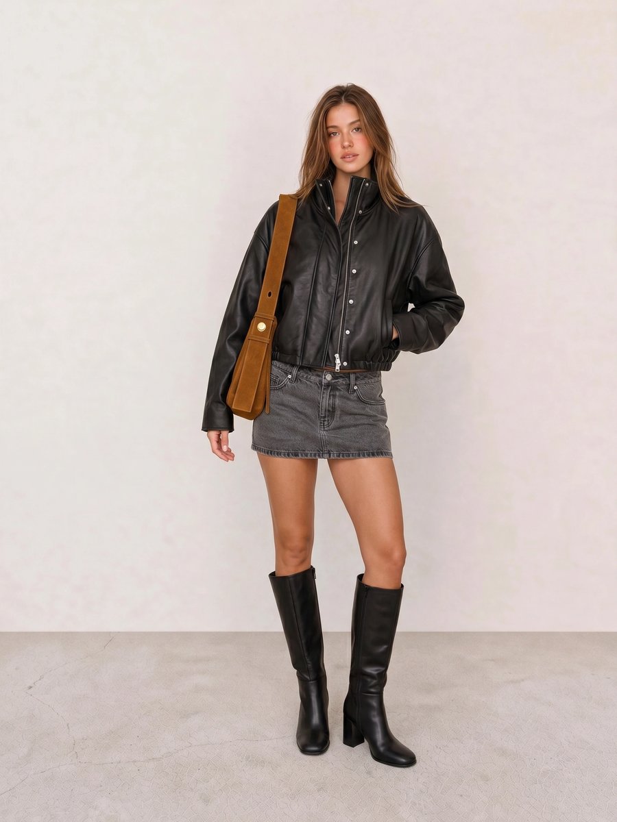
The line in Black Leather Bomber & Grey Denim Mini Skirt comes from a dark outer layer against faded denim. The contrast sits in value and texture, so a bright scarf would be optional rather than necessary.
The Four Personal Color Seasons at a Glance
Spring palettes are usually warm-leaning, light to medium in value, and clear rather than dusty. Think peach, warm pink, fresh green, light camel, ivory, and clear turquoise. The goal is freshness, not a mandatory collection of pastels.
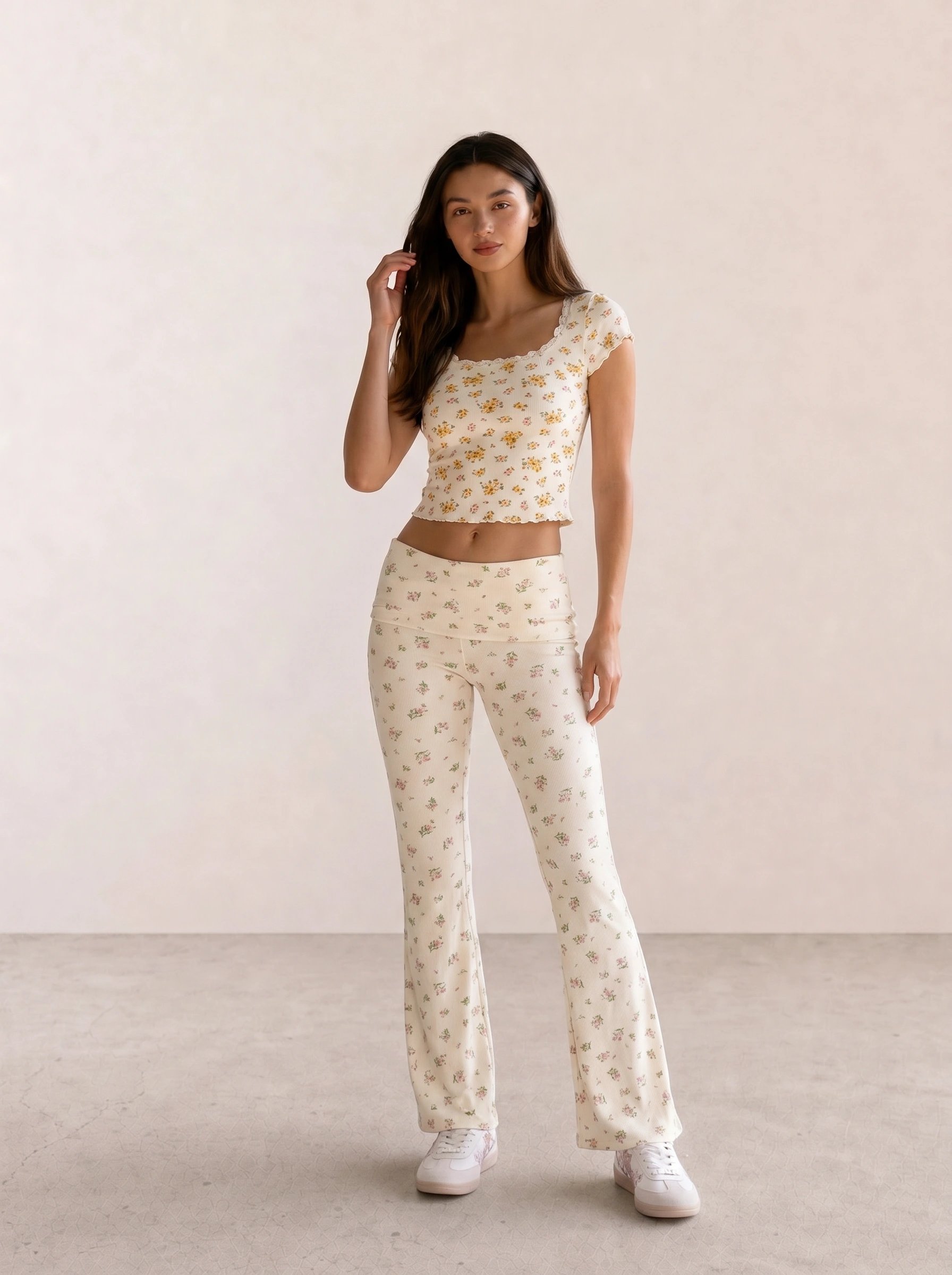
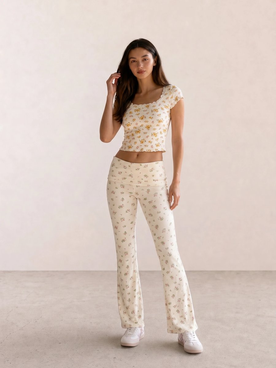
Yellow Daisy Floral Co-Ord Set uses clear yellow against ivory. The repeated floral color keeps a light palette from becoming washed out; a charcoal shoe would change the contrast more than the season label.
Summer palettes are usually cool-leaning, light to medium in value, and softened. Dusty rose, muted blue, lavender, soft navy, cool taupe, and pewter are common reference points. A Summer-like outfit often depends on close values and a lower-chroma accent, but anyone can use that formula when they want a quieter effect.
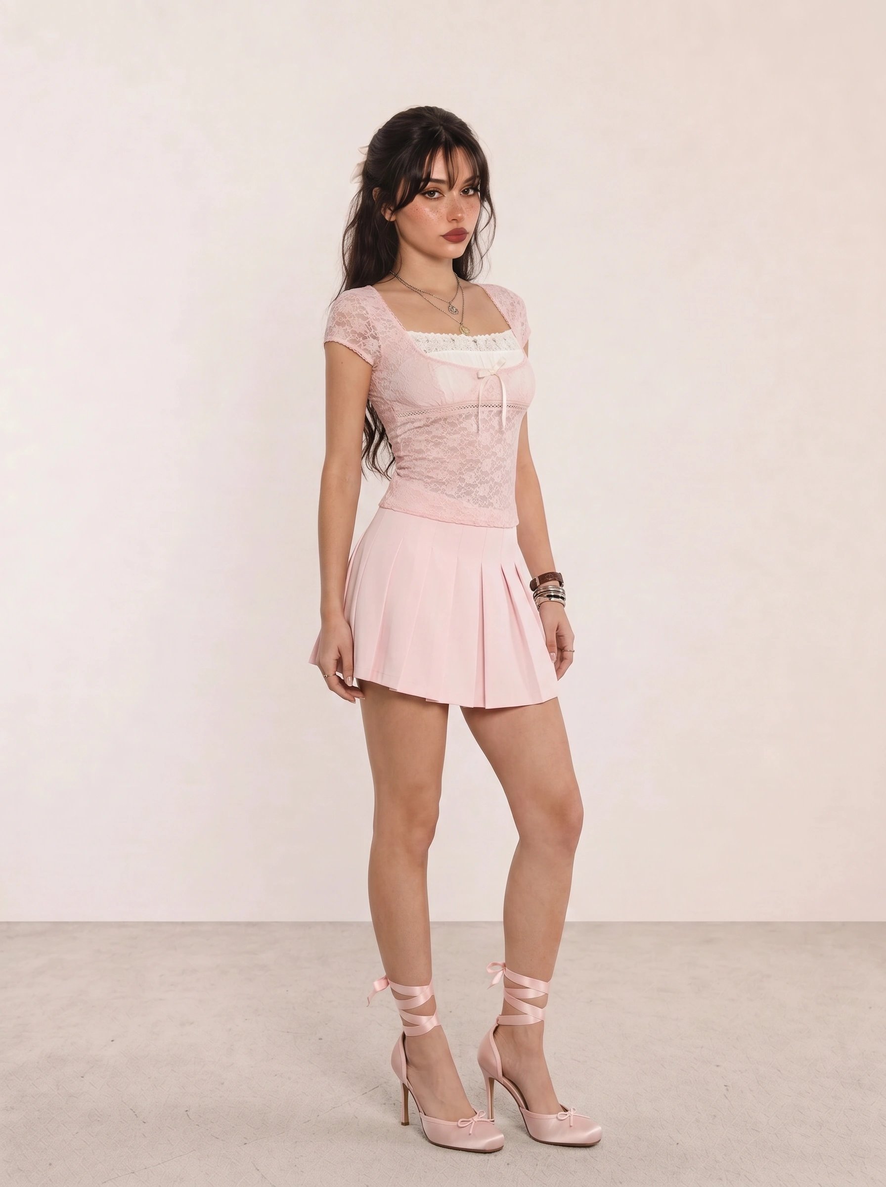
Autumn palettes are usually warm-leaning, medium to deep, and muted to richly earthy. Olive, moss, terracotta, cinnamon, cream, warm navy, and chocolate offer useful starting points. Texture matters here because suede, knit, leather, and washed denim can support a muted palette without adding another color.
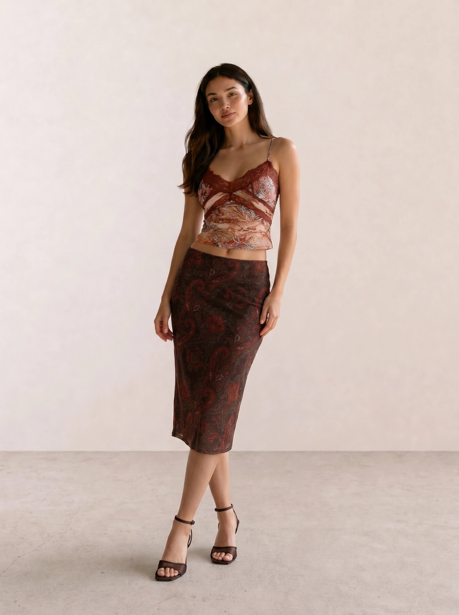
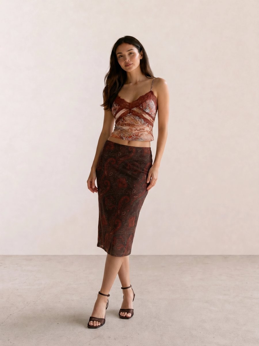
In Burgundy Paisley Cami & Dark Floral Midi, burgundy has enough depth to stand beside the floral skirt, while dark brown shoes keep the hem grounded. The palette relies on low-to-medium contrast, not on skin color.
Winter palettes are usually cool-leaning, clear, and medium to deep, with room for sharp contrast. True black, optic white, cobalt, fuchsia, emerald, blue-red, and icy pastels are common references. A Winter-like outfit can be graphic or minimal; clarity matters more than wearing every color at once.
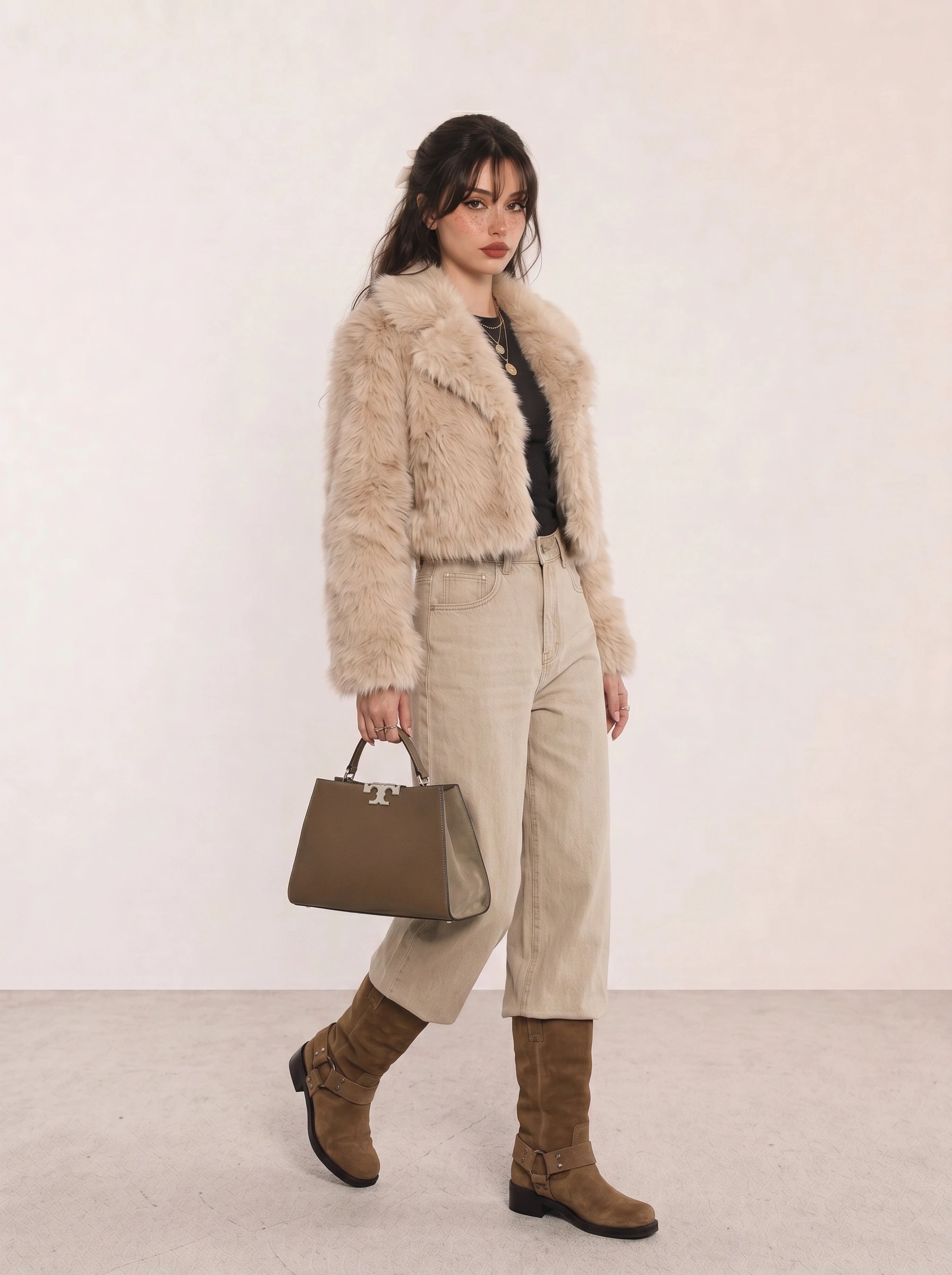
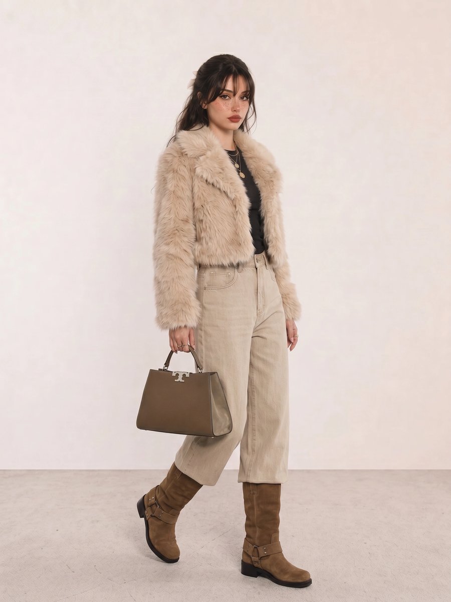
Use Beige Faux Fur Crop Jacket & Olive Tote as a reminder that outfit season and personal season are separate. It is a winter-weather look with softened olive and cream, not proof of a Winter personal palette.
Four Seasons Versus Twelve Seasons
The four-season model is a fast map. It helps you notice broad temperature, value, and chroma preferences without asking you to distinguish twelve neighboring categories. The twelve-season model divides each family into three directions, often light, true, bright, soft, warm, cool, or deep. It can be useful when two people both like Autumn colors but need different depth or clarity.
Do not force a subtype before the broad pattern makes sense. Adjacent palettes share colors, different practitioners use different names, and clothes vary in fabric, finish, and lighting. If your best choices cluster around “soft and warm” or “deep and cool,” that is already actionable. Precision is only useful when it changes a decision.
How to Use a Palette Without Replacing Your Style
Choose a base color you wear often, then test two alternatives near the face. If black feels hard, compare charcoal, ink navy, espresso, and deep olive. If bright white feels stark, compare soft white, cream, stone, and pale grey. This is more useful than buying a full palette card and trying to rebuild your closet in a weekend.
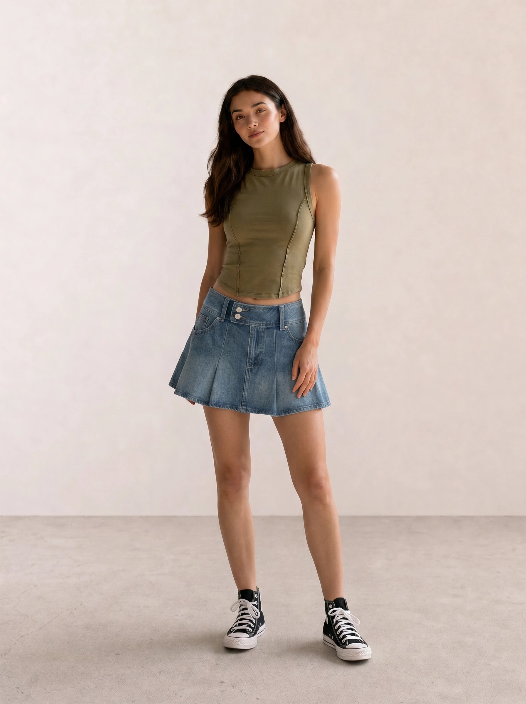
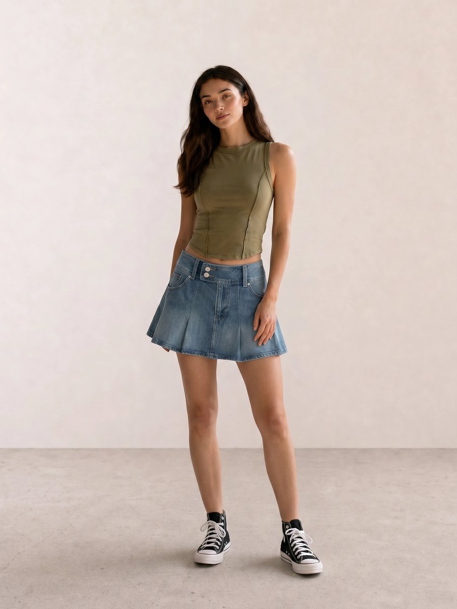
The olive in Olive Crop Tank & Denim Pleated Mini Skirt stays wearable because denim acts as a neutral and black sneakers add one firm boundary. Try the same formula with a softer grey shoe if you want less contrast.
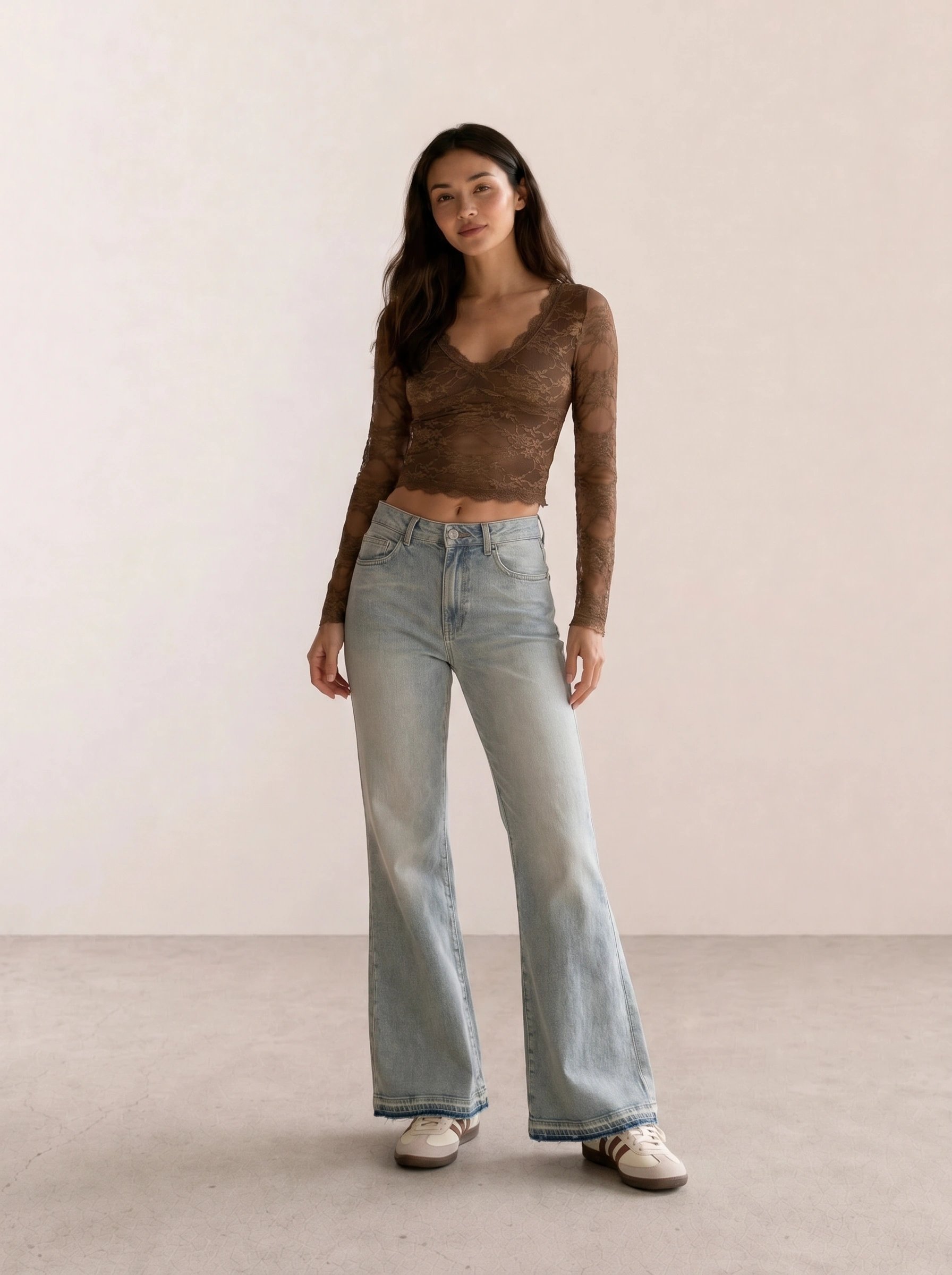
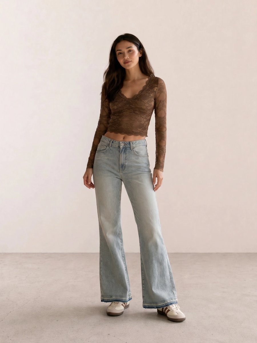
With Brown Lace Crop & Bell-Bottom Flares, the lace provides texture while the flares repeat the outfit’s deep brown direction. A bright white jacket would create a different, sharper effect, which may be exactly what you want.
Color is only one part of dressing. A favorite silhouette, a cultural reference, a dress code, lighting, and personal taste can matter more on a given day. Keep the colors that make getting dressed easier, then use the rest intentionally. The palette is a tool for editing, not a permission slip.
Your Next Personal Color Questions
This pillar sets the language for five companion guides. How to Find Your Undertone will compare warm, cool, neutral, and olive observations without relying on one test. The clothing-colors guide will turn those observations into neutrals, accents, denim, black, and white comparisons. Gold or Silver Jewelry will cover metal, neckline, and garment-color balance. Makeup Colors by Undertone will cover blush, lipstick, and eyeshadow in soft, bright, light, and deep directions.
Four individual season pages will then make the Spring, Summer, Autumn, and Winter families more specific. Those links will be added after each draft exists and passes reciprocal-link QA. Until then, use the existing seasonal outfit guides for weather and occasion ideas, rather than treating them as personal-color prescriptions.
For calendar-season styling, start with spring outfit ideas, summer outfit ideas, autumn outfit ideas, or the winter color palette guide.
Build the Personal-Color Cluster From Here
Start with How to Find Your Undertone, then use Best Clothing Colors for Your Undertone, Gold or Silver Jewelry for Your Undertone, and Makeup Colors by Undertone to test the same notes across clothes, metals, and makeup.
When you want a season to compare, read the Spring, Summer, Autumn, and Winter personal color palette guides before treating a single swatch as a final answer.
Seasonal Color Analysis FAQ
What is seasonal color analysis? Seasonal color analysis is a personal styling framework that compares hue, value, chroma, and contrast to help you choose clothing, makeup, and accessories. Its Spring, Summer, Autumn, and Winter labels describe palette families, not calendar weather or skin depth.
Can a person with any skin depth belong to any color season? Yes. Skin depth alone does not determine a personal color season. Compare temperature, value, chroma, and contrast in natural light, then use the result as a flexible styling reference.
Is four-season or twelve-season color analysis better? Four seasons are useful for learning broad patterns. Twelve seasons can add detail after you understand those patterns. Use the level of detail that changes your clothing choices without making them harder.
Do I have to stop wearing colors outside my palette? No. Use a palette to find easier colors near the face, then change contrast, makeup, jewelry, or the placement of a color when you want a different effect.
Weekly outfit picks and style guides — no fluff, unsubscribe anytime.