Summer Color Palette: Light, Cool & Soft Personal Colors
Find your Summer color palette with Light, Cool, and Soft Summer colors, practical neutrals, accents, metals, makeup, and everyday outfit formulas.
STYLEFINDEN editorial review: checked before publication for wearability, proportion logic and real-life outfit use. We explain our editorial method and image policy on the About page and keep affiliate independence details in the affiliate disclosure.
A Summer personal color palette is not a calendar-season guide to dressing for hot weather. It is a color direction built around cool undertones, softened contrast, and colors that look slightly misted rather than freshly squeezed. If clear coral makes your face disappear while rose, periwinkle, and muted blue look settled beside it, Summer is a useful comparison point.
The goal is not to ban every warm color from your closet. It is to notice the color relationships that make your features look calm and defined. Summer palettes usually gain more from lowering saturation than from buying paler versions of every trend color.
What Is a Summer Personal Color Palette?
A Summer personal color palette is a family of cool, light-to-medium, and softened colors used in seasonal color analysis. It commonly includes blue-based pinks, lavender, periwinkle, soft navy, dove gray, berry, and muted teal. The useful test is comparison: place a smoky rose and a clear orange-red near your face in daylight, then notice which one leaves your eyes and skin looking more distinct.
Color is easier to describe through hue, saturation, and brightness than through a long list of flattering rules. Adobe’s Color Picker guide defines HSB through hue, saturation, and brightness; Summer generally sits on the softer, cooler side of those comparisons rather than demanding a single exact swatch.
Where Summer Color Analysis Came From
The familiar four-season approach developed from twentieth-century color consulting, then became popular through beauty and image books that turned warm-versus-cool and light-versus-deep comparisons into wardrobe advice. The point worth keeping is the method, not the mythology: compare colors on a real face under usable light and keep the patterns that repeat.
Modern seasonal systems still describe Summer as soft and cool. Color Me Beautiful’s Summer guide highlights rose, periwinkle, and lilac as starting points. Treat that as a practical color family, not a diagnosis or a rule about what someone is allowed to wear.
The Key Colors in a Summer Palette
Start your swatches with soft white, dove gray, mushroom taupe, dusty navy, faded denim, cool rose, raspberry, lavender, periwinkle, soft teal, and smoky plum. These colors share a lowered intensity. A bright color can still be cool, but it will usually take visual focus away from a classic Summer palette faster than a softened equivalent.
For best neutrals, soft navy is more useful than black for many Summers because it gives structure without creating a hard border at the face. Dove gray, cool taupe, soft white, and medium denim do the same job. Accent colors should read blue-based or muted: rose, mauve, berry, lilac, and dusty turquoise are the reliable tests.
Light Summer Color Palette: Airy, Cool, and Soft
Light Summer prioritizes value first. Think pale blue, powder pink, light lavender, soft aqua, silver gray, and gentle navy. The palette can look bright in sunlight, but its brightness comes from lightness, not high chroma. It often shares a light quality with Light Spring, though Spring’s yellower, clearer colors may feel too warm or loud next to the face.
Keep contrast light in a Light Summer outfit: a dove-gray cardigan with faded denim, or a pale blue shirt with soft white pants. Black can work in a print or shoe, but a black high-neck top often does more visual work than the person wearing it.
Cool Summer Color Palette: Blue-Based and Even
Cool Summer, sometimes called True Summer, makes the cool direction most obvious. Blue-red, cool pink, raspberry, medium lavender, soft navy, charcoal, and blue-green tend to make more sense here than yellowed beige or orange. It can carry more depth than Light Summer, but the finish stays balanced rather than sharp.
Silver, platinum, white gold, soft pewter, and cool pearls are useful first metal tests. Jewelry is small, so this is not a courtroom ruling on gold. The better question is whether the metal creates a clean echo with the rest of the outfit or turns the entire look warmer than you intended.
Soft Summer Color Palette: Muted With Depth
Soft Summer leads with mutedness. Rose brown, mauve, smoky berry, sage-leaning blue-green, mushroom, soft charcoal, and muted navy give it more depth than Light Summer while avoiding the golden cast of Soft Autumn. The palette benefits from blended combinations, where two related colors meet without a severe jump in value.
Most people assume a muted palette needs beige everywhere. It does not. A smoky raspberry or muted teal can be the strongest part of a Soft Summer closet because the low saturation, not the absence of color, is doing the work.
How to Style Summer Colors Without Losing Their Softness
Use one soft neutral near the face, then choose one accent that stays in the same cool, muted register. A periwinkle tee with light denim works because the value shift is gentle and the blue family repeats. A bright neon bag would change the outfit’s center of gravity; a silver hoop or dusty navy sneaker keeps the color logic intact.
Fabric matters. Matte cotton, washed denim, brushed knits, suede, and softly textured linen make muted colors look intentional. Very glossy black patent or a highly saturated synthetic print can be useful for contrast, but treat it as punctuation. For a Summer palette, the face should remain the clearest focal point.
Summer Makeup Colors: Blush, Lipstick, and Eyeshadow
For a Summer makeup comparison, try cool rose, mauve, berry, soft raspberry, plum, taupe, gray, lavender, and pewter. A blue-based blush or lipstick often connects to the palette more readily than peach or orange-coral. Skin depth and contrast still matter: a deeper Summer can test richer berry and plum, while a lighter Summer may prefer sheer rose and soft lilac.
Do not use a season label to override your own preferences or a product’s undertone on your skin. Swatch in daylight, compare two shades at once, and keep the one that supports your features. Makeup is optional; the palette should be useful even on bare-face days.
Common Summer Palette Mistakes to Avoid
Avoid treating “cool” as a command to wear icy pastels from head to toe. Cool Winter can usually carry clearer, darker, higher-contrast colors; Summer needs softness as well. Avoid replacing every neutral with black, especially in a neckline that frames the face, when soft navy or charcoal gives you the same structure with less severity.
Another trap is confusing Soft Summer with Soft Autumn because both like muted color. Soft Autumn usually tolerates more olive, camel, rust, and warm brown; Soft Summer is better tested against smoky rose, cool taupe, blue-gray, and mauve. Let side-by-side swatches settle the question rather than forcing an answer from one online quiz.
Summer Color Palette Outfit Examples
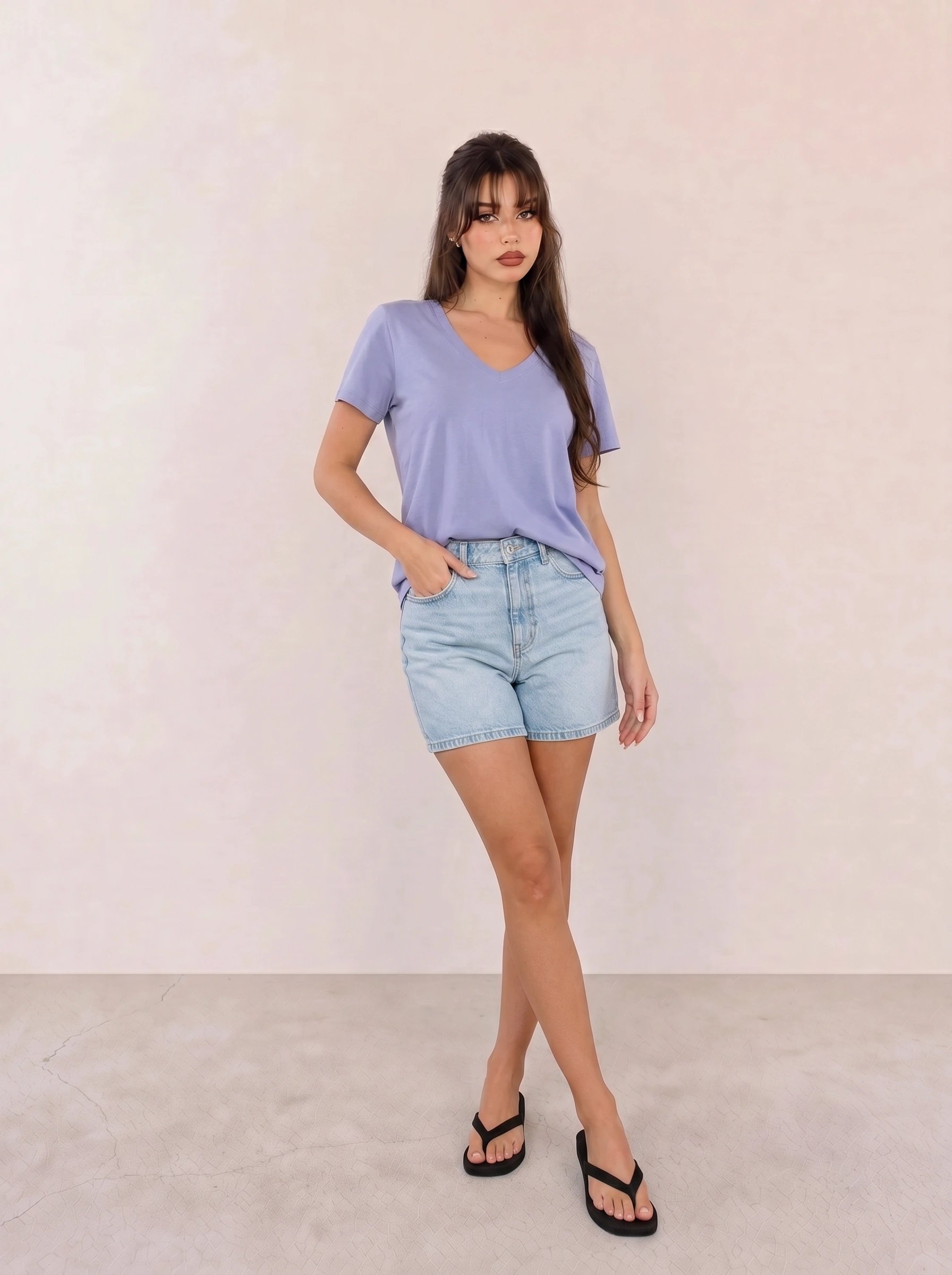
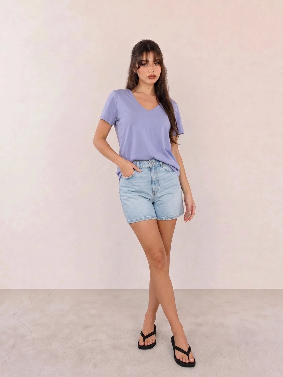
In Periwinkle V-Neck Tee & Light Wash Denim Shorts, the close blue values create a soft color bridge from top to denim. The black sandals add a useful anchor, but a silver or soft navy option would keep the effect closest to a Light or Cool Summer palette.
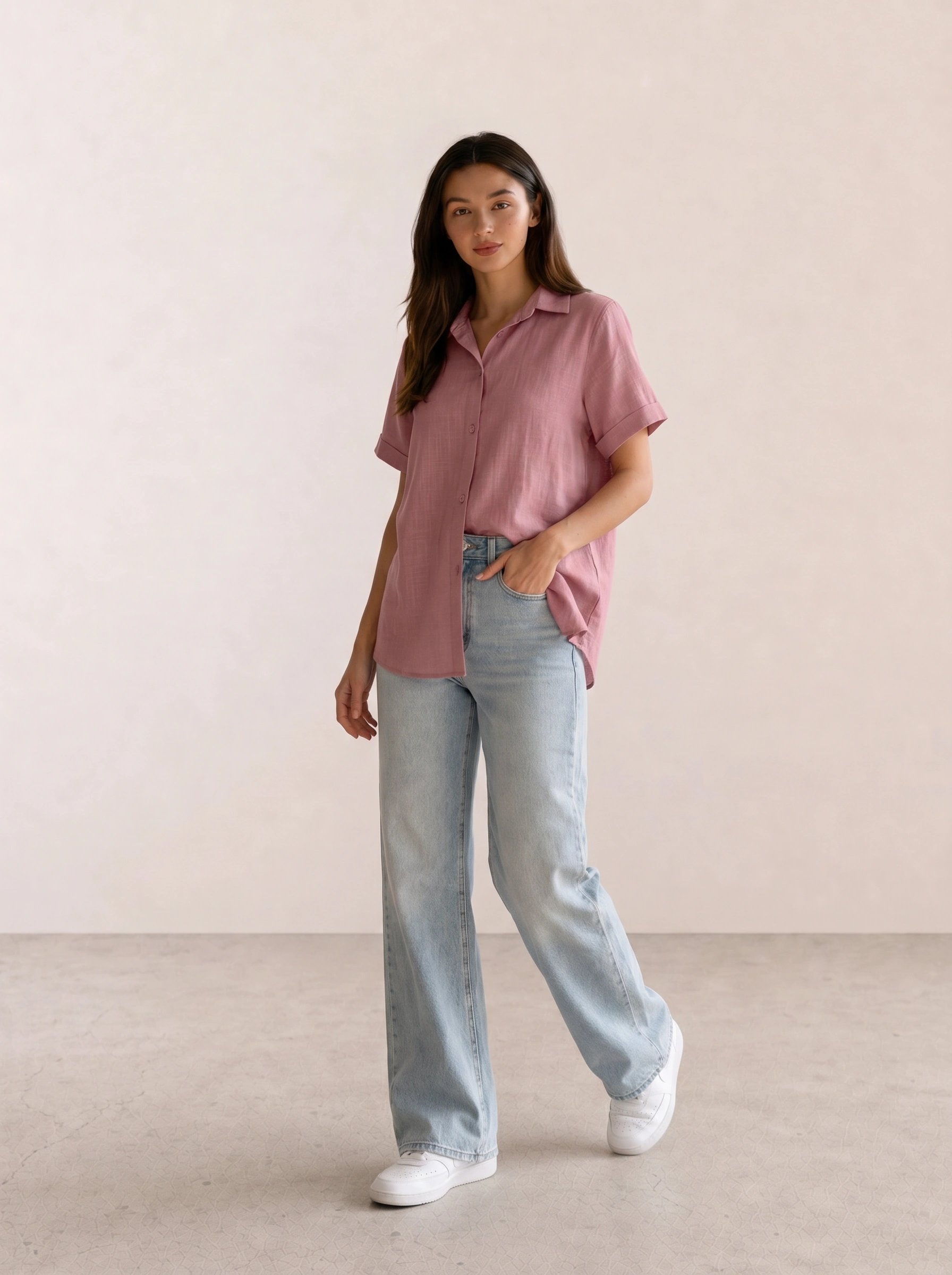
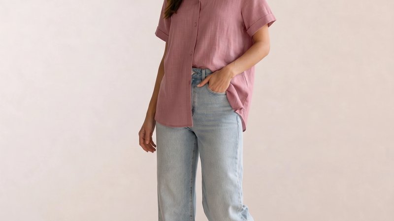
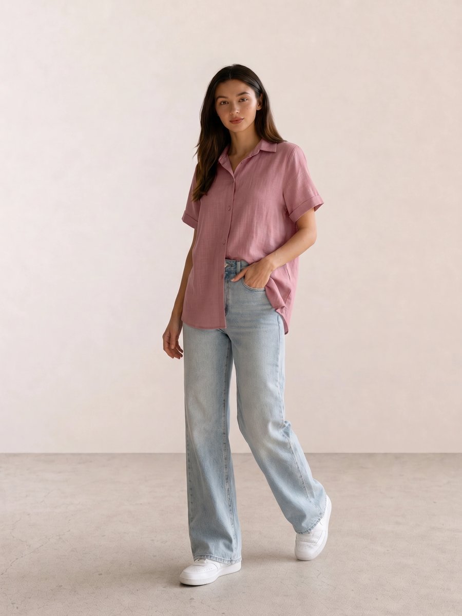
The value of Mauve Linen Shirt & Bleached Wide-Leg Jeans comes from temperature rather than novelty. Mauve supplies a blue-based pink while the faded jeans lower contrast; without that softened denim, a crisp optic-white bottom would make the shirt look more isolated.
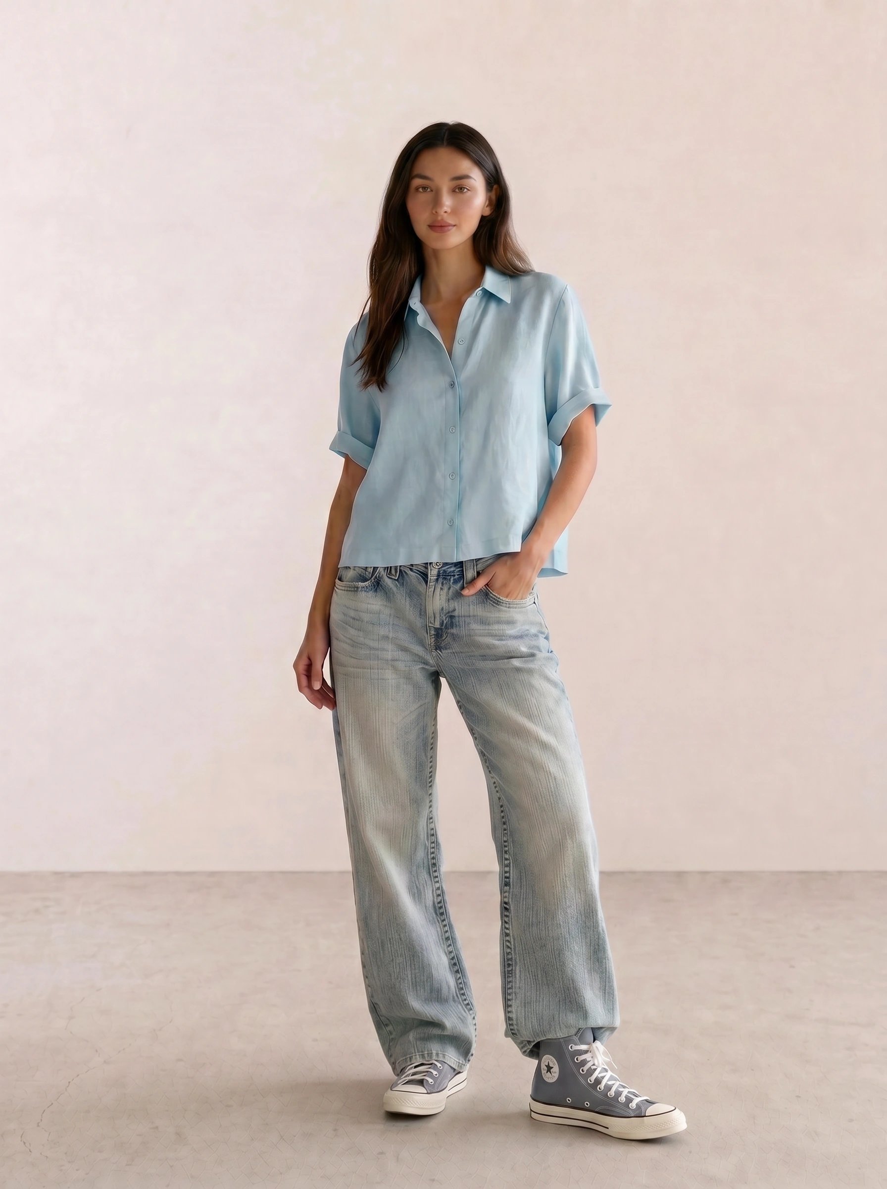
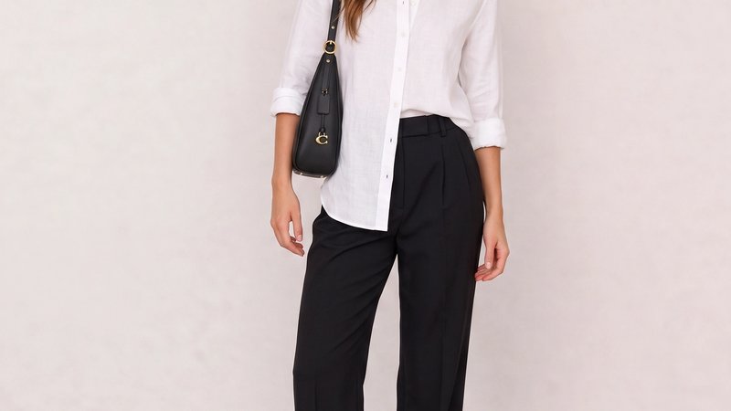
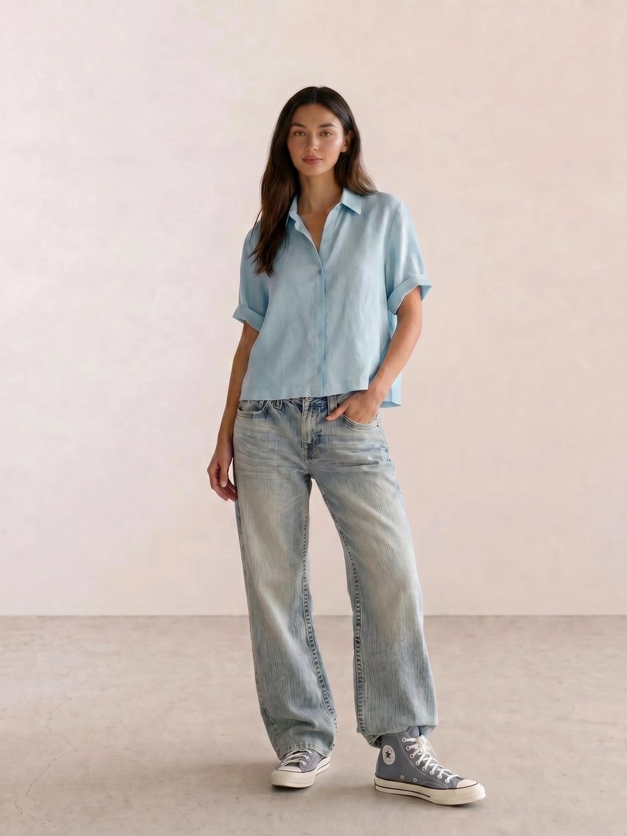
For Light Blue Linen Shirt & Baggy Jeans, the repeated blue family gives an oversized silhouette a clear direction. This is the easiest formula to recreate for an afternoon that begins at a gallery and ends at dinner: keep the shirt relaxed, then choose one cooler shoe rather than a warm tan accessory.
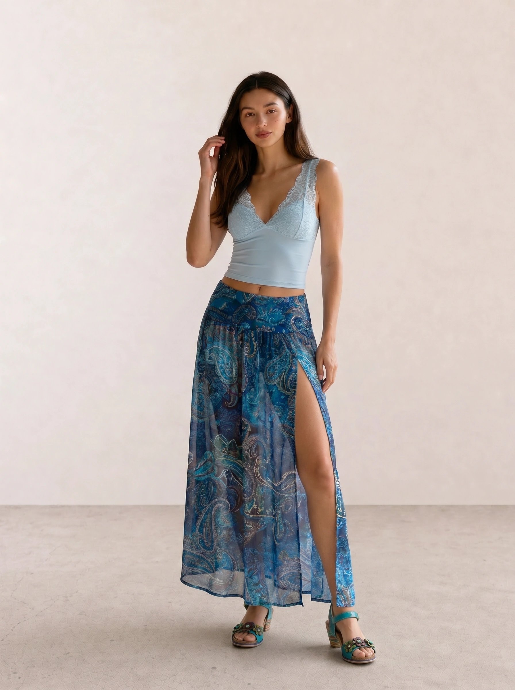
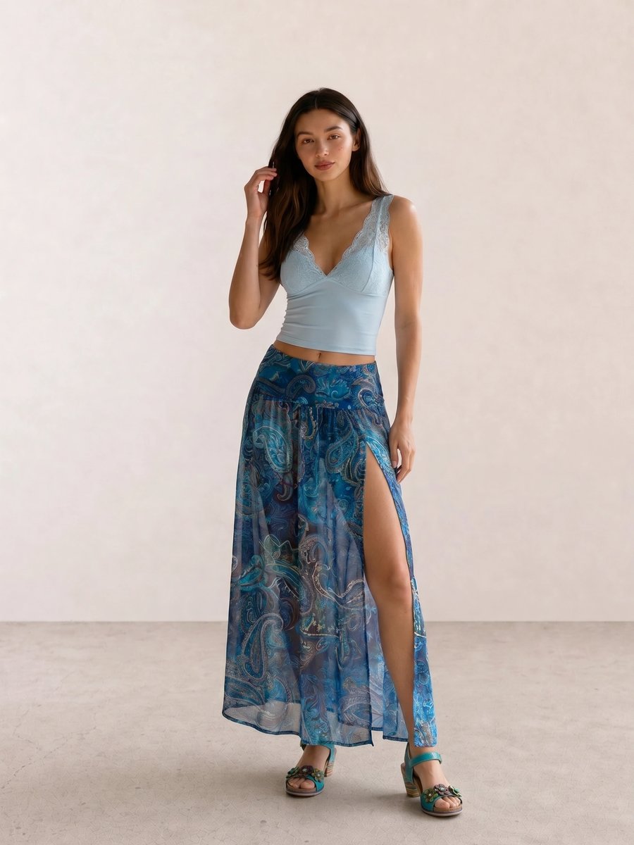
In Lace Trim Cami & Paisley Slit Maxi Skirt, the color story carries more weight than the boho details. Pale blue, medium blue, and turquoise stay related across different textures; without the blue repetition, the look would rely on the print alone and lose its quiet Summer logic.
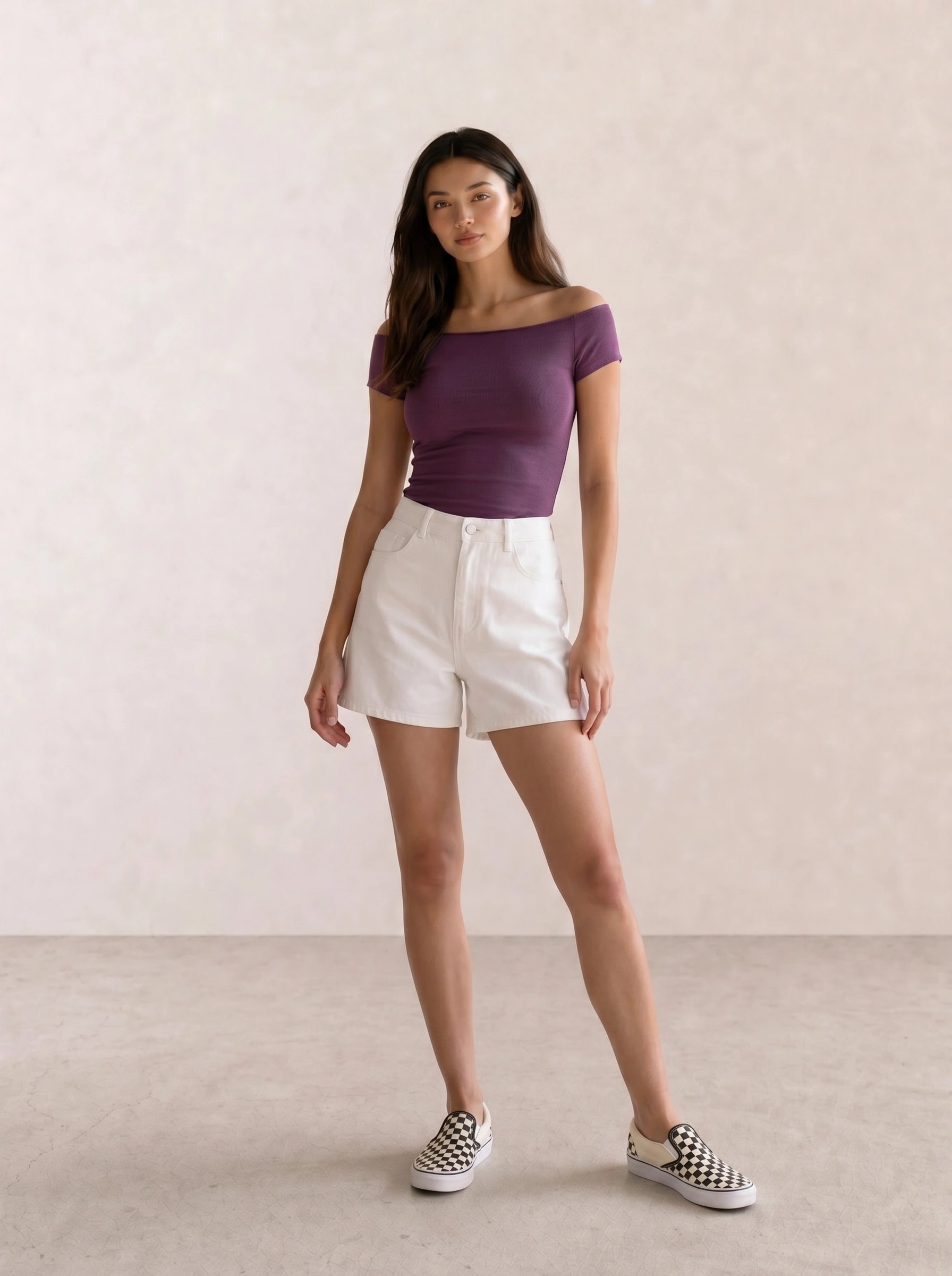
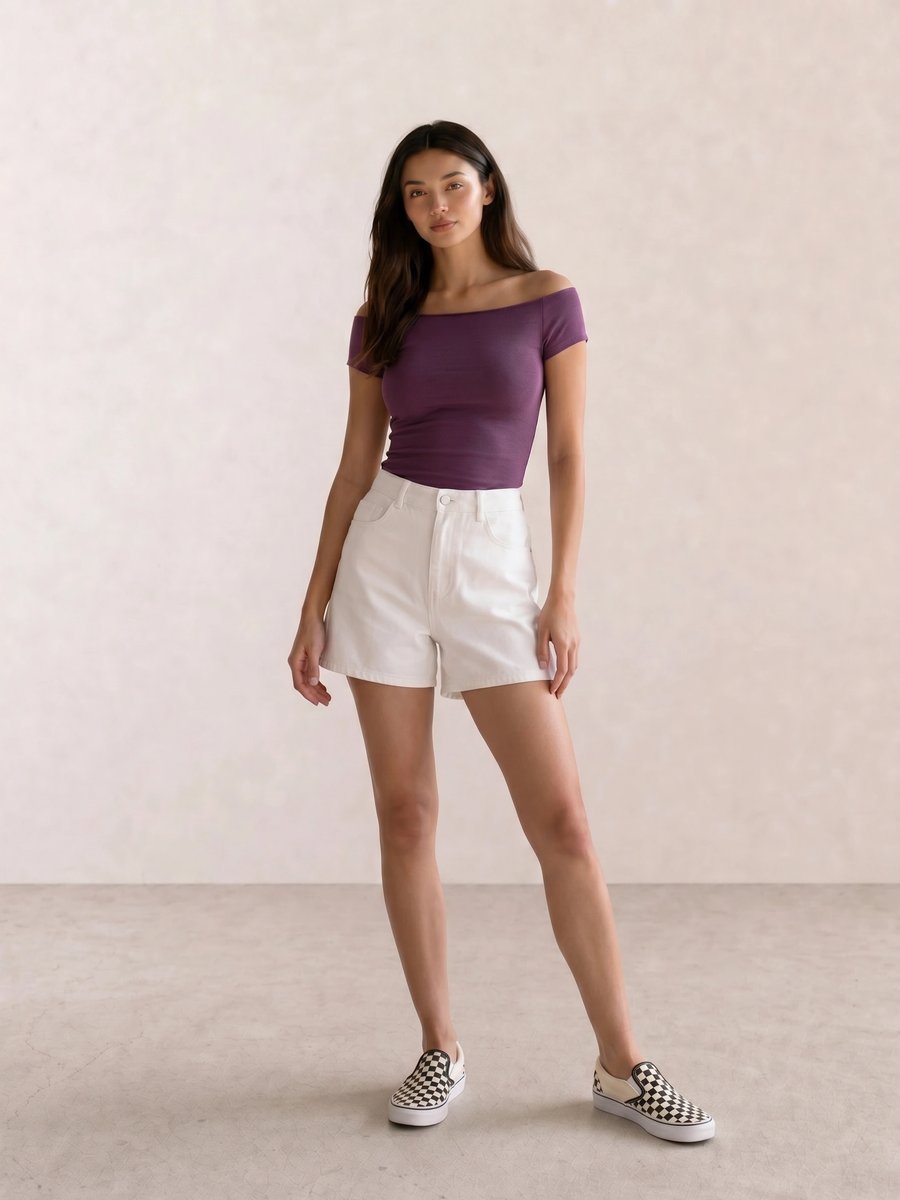
The plum in Plum Off-Shoulder Top & White Denim Shorts shows how a Summer palette can go deeper without going stark. A cool berry lip or pewter earring would repeat the top’s undertone; a bright orange-red accessory would make the color relationship argue with itself.
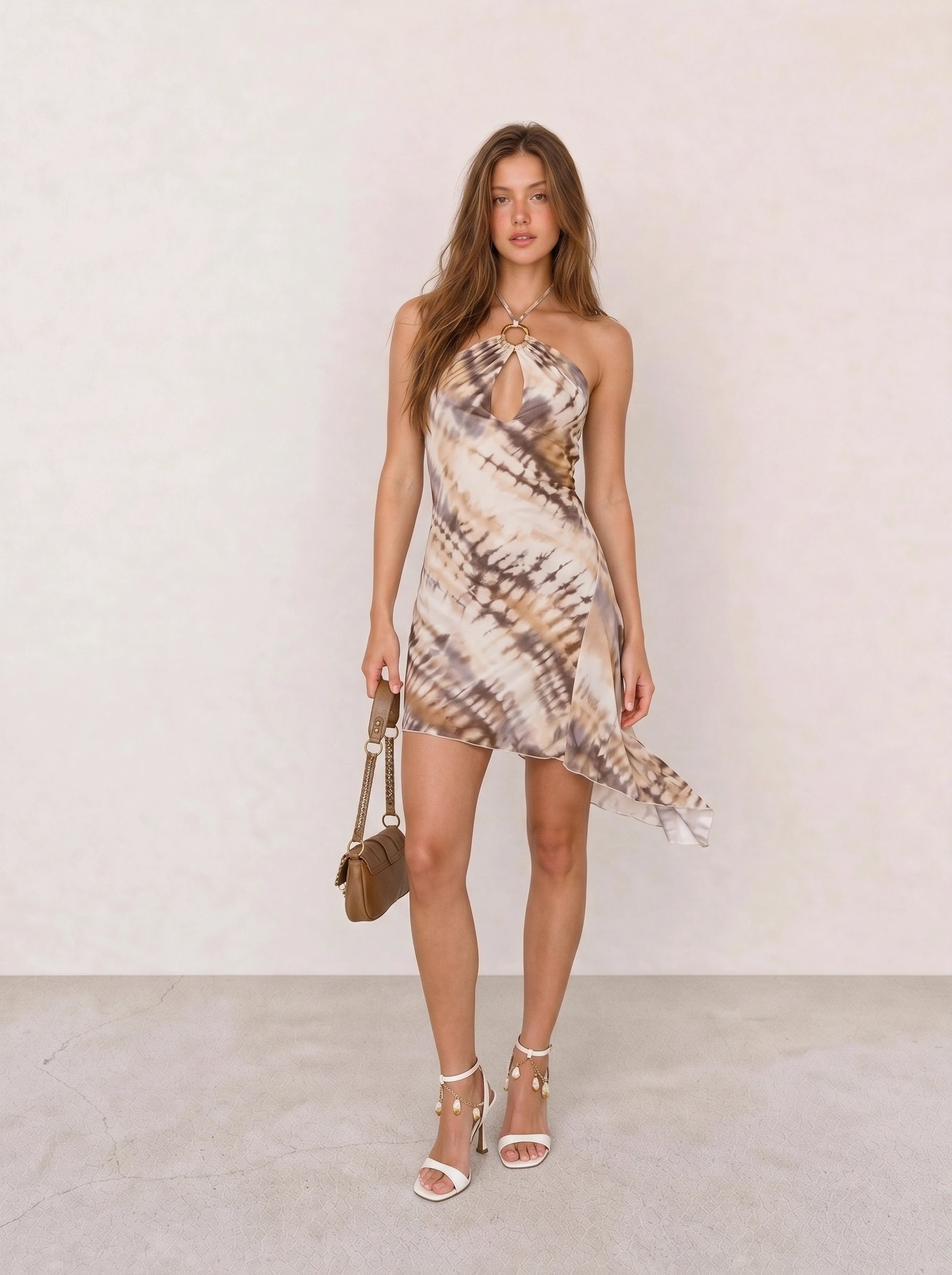
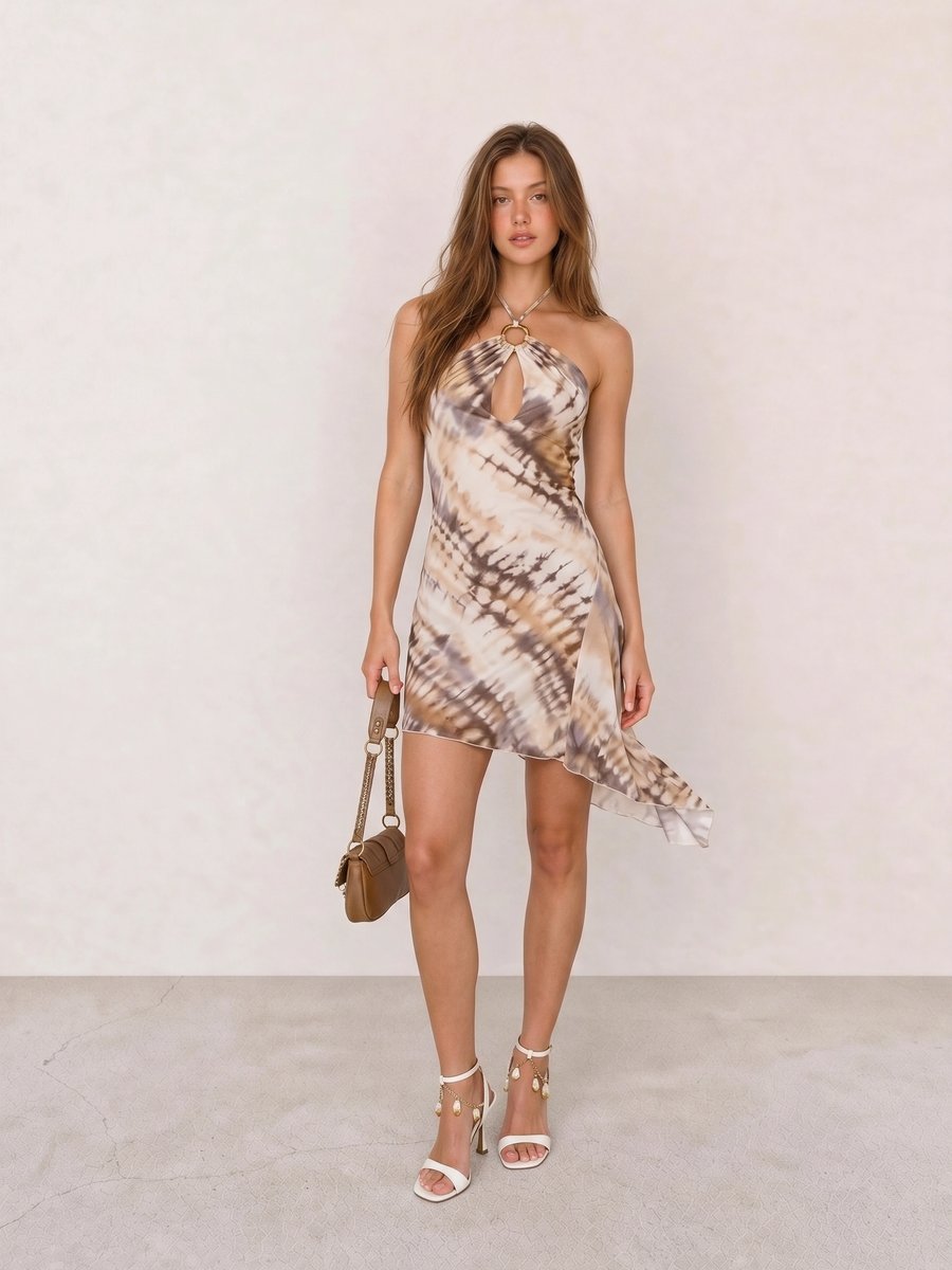
With Taupe Tie-Dye Keyhole Halter Mini Dress, the softer taupe and olive suggest a useful Soft Summer boundary test. The dress succeeds because the colors remain grayed; replace them with camel and vivid grass green, and the outfit moves toward Soft Autumn instead.
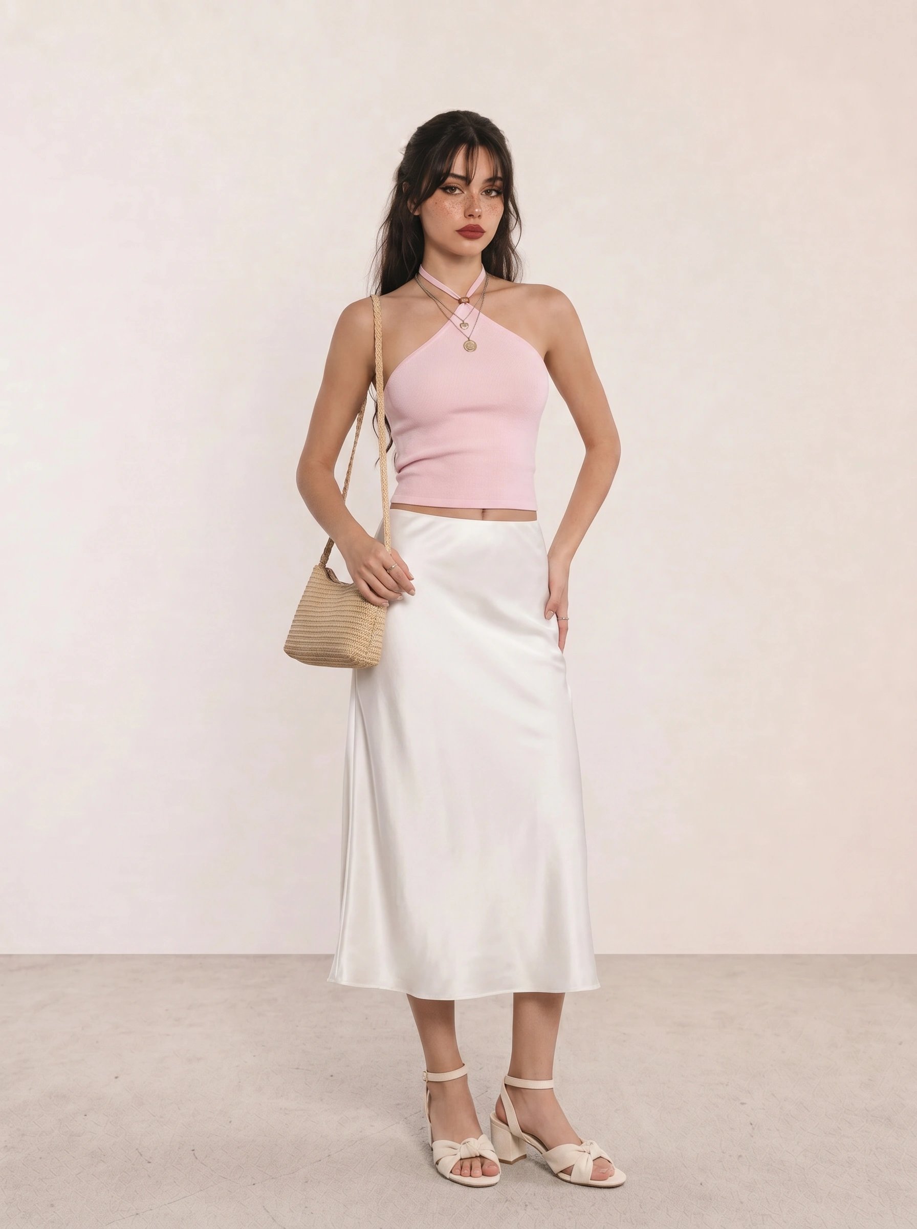
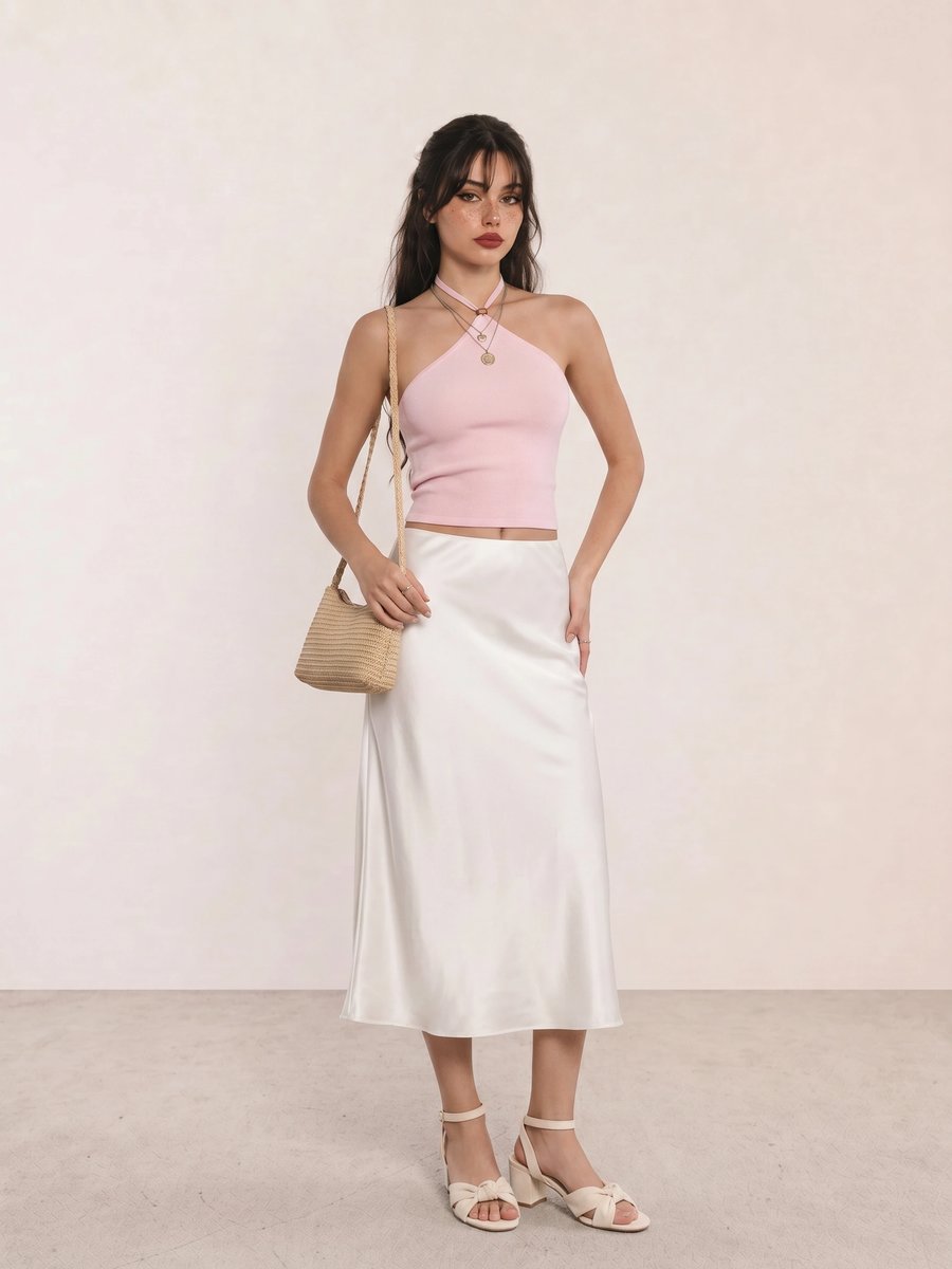
The strongest element in Pink Halter Top & White Satin Midi Skirt is the cool pink near the face. The white satin lifts the value, so this formula suits a lighter Summer looking for an evening option; choose silver jewelry if gold makes the pink look warmer than it is.
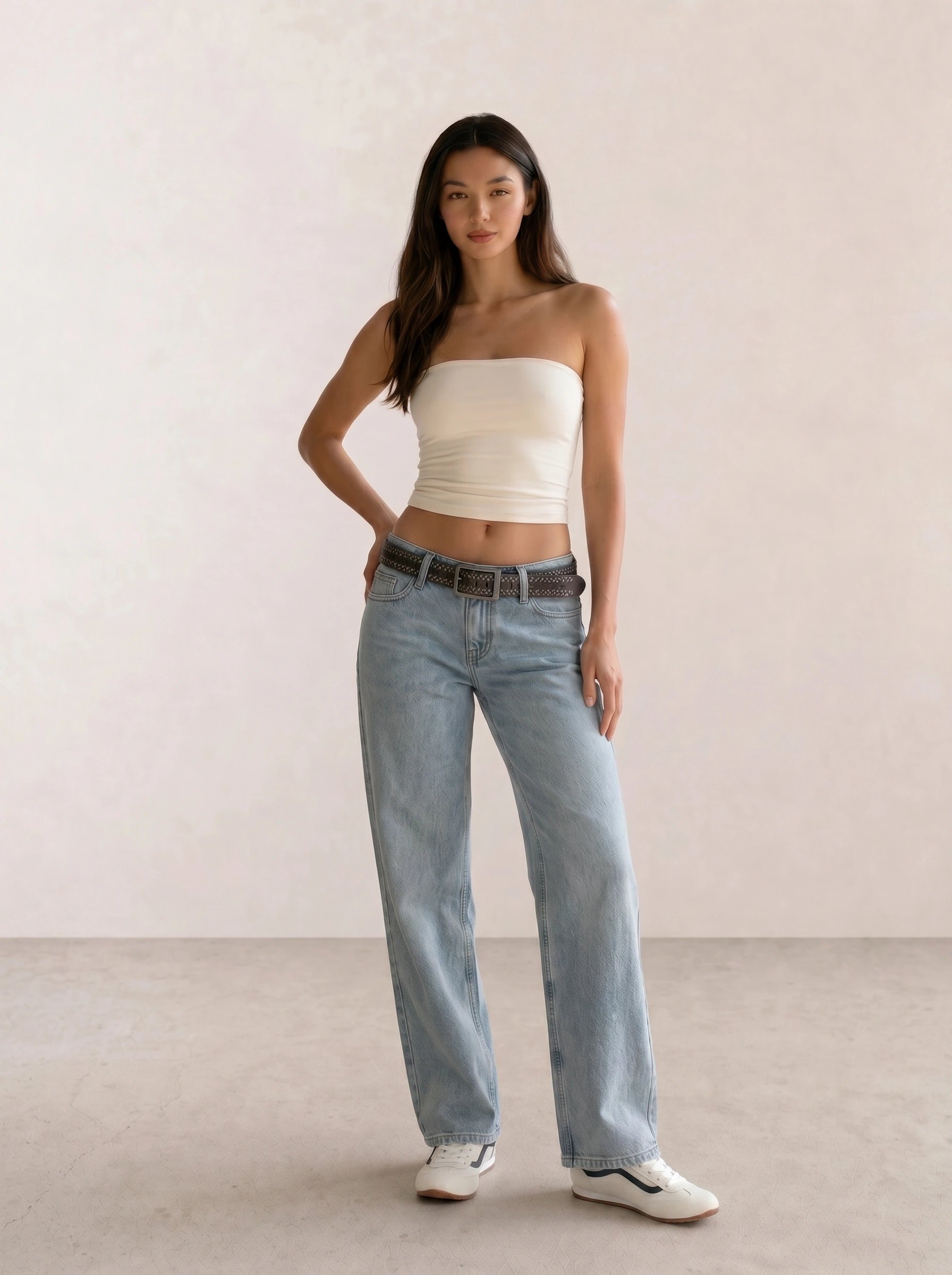
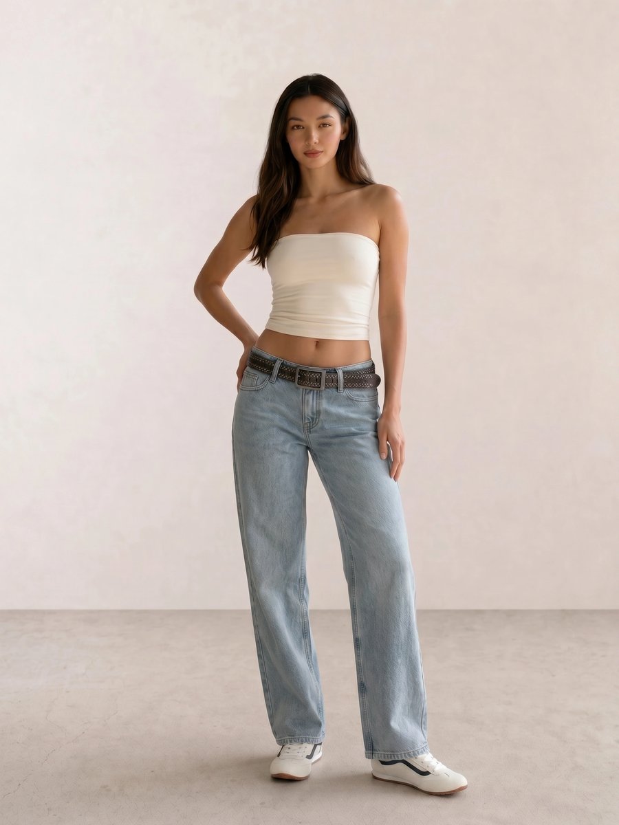
For Cream Tube Top & Light Wash Wide-Leg Jeans, the pale denim does the palette work while the cream top leaves space for a rose, mauve, or periwinkle accessory. This is a good reminder that a Summer closet needs useful bases, not eight versions of lavender.
A Practical Shopping Guide for Summer Colors
At a budget, start with a soft navy knit, dove-gray tee, faded denim, and one rose or periwinkle top. At mid-range, spend on the items that sit near your face most often: a coat, blazer, shirt, or everyday handbag in a neutral you can repeat. At luxury, reserve the budget for fabric and fit after you have tested the color in more than one light.
Apply Summer Beyond a Swatch
Compare Summer with Seasonal Color Analysis, then use your undertone notes, clothing colors, jewelry metals, and makeup colors to see whether softness and coolness hold across the whole look.
Summer Personal Color Palette FAQ
What colors look best on a Summer palette? Soft white, dove gray, cool taupe, soft navy, faded denim, rose, berry, lavender, periwinkle, and muted teal are useful first swatches. Select lighter, cooler, or more muted versions according to Light Summer, Cool Summer, or Soft Summer.
Can a Summer palette wear black? Yes, though black often works better as a shoe, bag, print, or lower-half piece than as a high neckline. Compare black with soft navy or charcoal near your face and keep the option that lets your own coloring remain visible.
What jewelry metals suit Summer coloring? Silver, platinum, white gold, pewter, and cool pearls are common starting tests. Gold is still wearable when its finish, scale, and the surrounding colors work for you.
How do Light Summer, Cool Summer, and Soft Summer differ? Light Summer prioritizes light value, Cool Summer prioritizes an even blue-based temperature, and Soft Summer prioritizes mutedness with a little more depth. All three sit away from the clear warmth of Spring and Autumn and the sharper contrast of Winter.
Weekly outfit picks and style guides — no fluff, unsubscribe anytime.