Spring Color Palette: Light, Warm & Bright Personal Colors
Find your Spring color palette with Light, Warm, and Bright Spring colors, practical neutrals, accents, metals, makeup, and outfit formulas.
STYLEFINDEN editorial review: checked before publication for wearability, proportion logic and real-life outfit use. We explain our editorial method and image policy on the About page and keep affiliate independence details in the affiliate disclosure.
A Spring personal color palette has more to do with color behavior than the month on the calendar. It usually tests best with lightness, warmth, and clear color: creamy ivory instead of stark white, coral instead of dusty rose, and fresh blue instead of smoky navy. You are looking for shades that stay visible beside your face without turning heavy or gray.
This is a starting point, not a verdict. Try a color near your face in daylight, compare it with a nearby alternative, and keep the version that makes your eyes and skin read first. Spring contains three useful routes, Light Spring, Warm Spring, and Bright Spring, so the right palette is rarely a rack of identical pastels.
What Is a Spring Personal Color Palette?
In four-season color analysis, Spring is commonly described as warm and clear, often with a light overall value. Its palette uses yellow-leaning or clean hues such as warm ivory, peach, coral, butter yellow, fresh aqua, leaf green, and warm turquoise. The practical test is comparison: if charcoal, icy pink, and dusty mauve drain the face while clear warm alternatives sharpen it, Spring is worth exploring.
Color Me Beautiful’s Spring palette guide presents Spring as one of four seasonal palettes and frames it around light, warm color. Adobe’s HSB color explanation separates hue, saturation, and brightness, which is useful here: a Spring choice can change temperature, clarity, or depth without changing the basic color name.
Where Spring Color Analysis Came From
Modern seasonal color analysis entered popular fashion culture through Carole Jackson’s 1980 book Color Me Beautiful, which translated four seasonal palettes into clothes, cosmetics, and shopping decisions. The original system is best used as a comparison tool. It gives you a short list of directions to test, then leaves room for contrast preference, hair color changes, and the colors you simply enjoy wearing.
The useful update is specificity. “Spring” does not mean every pastel works, and it does not require a floral print. A clear yellow can suit one Spring better than a pale lavender; a warm navy can be more useful than a closet full of beige. The subtype helps explain that difference.
The Key Colors in a Spring Palette
Picture the palette in swatches: warm ivory and light camel for a base; peach, apricot, coral, and butter yellow for warmth; clear aqua, turquoise, grass green, and periwinkle-blue for lift; tomato red and fresh pink for a stronger accent. The common thread is clarity. Colors can be light or deep enough to suit your contrast, but they should not look heavily smoked with gray.
Most people assume Spring means pale from head to toe. In reality, a well-placed clear accent does more than another pale layer. A coral bag, warm red lip, or turquoise earring gives a soft cream outfit a focal point; the rest of the look can stay calm.
Light Spring Color Palette: Lightness With Warmth
Light Spring sits at the airy end of the family. Start with warm white, oatmeal, light camel, pale peach, butter yellow, light aqua, soft warm pink, and clear light blue. Keep contrast low to medium: cream pants with a peach knit, or light blue denim with a warm ivory top, reads more intentional than a black jacket dropped over the same outfit.
Light Spring differs from Light Summer through temperature and softness. Light Summer can carry cooler, grayer pinks and blues; Light Spring usually benefits from a little more yellow warmth and cleaner color. Silver can work when it is delicate, but light gold, champagne, and warm pearl are usually easier first metal tests.
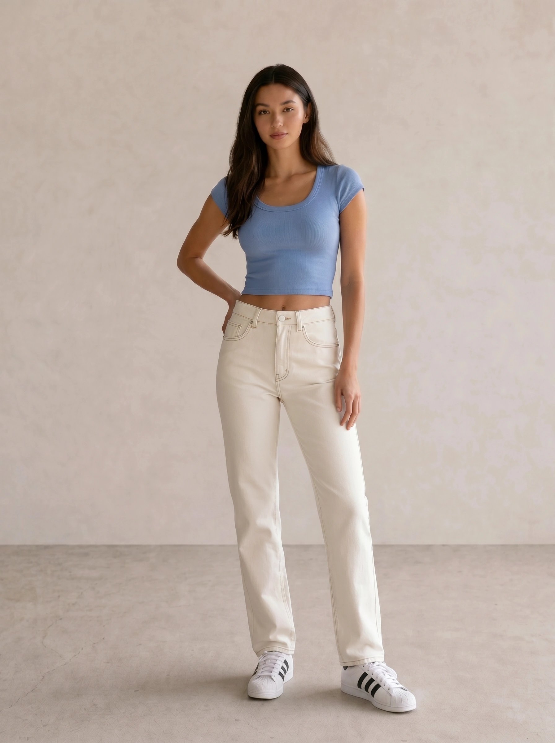
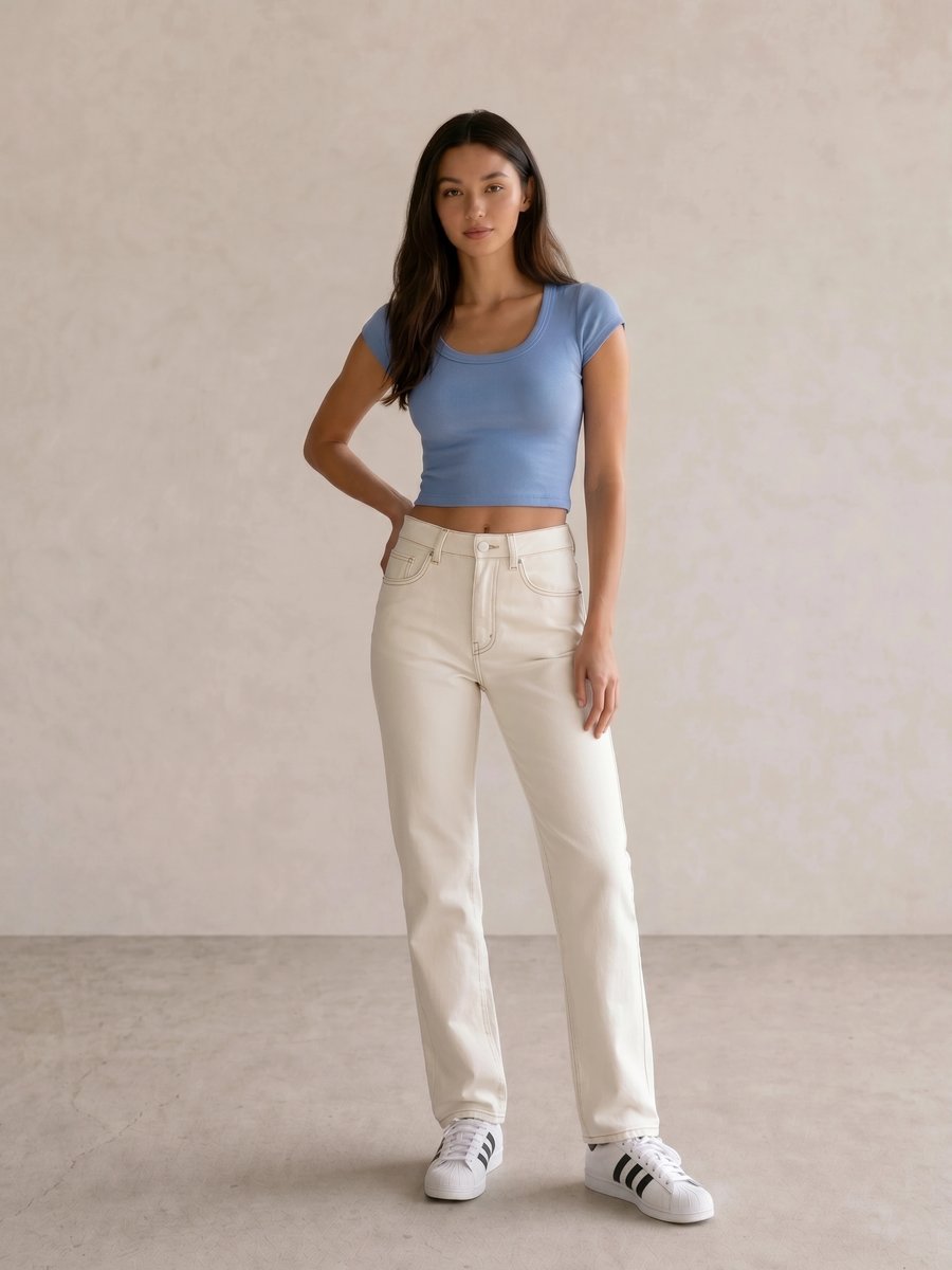
In Blue Scoop Crop Tee & Cream Straight Jeans, the cream jeans keep the blue open and light rather than inky. Add a warm ivory layer or small gold hoop before adding black; without that warmth, the color direction shifts closer to a cooler summer formula.
Warm Spring Color Palette: Golden Color Without Autumn Weight
Warm Spring gives temperature the lead. Apricot, warm coral, marigold, clear olive, warm turquoise, tomato red, camel, and golden beige are strong comparisons. Choose warm neutrals with some lightness, such as cream, sand, cognac, or warm navy, instead of defaulting to dark chocolate and rust.
Warm Spring differs from Warm Autumn because Autumn colors usually carry more depth and muting. The same orange family can become too earthy when it turns burnt or browned. Gold, brass, and warm tortoiseshell reinforce this direction; the best makeup tests are peach or apricot blush, warm coral or tomato lips, and bronze or olive-gold eyes.
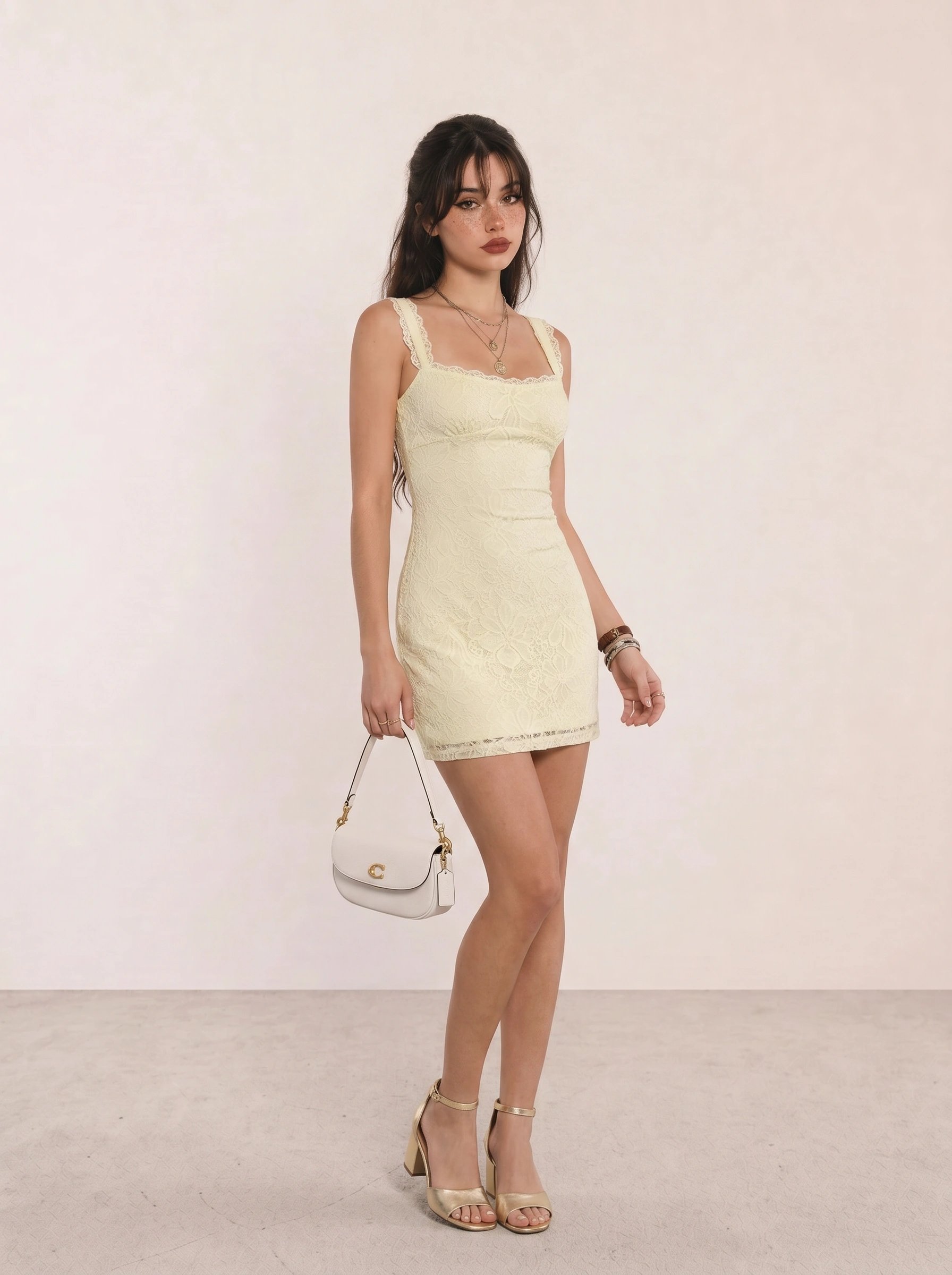
With Pale Yellow Lace Bodycon Mini Dress, gold sandals repeat the yellow direction without adding a second competing color. A peach cheek and warm red lip work because the dress stays light; a heavy burgundy bag would pull the formula toward Autumn.
Bright Spring Color Palette: Clear Contrast With Warmth
Bright Spring can take more chroma and contrast than the other Spring subtypes. Test clear coral, bright warm pink, turquoise, vivid leaf green, tomato red, warm cobalt, and crisp warm white against navy or medium camel. The point is definition, not maximalism: one clean bright color against a stable neutral is more convincing than four competing brights.
Bright Spring differs from Bright Winter through temperature. Bright Winter often supports icy, blue-based pink, optic white, and black more easily; Bright Spring usually looks more coherent with warm white, coral, warm red, and gold. For makeup, try clear coral blush, warm pink or tomato lipstick, and gold, copper, or bright teal used as a controlled eye accent.
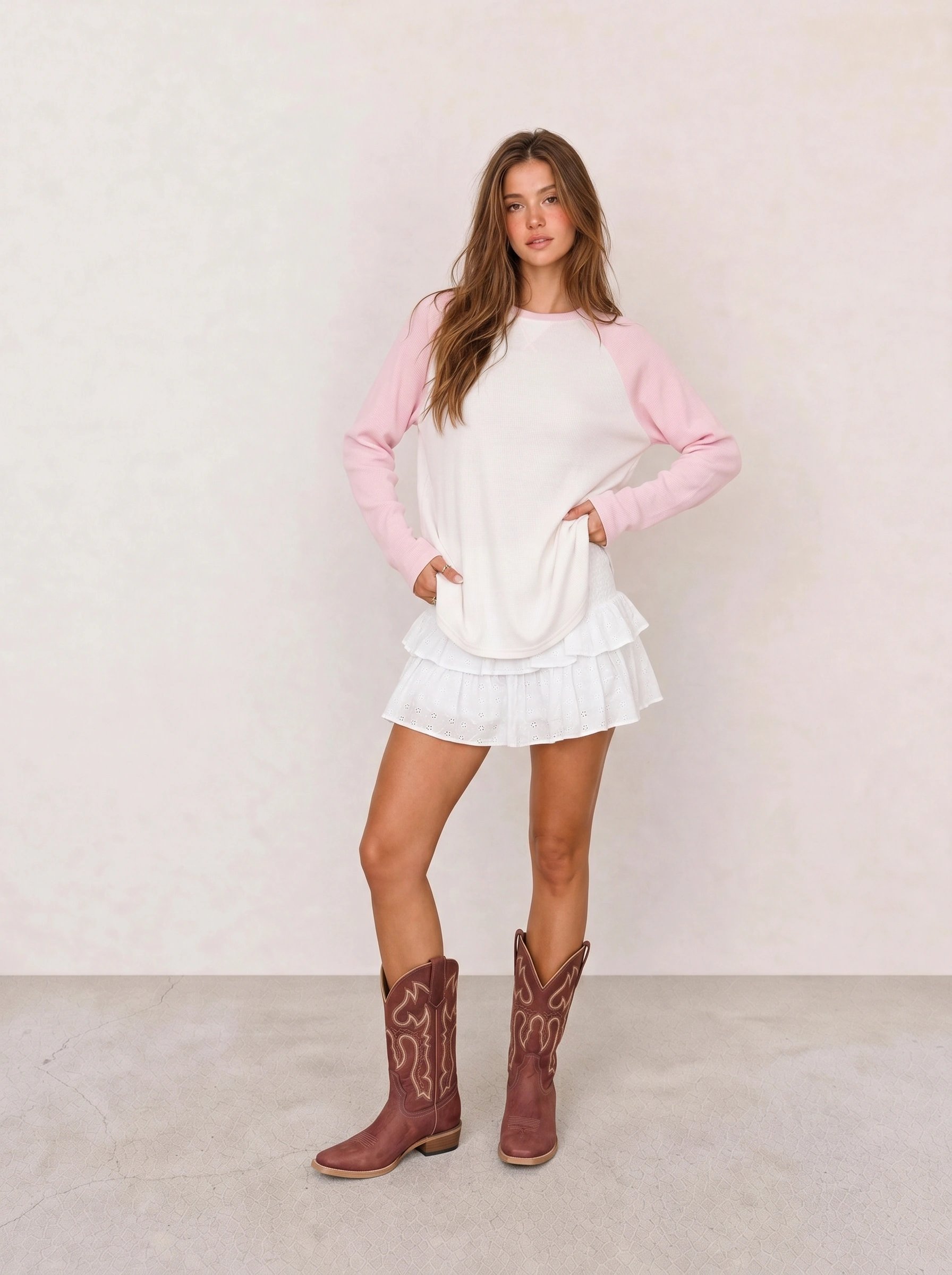
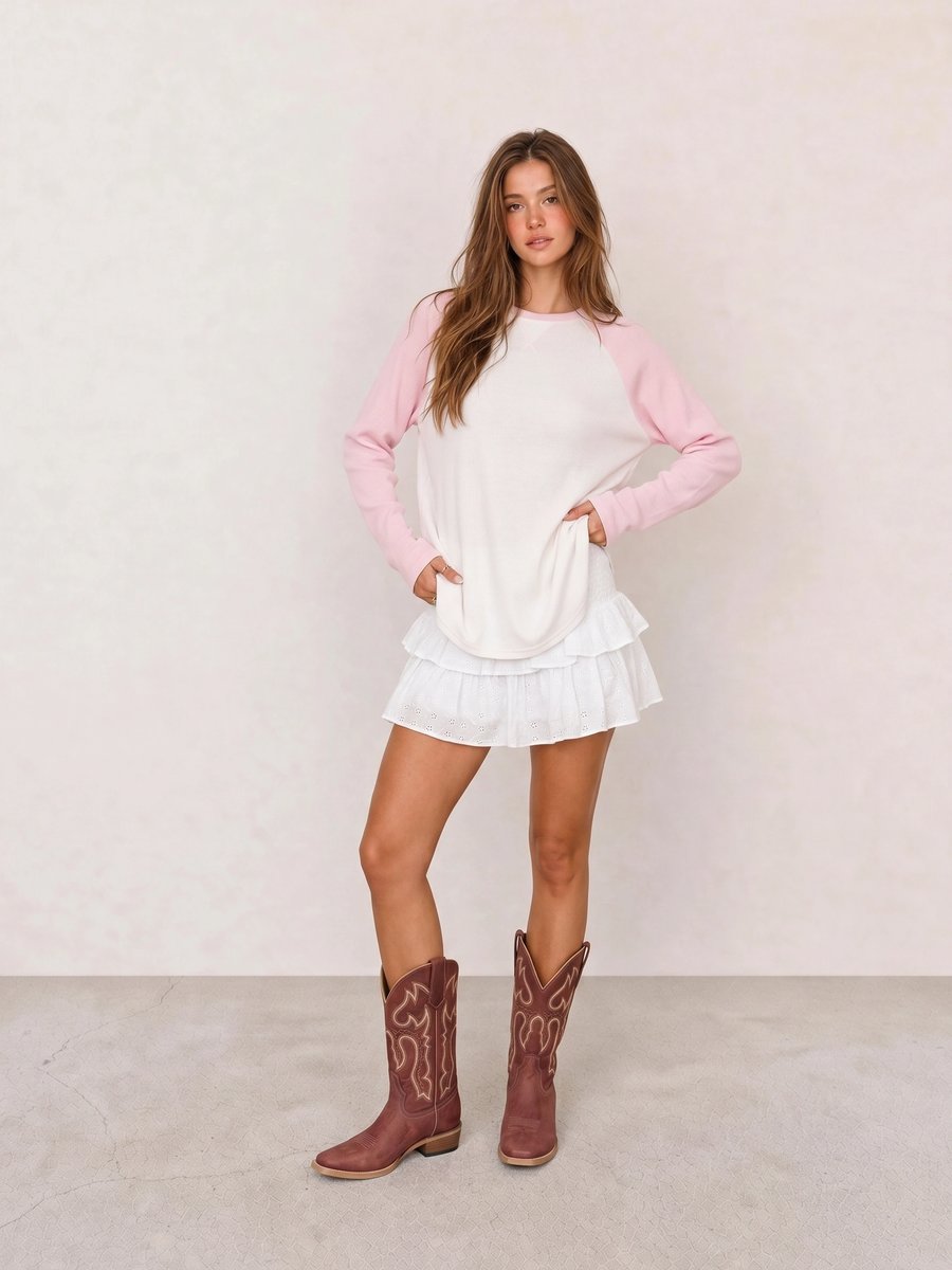
In Colorblock Raglan Top & White Eyelet Mini Skirt, the pink panel becomes the focal point because the skirt does not compete. Keep jewelry gold and choose a clear warm lip or a soft eye, not both; extra high-chroma details would make the look feel scattered.
How to Style Spring Colors: Neutrals, Accents, and Metals
Build outfits from a light neutral, one clear color, and one repeat near the face. Warm ivory, cream, sand, light camel, and warm navy are the best Spring neutrals because they support color without making it look juvenile. Accent colors can be coral, aqua, clear green, tomato red, or butter yellow. Repeat the accent in a shoe, bag, scarf, or lipstick only when the outfit needs more definition.
Gold is the practical starting metal for most Spring palettes, with champagne, brass, and warm pearl close behind. The rule is not “never wear silver.” A small silver clasp is irrelevant; a large icy silver necklace beside the face can change the whole temperature. Keep the metal subordinate to the garment’s color story.
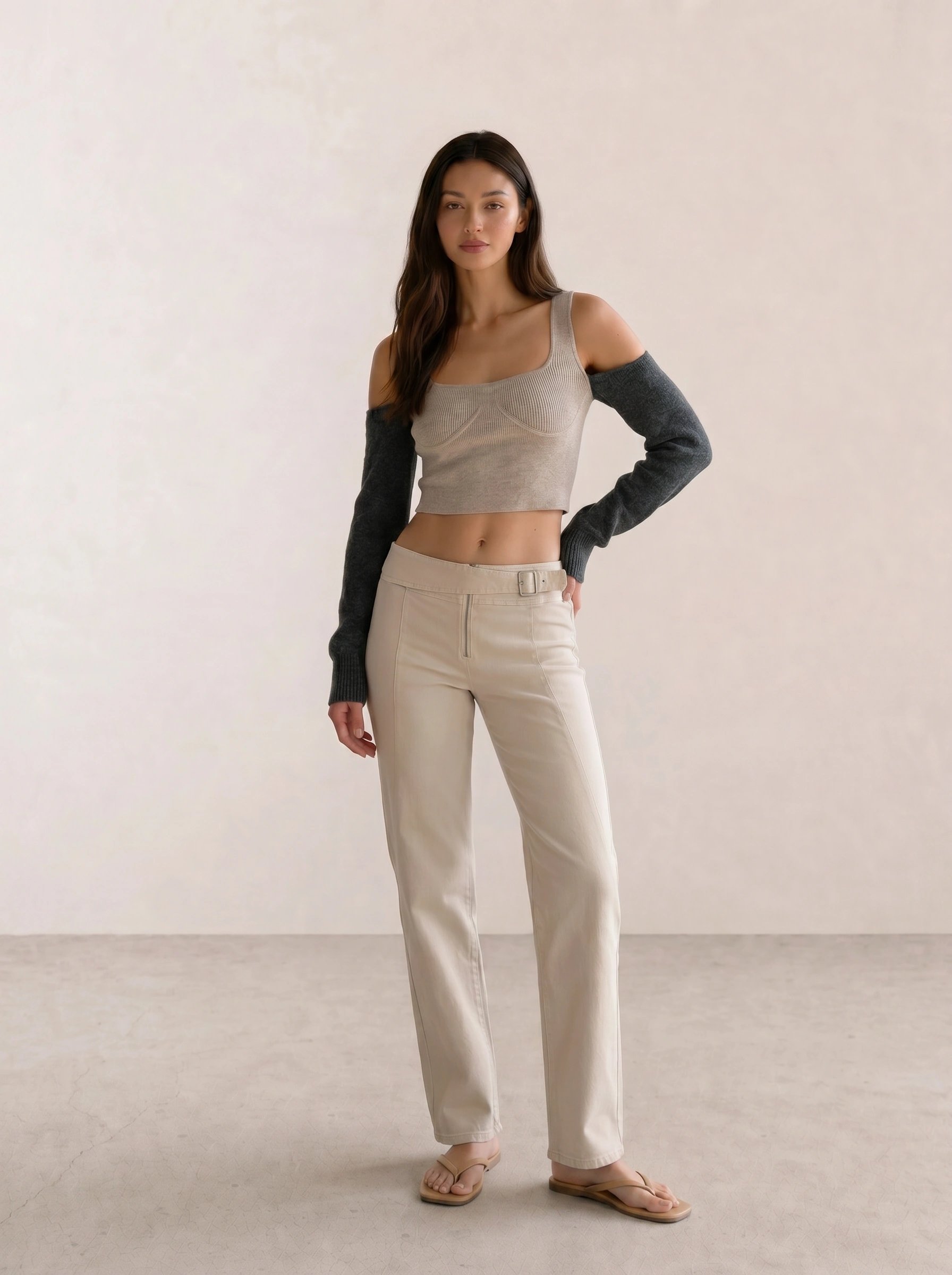
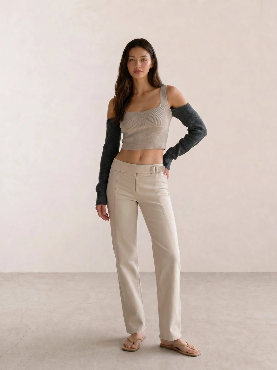
The proportion in Beige Bustier Knit Top & Cream Trousers leaves room for a coral shoe, turquoise bag, or gold earring. The neutral base works because it is light and warm; replace it with cool gray and the same accessories lose their color logic.
Spring Makeup Colors: Blush, Lips, and Eyeshadow
For a Spring palette, begin with peach, apricot, warm coral, or clear warm pink blush; coral, tomato red, warm pink, and peachy nude lipstick; then gold, bronze, warm taupe, olive-gold, or a clear aqua accent for eyeshadow. Light Spring can sheer the pigment, Warm Spring can favor golden warmth, and Bright Spring can carry more saturated color.
Match depth before assuming a family fails. A deep Spring-leaning complexion may need terracotta rather than pale peach for the same readable warmth, while a lighter complexion may prefer a translucent apricot. This is color comparison, not skincare or product-safety advice.
Common Spring Palette Mistakes
Avoid treating black as the only polished neutral. Black can overpower a light or warm Spring palette near the face; try warm navy, medium camel, or a black shoe kept away from the face before ruling it out. Avoid dusty versions of every color too. Muted mauve, olive, and rose can be beautiful, but excessive gray can erase the clear quality that makes Spring distinct.
Do not buy a color because its label says “Spring.” Check hue, saturation, and brightness in daylight. A warm, clear coral can suit several Spring subtypes at different depths, while a pale chalky coral can disappear on deeper skin or feel too weak beside high-contrast features.
Spring Personal Color Palette Outfit Examples
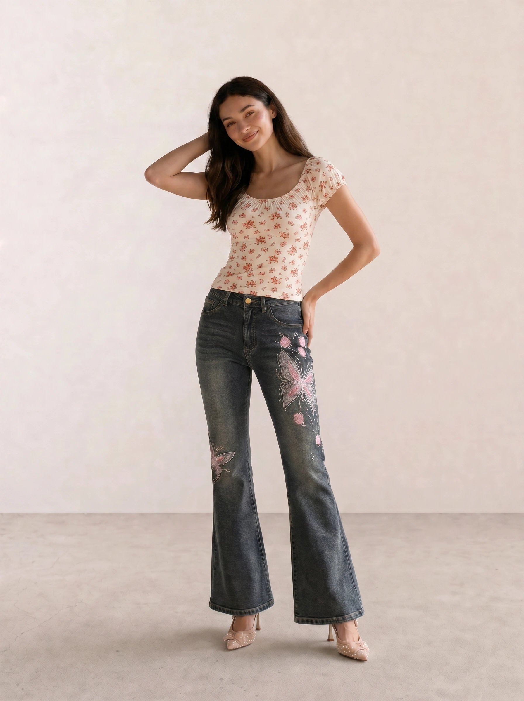
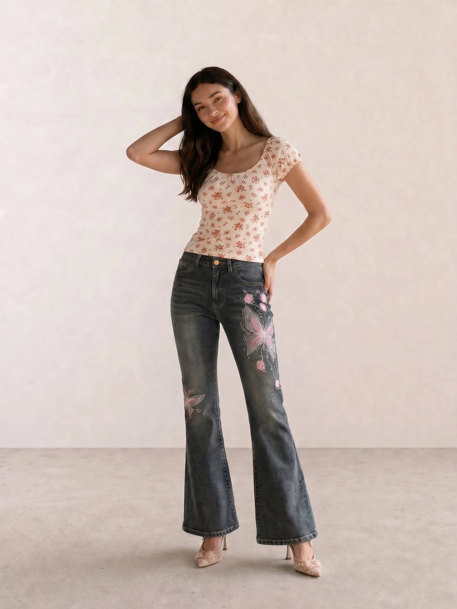
The useful lesson in Daisy Bodysuit & Floral Embroidered Flare Jeans is repeat, not matching. The blush heel picks up the softness of the floral detail while the cream bodysuit keeps the face area bright. Without the light neutral, the embroidered denim would carry too much visual weight for a fresh Spring effect.
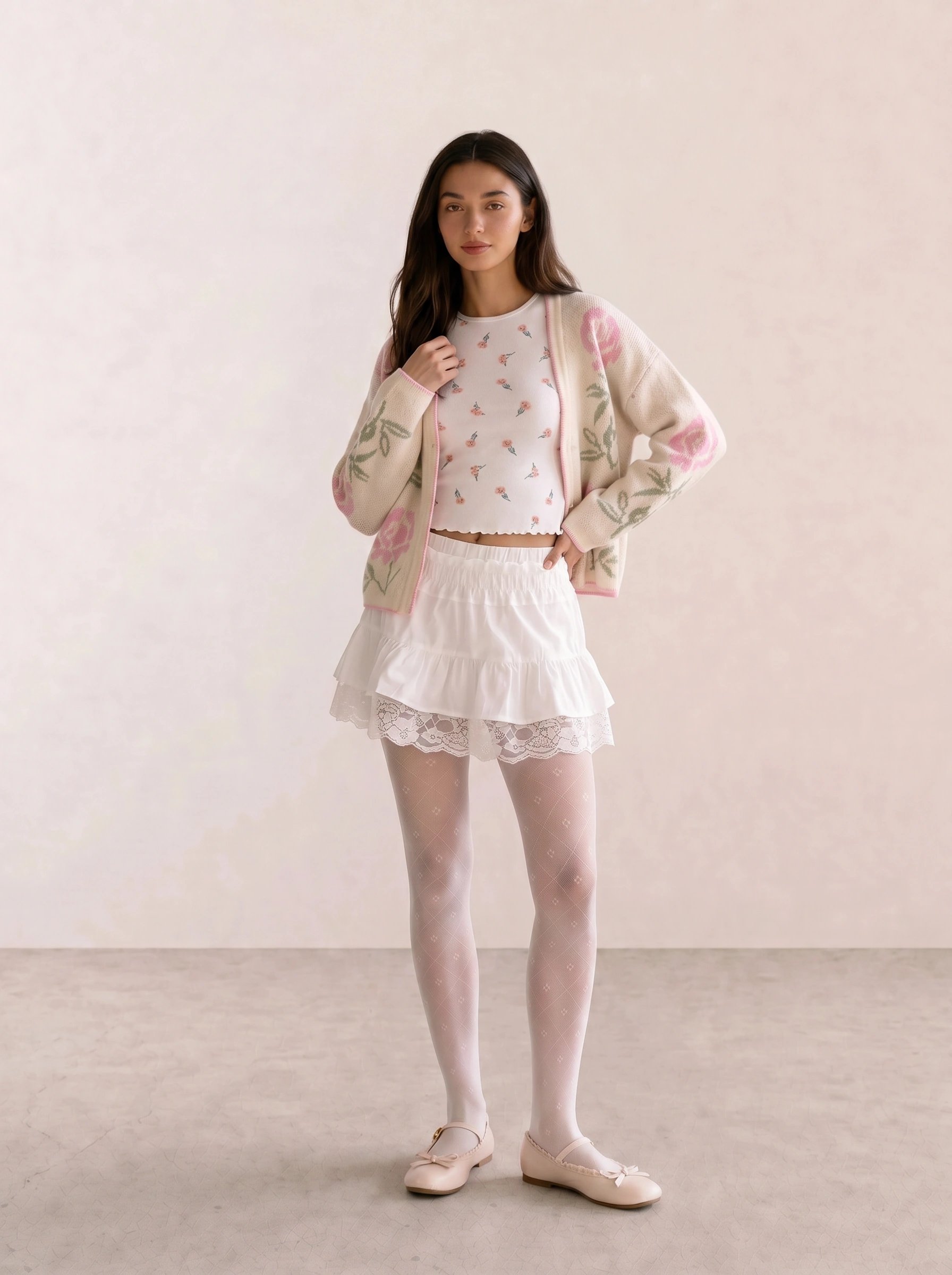
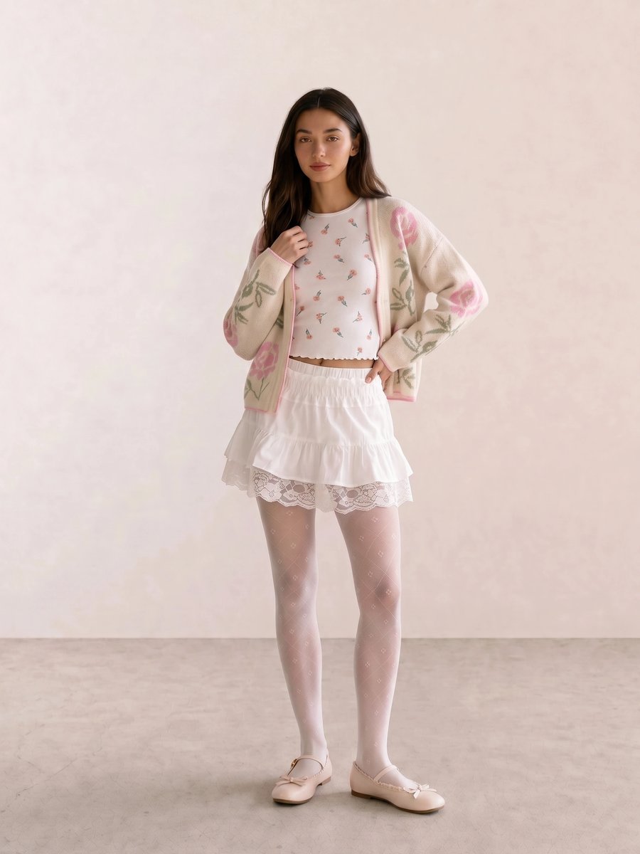
For Embroidered Floral Cardigan & White Lace Mini, the cardigan and lace mini keep contrast gentle, so a warm pink lip can do the color work. This is the outfit for a long lunch that starts indoors and ends in late-afternoon sun; a dark opaque tight or black moto jacket would interrupt the light value pattern.
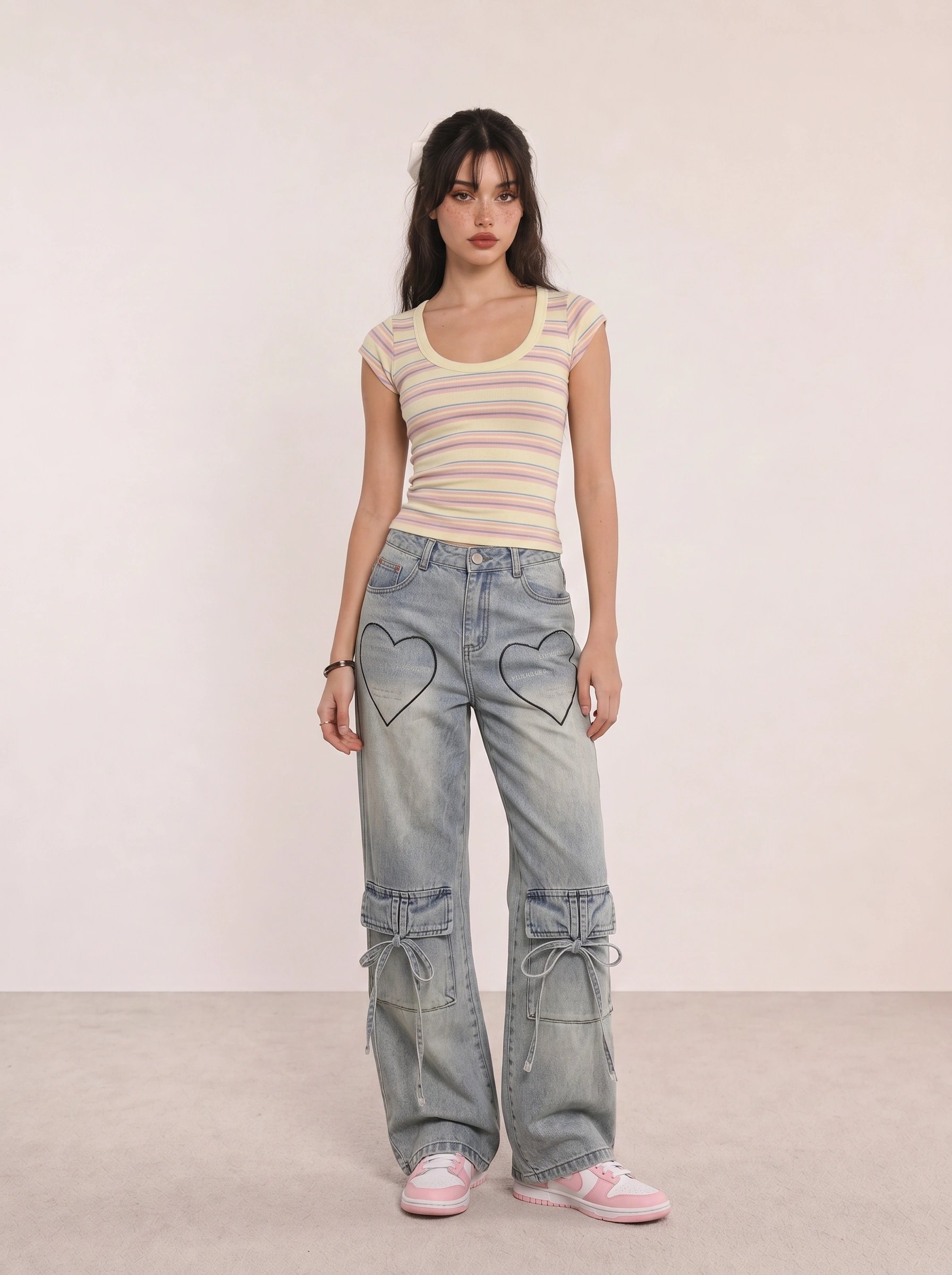
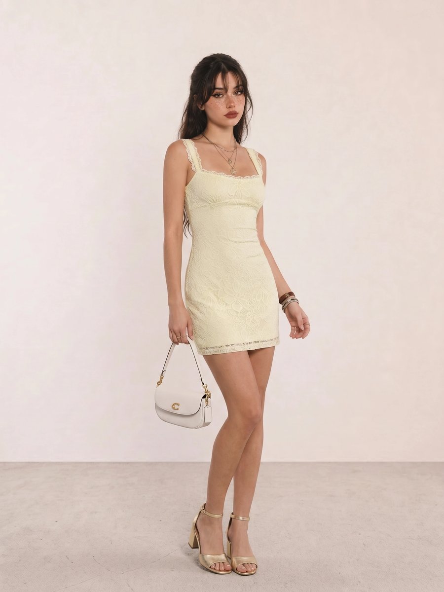
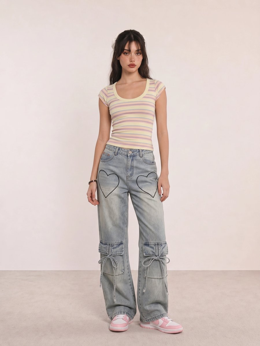
In Pastel Stripe Crop & Heart-Pocket Jeans, the stripe supplies several clear hues but the blue jeans give them space. The styling mechanism is saturation control: choose one of the stripe colors for an accessory and leave the rest alone.
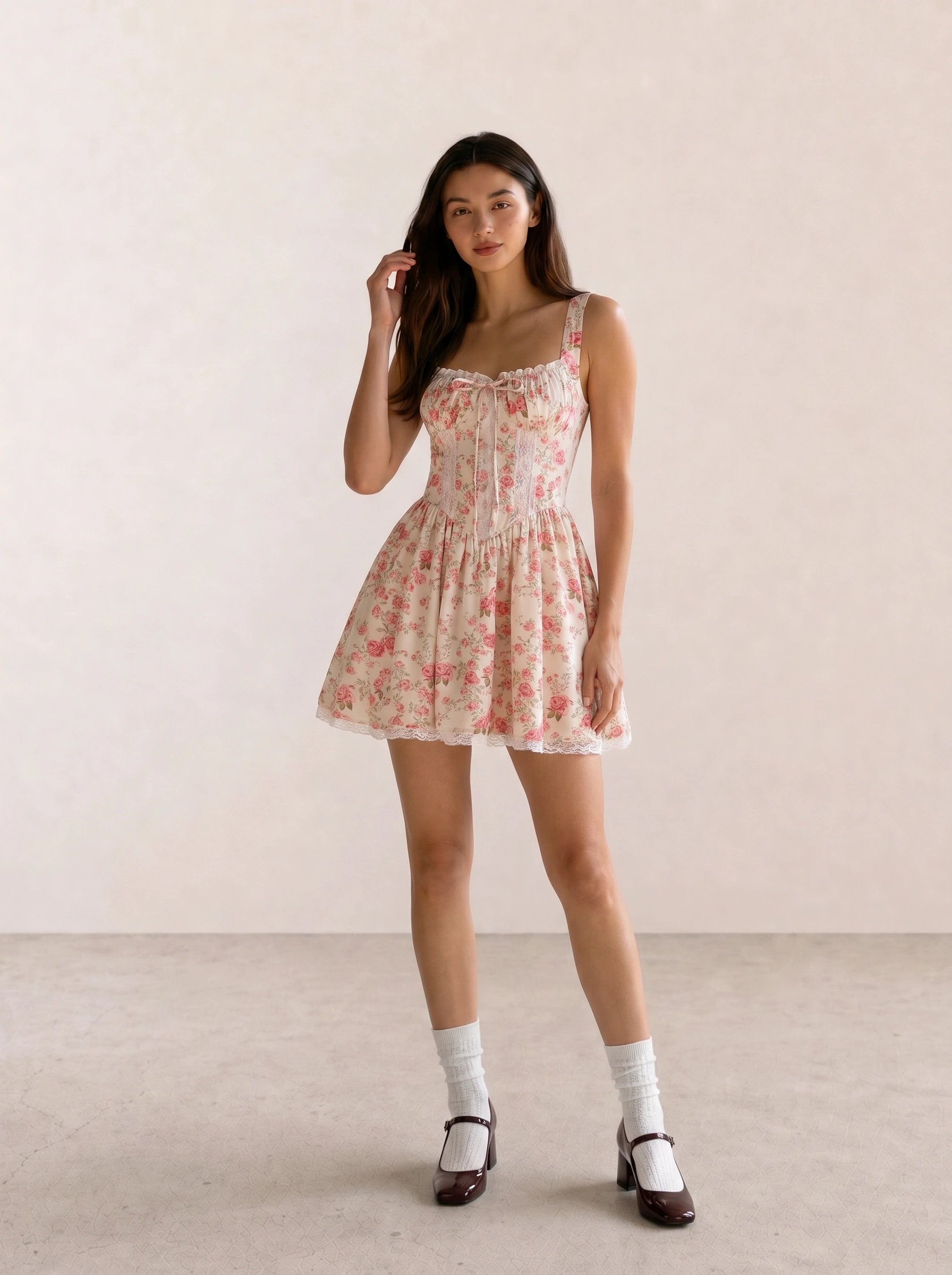
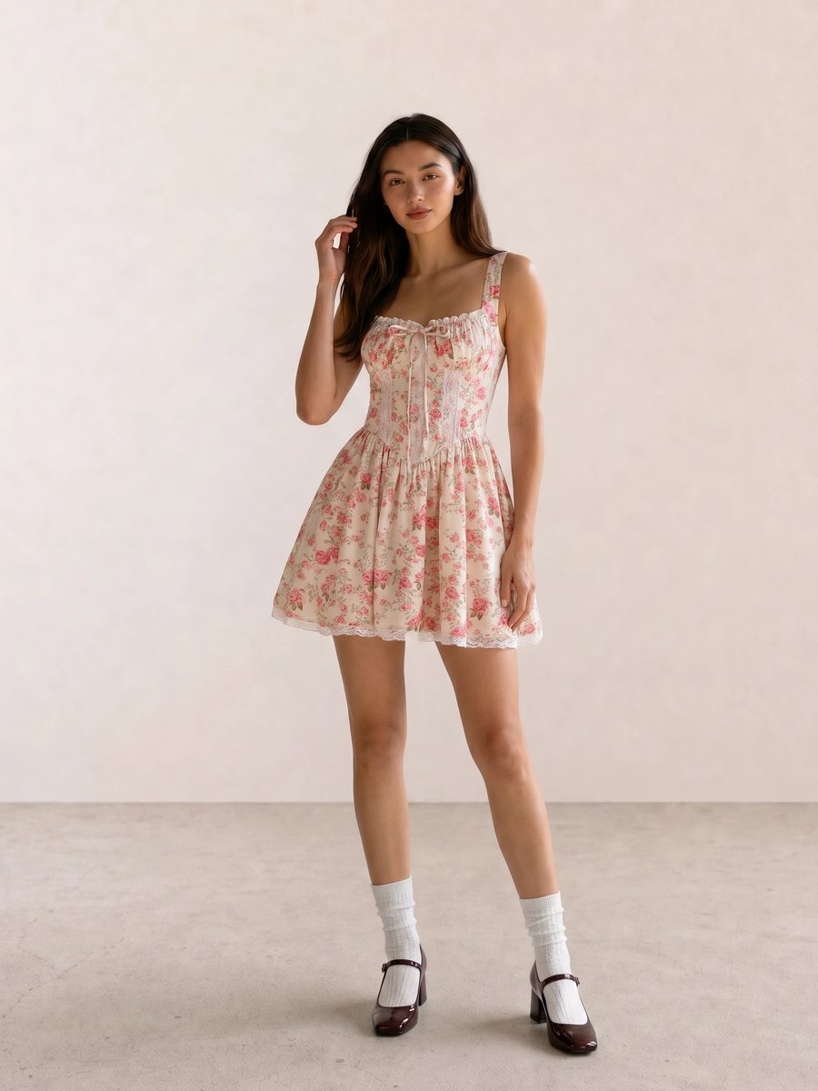
The warm pink in Cottagecore Rose Floral Mini Dress needs a gold or champagne metal more than another floral accessory. A peach cheek and soft warm eye keep the face connected; without the warm repeat, the wine shoes make the palette read heavier than it needs to.
A Practical Shopping Guide for Spring Colors
At a budget, start with one light neutral top, one clear accent knit or tee, and a gold-toned earring. The color matters more than a complete capsule. At mid-range, spend on a blazer, jacket, or handbag in a neutral you can repeat with coral, aqua, and warm pink. At luxury, buy only the color you have tested beside your face enough times to know it earns its place.
Apply Spring Beyond a Swatch
Use Seasonal Color Analysis to place Spring beside the other seasons, then check your undertone, clothing colors, jewelry metals, and makeup colors in daylight.
Spring Personal Color Palette FAQ
What colors look best on a Spring palette? Warm ivory, cream, light camel, peach, coral, butter yellow, turquoise, clear green, warm blue, and tomato red are useful starting comparisons. Choose lighter, warmer, or brighter versions according to your Spring subtype and contrast preference.
Can a Spring palette wear black? Yes, but black is often easier as a shoe, bag, or small print than as a high neckline. Compare it with warm navy or medium camel near the face and keep the option that preserves your coloring.
What jewelry metals suit Spring coloring? Gold, champagne, brass, warm pearl, and tortoiseshell are common first tests because they support Spring warmth. Light Spring may also enjoy delicate silver, especially when the rest of the palette stays light.
How do Light Spring, Warm Spring, and Bright Spring differ? Light Spring prioritizes light value, Warm Spring prioritizes golden warmth, and Bright Spring prioritizes clear chroma and contrast. All three can share a Spring direction while needing different intensity.
Weekly outfit picks and style guides — no fluff, unsubscribe anytime.